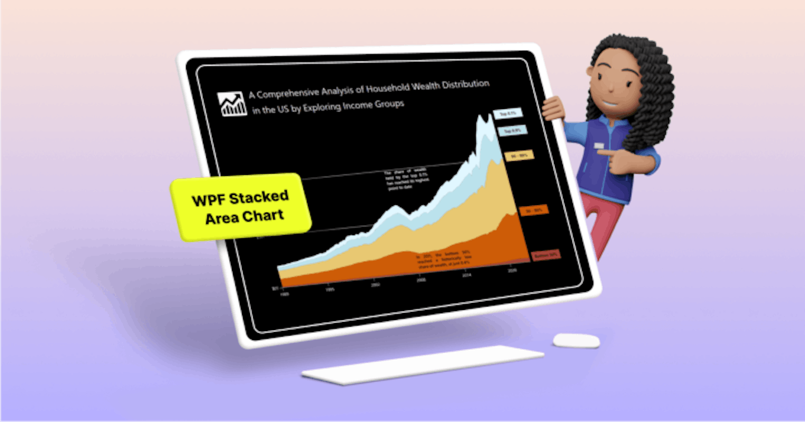
GayathriRamalingamgayathriramalingam.hashnode.dev·19 hours agoChart of the Week: Creating a WPF Stacked Area Chart to Visualize Wealth Distribution in the U.S.TL;DR: Learn to visualize wealth distribution in the U.S. from 1990 to 2023 using Syncfusion WPF Stacked Area Chart. Explore a step-by-step guide on data preparation, chart layout design, customization, and more. Dive into insightful analysis with th...Discusschart
Sumit Mondalsumit007.hashnode.dev·Apr 5, 2024A Beginner's Guide to Implementing Amazon QuickSight in AWSAre you looking to visualize your data and gain valuable insights without the hassle of complex setups? Amazon QuickSight might just be the solution you're seeking. As part of Amazon Web Services (AWS), QuickSight offers a user-friendly platform for ...DiscussAWS - HandsOn#AmazonQuickSight
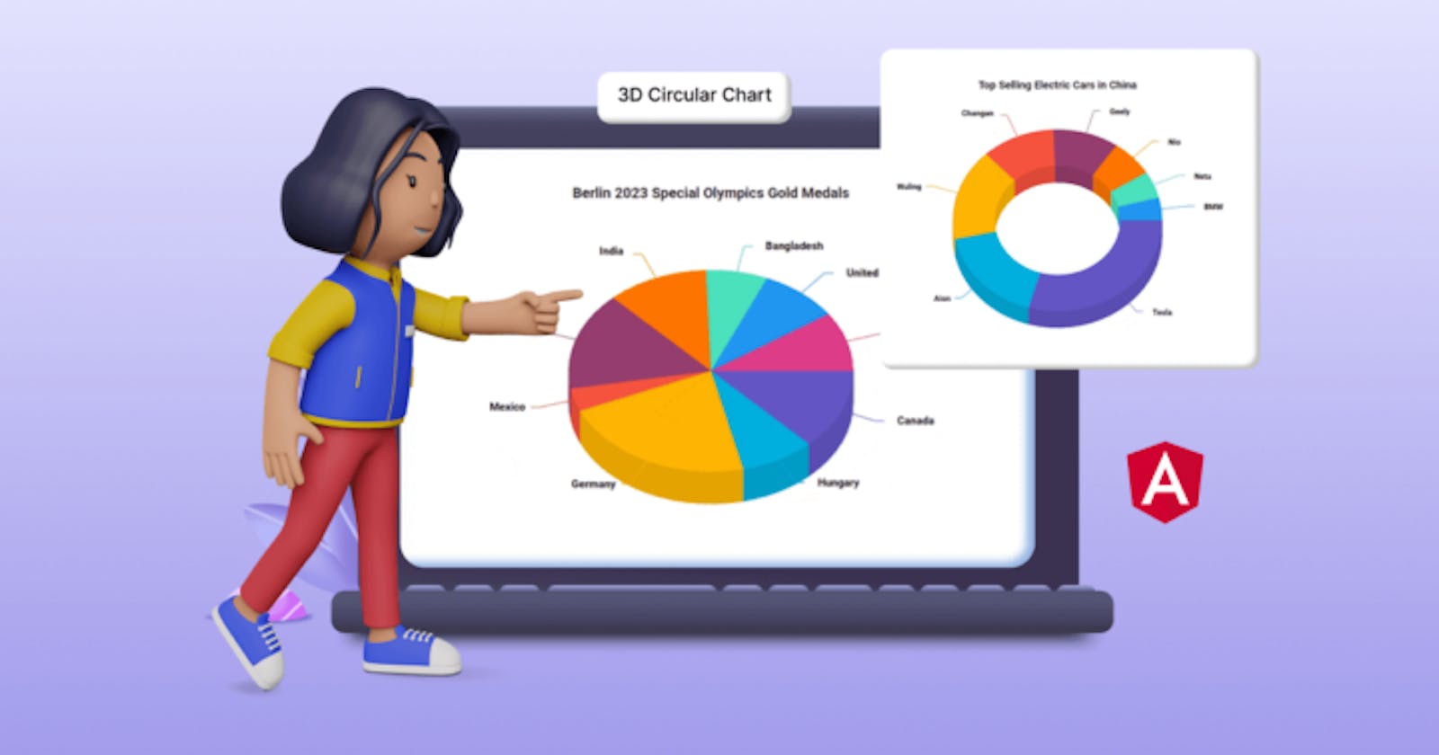
GayathriRamalingamgayathriramalingam.hashnode.dev·Apr 3, 2024Unveiling the New Angular 3D Circular Charts ComponentTLDR: Exploring the new Syncfusion Angular 3D Circular Charts component, visualizing data with its marvelous features and code examples. We are thrilled to introduce the new [Angular 3D Circular Charts](https://www.syncfusion.com/angular-components/a...DiscussAngular
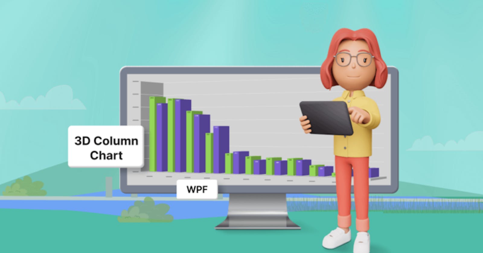
GayathriRamalingamgayathriramalingam.hashnode.dev·Apr 3, 2024Chart of the week: Creating a WPF 3D Column Chart to Visualize the Panama Canal’s Shipment Transit DataTLDR: Gathering and visualizing the data on Panama Canal shipment traffic using the Syncfusion WPF 3D Column Chart, customizing the chart’s title, axis, position, data labels, and other elements for enhanced insights. Welcome to our Chart of the Week...Discusschart
Tejaswi Nukavaraputejaswinukavarapu.hashnode.dev·Mar 11, 2024Capabilities of Power BIPower BI - Power Business Intelligence Microsoft Power BI is a collection of software services, apps, and connectors that work together to turn your unrelated sources of data into coherent, visually immersive, and interactive insights. From data in a...DiscussData Science
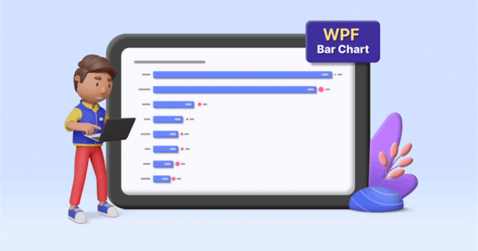
GayathriRamalingamgayathriramalingam.hashnode.dev·Feb 21, 2024Chart of the Week: Creating a WPF Bar Chart to Visualize the Homelands of America’s International StudentsWelcome to our Chart of the Week blog series! Today, we embark on an exploration of the U.S.’s international student landscape from the 2022–23 academic year, harnessing the robust capabilities of the Syncfusion WPF Bar Chart. Despite enduring the un...Discusschart
Modupe Giwamodupegiwa.hashnode.dev·Jan 29, 2024A Comprehensive Guide To Effective Data Visualization With MatplotlibIntroduction Data visualization is a crucial aspect of data analysis, allowing you to communicate insights effectively. This tutorial aims to introduce you to Matplotlib, providing a step-by-step guide on installation, basic plot creation, customizat...Discuss·10 likes·63 readsPython
Poorva Adhikarypoorva0704.hashnode.dev·Jan 28, 2024Cyber Crime - A Global ThreatGreetings! I'm Poorva Adhikary, a Computer Science student on the exciting journey of my first blog. Nervous yet eager, I'm diving into the world of cybercrime, a potent threat in our century. For my industrial training project in data analysis, my t...DiscussCybercrime
Kevin Millerkevinmiller.hashnode.dev·Jan 17, 2024Power BI Semantic Model Guide for 2024Introduction: As we step into the dynamic landscape of 2024, the role of data in decision-making has never been more critical. Businesses are continually seeking ways to harness the power of their data, and Microsoft's Power BI remains at the forefro...Discusspowerbi semantic model
Kevin Millerkevinmiller.hashnode.dev·Dec 29, 2023Unleashing the Power: A Guide to Creating Data Models in Power BIIntroduction: In the dynamic world of data analytics, harnessing the power of cutting-edge tools is essential for gaining valuable insights. Power BI, Microsoft's business analytics service, stands out as a frontrunner in this arena. In this blog, ...DiscussPowerBI