Sarthak semwalsarthaksmwl.hashnode.dev·Mar 26, 2024Mastering CSS Flexbox: A Beginner's GuideIntroduction In web development, creating a flexible and responsive layouts is very crucial to providing an optimal user experience across various devices and screen sizes. Fortunately, CSS Flexbox provides a powerful solution to this challenge. In t...Discuss·37 readscss flexbox
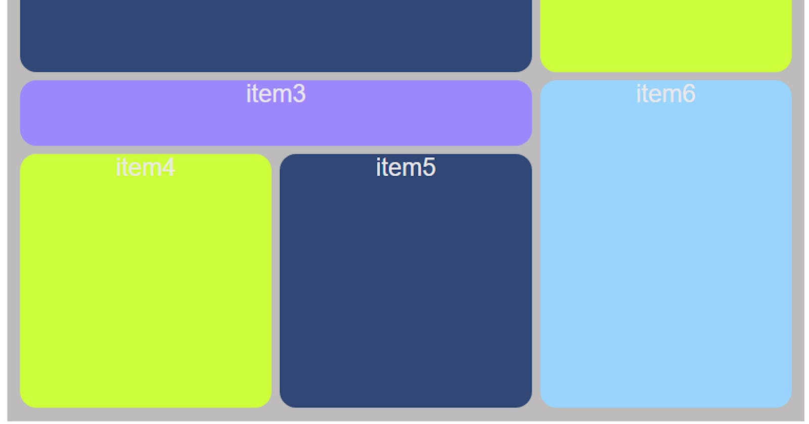
Leilan Naleilan.hashnode.dev·Mar 9, 2024Bento Responsive Grid Design with CSS GridFirst creating a container element that will serve as our grid container. Inside, we'll have items named item1,item2 and... . <div class="container"> <div class="item item1">item1</div> <div class="item item2">item2</div> <div c...Discuss·2 likes·34 readsbento grid
Kendgrrkend.com·Feb 24, 2024Mastering UI/UX Design Basics for DevelopersIn the realm of software and web development, the emphasis on delivering stellar user experiences (UX) and intuitive user interfaces (UI) has never been higher. Developers are increasingly expected to possess a keen understanding of UI/UX principles ...DiscussUser Experience Principles
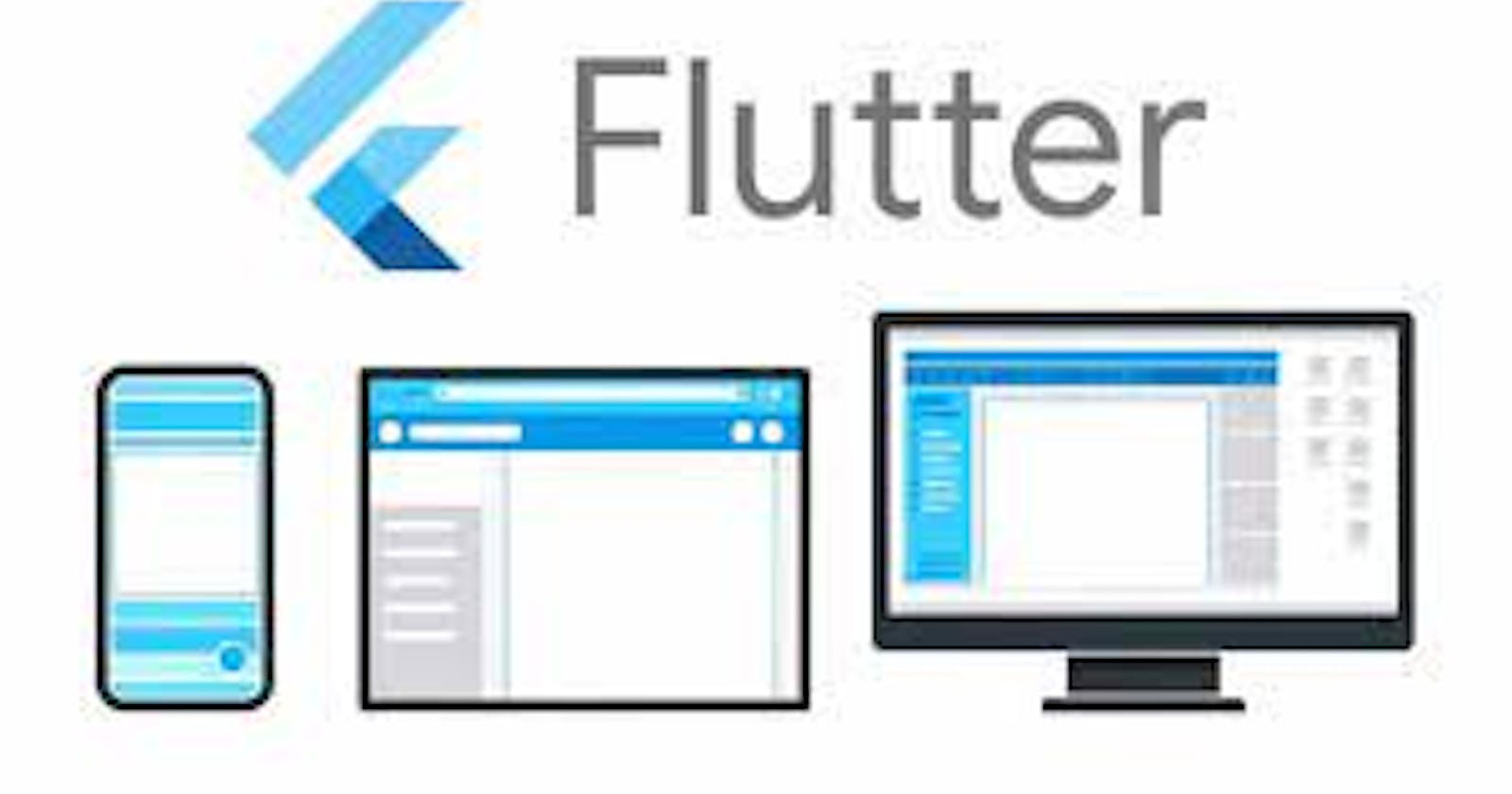
Ayoola Tosincodeblast.hashnode.dev·Dec 17, 2023Preview flutter apps on different devicesSo your done building you amazing flutter app but have no idea how you application looks like or will look like on different mobile devices☹️ that's a bummer. But worry no further, there is a way to preview you flutter apps on multiple devices to tes...Discuss·60 readsDevice preview
Gideon Salamisalamitech.hashnode.dev·Dec 7, 2023Navigating the Responsive Realm in Flutter: Insights from a Senior Mobile App EngineerIntroduction Remember the last time you opened an app on your phone and found it awkwardly stretched on your tablet? 🤔 That's the challenge we tackle head-on in Flutter's responsive UI design 😎 In the ever-evolving landscape of cross-platform appli...Discuss·2 likes·394 readsFlutter
Michael Salammichaelsalam.hashnode.dev·Oct 7, 2023The Best Approach to Website Responsiveness (Stop Abusing Media Queries)If you're familiar with the concept of responsive web design, you would have inevitably made use of media queries. However, without the right approach, media queries can easily be abused. Beyond understanding media queries for responsive design, appr...Discuss·3 likes·91 readsWeb Development
Asfak Ahmedasfakahmedsblog.hashnode.dev·Sep 1, 2023Responsive ( all core concept ) part 1 - introductionরেসপন্সিভ শব্দটি কি? রেসপন্সিভ শব্দটি বৈশিষ্ট্য বুঝাতে ব্যবহৃত হয় যা একটি উত্তর বা প্রতিক্রিয়ার জন্য বলা হয়, যা স্ক্রিনের আকার, আকৃতি, আকার বা মাধ্যমের মধ্যে গুরুত্বপূর্ণ পরিবর্তনের উত্তর দেয়। অর্থাৎ, যখন একটি ওয়েবসাইট বা অ্যাপ্লিকেশন রেসপন্সিভ হ...Discuss·1 like·410 reads2Articles1Week
brian leybrianley.hashnode.dev·Aug 25, 2023Building Exceptional UI/UX with the Bootstrap Grid SystemIn today's digital landscape, where users access websites across a myriad of devices, crafting a seamless user experience is paramount. The Bootstrap grid system emerges as a cornerstone, offering a streamlined approach to crafting responsive designs...Discussresponsive designs
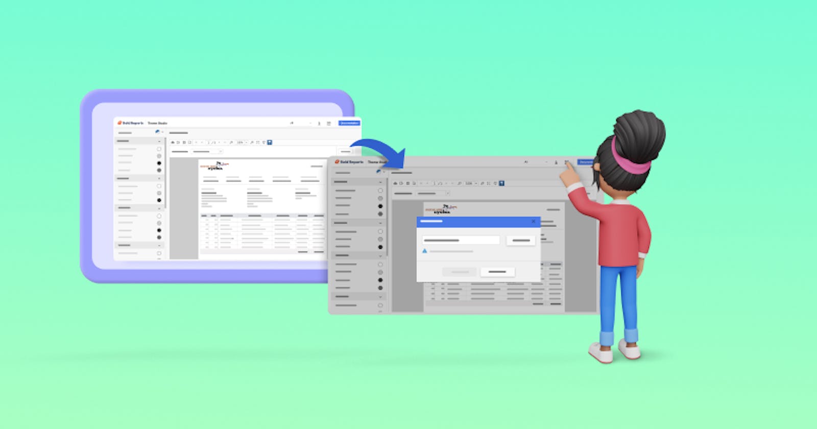
Bold Reports Teamboldreports.hashnode.dev·Aug 22, 2023Bold Reports Theme Studio: Transforming Reporting Tool Styles for a Fresh LookIn today’s fast-moving world, it’s important to stand out. That’s where Bold Reports Theme Studio comes in—it’s a tool that helps you completely change how your reporting tools look. You can customize their appearance to match your own style, brand, ...DiscussBold Reports
Mohd Junaid Arifmohd-junaid.hashnode.dev·Aug 22, 2023Introduction to Responsive Web Design: Building mobile-friendly websites.Crafting Seamless User Experiences: Unveiling the Art of Responsive Web Design Greetings, digital architects! Prepare to embark on an exhilarating journey into the realm of Responsive Web Design. In this comprehensive guide, we'll demystify the proce...DiscussResponsive Web Design