
5 Different Ways To Visualize A Color Picker Control In Xamarin.Forms


Introduction
Nowadays, a UI for picking a color plays a vital role in some mobile applications. A color picker presents a unique UI challenge to adapting to the compact screens of mobile devices. So, Syncfusion Xamarin.Forms controls like Chips, Radial Menu, Picker, Segmented Control, and Range Slider will help us to implement various color picker UIs easily.
Xamarin.Forms Chips as a color picker
The Xamarin.Forms Chips control will present colors as multiple circles. It arranges multiple color chips in a flex layout. They can be wrapped and grouped to make selection easy.
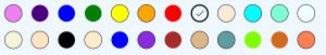 Xamarin.Forms Chips as Color Picker
The following code illustrates the Xamarin.Forms Chips control populated with color values bound as background colors with customized corners.
<sfbuttons:SfChipGroup  Type="Choice"
                        ChipBorderWidth="1"
                        SelectedItem="{Binding SelectedItem}"
                        ItemsSource="{Binding Colors, Converter={StaticResource ColorsToChips}}">
           <sfbuttons:SfChipGroup.ChipLayout>
                     <FlexLayout HorizontalOptions="Start"
                                 VerticalOptions="Center"
                                 Direction="Row"
                                 Wrap="Wrap"
                                 JustifyContent="Start"
                                 AlignContent="Start"
                                 AlignItems="Start"/>
           </sfbuttons:SfChipGroup.ChipLayout>
</sfbuttons:SfChipGroup>
Xamarin.Forms Picker Control as a color picker
The Xamarin.Forms Picker control is one of the most common UIs for color pickers. Users select a color using its name. You can implement this color picker by populating the Xamarin.Forms color values.
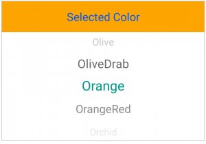 Xamarin.Forms Picker as Color Picker
The following code illustrates the Xamarin.Forms Picker control populated with a color name as a string value.
<sfpicker:SfPicker HeaderText="Selected Color"
                   SelectedItem="{Binding SelectedItem}"
                   ItemsSource="{Binding Colors}"/>
Xamarin.Forms Radial Menu as a color picker
The Xamarin.Forms Radial Menu provides an elegant color picker UI. This UI can fit into any compact mobile screen. The hierarchy of menu items allows you to navigate from a primary color to pick from its shades in the next level. Populating a primary color in first-level radial menus and populating its shades as submenus will look like the following UI.
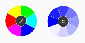 Xamarin.Forms Radial Menu as Color Picker
The following code illustrates the Xamarin.Forms Radial Menu control populated with primary colors with their shades as subitems.
<sfradialmenu:SfRadialMenu  CenterButtonBackgroundColor="#383838" >
    <sfradialmenu:SfRadialMenu.Items>
        <sfradialmenu:SfRadialMenuItem BackgroundColor="#FF0000">
            <sfradialmenu:SfRadialMenuItem.Items> <sfradialmenu:SfRadialMenuItem BackgroundColor="#FF0000" /> <sfradialmenu:SfRadialMenuItem BackgroundColor="#FF1E1E" /> <sfradialmenu:SfRadialMenuItem BackgroundColor="#FF3C3C" />  <sfradialmenu:SfRadialMenuItem BackgroundColor="#FF5A5A" />  <sfradialmenu:SfRadialMenuItem BackgroundColor="#FF7878" />  <sfradialmenu:SfRadialMenuItem BackgroundColor="#FF9696" />  <sfradialmenu:SfRadialMenuItem BackgroundColor="#FFB4B4" />  <sfradialmenu:SfRadialMenuItem BackgroundColor="#FFD2D2" /> <sfradialmenu:SfRadialMenuItem BackgroundColor="#FFF0F0" /> </sfradialmenu:SfRadialMenuItem.Items>
        </sfradialmenu:SfRadialMenuItem>
        <sfradialmenu:SfRadialMenuItem BackgroundColor="#FFFF00">
            <sfradialmenu:SfRadialMenuItem.Items> <sfradialmenu:SfRadialMenuItem BackgroundColor="#FFFF00" /> <sfradialmenu:SfRadialMenuItem BackgroundColor="#FFFF1E" /> <sfradialmenu:SfRadialMenuItem BackgroundColor="#FFFF3C" />  <sfradialmenu:SfRadialMenuItem BackgroundColor="#FFFF5A" /> <sfradialmenu:SfRadialMenuItem BackgroundColor="#FFFF78" />  <sfradialmenu:SfRadialMenuItem BackgroundColor="#FFFFB4" /> <sfradialmenu:SfRadialMenuItem BackgroundColor="#FFFFD2" /> <sfradialmenu:SfRadialMenuItem BackgroundColor="#FFFFF0" /> </sfradialmenu:SfRadialMenuItem.Items>
        </sfradialmenu:SfRadialMenuItem>
        <sfradialmenu:SfRadialMenuItem BackgroundColor="#00FF00">
            <sfradialmenu:SfRadialMenuItem.Items> <sfradialmenu:SfRadialMenuItem BackgroundColor="#00FF00" /> <sfradialmenu:SfRadialMenuItem BackgroundColor="#1EFF1E" /> <sfradialmenu:SfRadialMenuItem BackgroundColor="#3CFF3C" />  <sfradialmenu:SfRadialMenuItem BackgroundColor="#78FF78" /> <sfradialmenu:SfRadialMenuItem BackgroundColor="#96FF96" /> <sfradialmenu:SfRadialMenuItem BackgroundColor="#B4FFB4" /> <sfradialmenu:SfRadialMenuItem BackgroundColor="#D2FFD2" /> <sfradialmenu:SfRadialMenuItem BackgroundColor="#F0FFF0" /> </sfradialmenu:SfRadialMenuItem.Items>
        </sfradialmenu:SfRadialMenuItem>
        <sfradialmenu:SfRadialMenuItem BackgroundColor="#00FFFF">
            <sfradialmenu:SfRadialMenuItem.Items> <sfradialmenu:SfRadialMenuItem BackgroundColor="#00FFFF" /> <sfradialmenu:SfRadialMenuItem BackgroundColor="#1EFFFF" /> <sfradialmenu:SfRadialMenuItem BackgroundColor="#3CFFFF" /> <sfradialmenu:SfRadialMenuItem BackgroundColor="#78FFFF" /> <sfradialmenu:SfRadialMenuItem BackgroundColor="#96FFFF" /> <sfradialmenu:SfRadialMenuItem BackgroundColor="#B4FFFF" /> <sfradialmenu:SfRadialMenuItem BackgroundColor="#D2FFFF" /> <sfradialmenu:SfRadialMenuItem BackgroundColor="#F0FFFF" /> </sfradialmenu:SfRadialMenuItem.Items>
        </sfradialmenu:SfRadialMenuItem>
        <sfradialmenu:SfRadialMenuItem BackgroundColor="#0000FF">
            <sfradialmenu:SfRadialMenuItem.Items> <sfradialmenu:SfRadialMenuItem BackgroundColor="#0000FF" /> <sfradialmenu:SfRadialMenuItem BackgroundColor="#1E1EFF" /> <sfradialmenu:SfRadialMenuItem BackgroundColor="#3C3CFF" /> <sfradialmenu:SfRadialMenuItem BackgroundColor="#7878FF" /> <sfradialmenu:SfRadialMenuItem BackgroundColor="#9696FF" /> <sfradialmenu:SfRadialMenuItem BackgroundColor="#B4B4FF" /> <sfradialmenu:SfRadialMenuItem BackgroundColor="#D2D2FF" /> <sfradialmenu:SfRadialMenuItem BackgroundColor="#F0F0FF" /> </sfradialmenu:SfRadialMenuItem.Items>
        </sfradialmenu:SfRadialMenuItem>
        <sfradialmenu:SfRadialMenuItem BackgroundColor="#FF00FF">
            <sfradialmenu:SfRadialMenuItem.Items> <sfradialmenu:SfRadialMenuItem BackgroundColor="#FF00FF" /> <sfradialmenu:SfRadialMenuItem BackgroundColor="#FF1EFF" /> <sfradialmenu:SfRadialMenuItem BackgroundColor="#FF3CFF" /> <sfradialmenu:SfRadialMenuItem BackgroundColor="#FF78FF" /> <sfradialmenu:SfRadialMenuItem BackgroundColor="#FF96FF" /> <sfradialmenu:SfRadialMenuItem BackgroundColor="#FFB4FF" /> <sfradialmenu:SfRadialMenuItem BackgroundColor="#FFD2FF" /> <sfradialmenu:SfRadialMenuItem BackgroundColor="#FFF0FF" /> </sfradialmenu:SfRadialMenuItem.Items>
        </sfradialmenu:SfRadialMenuItem>
    </sfradialmenu:SfRadialMenu.Items>
</sfradialmenu:SfRadialMenu>
Xamarin.Forms Range Slider as a color picker
The Xamarin.Forms Range Slider helps the user pick a color by defining the RGB value. Three range slider controls represent the RGB color code and the selection is restricted to between 0 and 255.
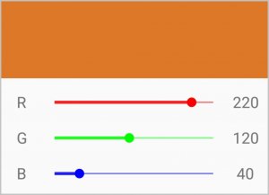 Xamarin.Forms Range Slider as Color Picker
The following code illustrates how three Xamarin.Forms Range Slider controls made the previous UI.
<ContentView.Resources>
        <Style TargetType="sfrangeslider:SfRangeSlider">
            <Setter Property="Orientation" Value="Horizontal"/>
            <Setter Property="ShowValueLabel" Value="False"/>
            <Setter Property="ShowRange" Value="False"/>
            <Setter Property="TrackSelectionThickness" Value="2"/>
            <Setter Property="TrackThickness" Value="1"/>
            <Setter Property="TickFrequency" Value="255"/>
            <Setter Property="StepFrequency" Value="1"/>
            <Setter Property="TickPlacement" Value="None"/>
            <Setter Property="ThumbSize" Value="20"/>
            <Setter Property="Minimum" Value="0"/>
            <Setter Property="Maximum" Value="255"/>
        </Style>
</ContentView.Resources>

<sfrangeslider:SfRangeSlider  Value="{Binding RValue, Mode=TwoWay}"
                              TrackColor="#77FF0000"
                              KnobColor="#FFFF0000"
                              TrackSelectionColor="#CCFF0000"/>

<sfrangeslider:SfRangeSlider  Value="{Binding GValue, Mode=TwoWay}"
                              TrackColor="#7700FF00"
                              KnobColor="#FF00FF00"
                              TrackSelectionColor="#CC00FF00"/>

<sfrangeslider:SfRangeSlider  Value="{Binding BValue, Mode=TwoWay}"
                              TrackColor="#770000FF"
                              KnobColor="#FF0000FF"
                              TrackSelectionColor="#CC0000FF"/>
Xamarin.Forms Segmented control as a color picker
The Xamarin.Forms Segmented Control provides a linear set of circle tiles, each of which functions as a UI to pick a color. Even though it provides a similar UI to Xamarin.Forms Chips, but it provides selection animation.
 Xamarin.Forms Segmented Control as Color Picker
The following code illustrates the Xamarin.Forms Segmented Control populated with color values and bound with segmented items such as a custom view color and customized corners.
<sfsegmentedcontrol:SfSegmentedControl BackgroundColor="{Binding SelectedColor}"
                                       SegmentHeight="40"
                                       SegmentWidth="40"
                                       SelectedItem="{Binding SelectedItem}"
                                       ItemsSource="{Binding ViewCollection}"
                                       SelectedIndex="{Binding SelectedIndex, Mode=TwoWay}"
                                       SegmentPadding="5">
      <sfsegmentedcontrol:SfSegmentedControl.SelectionIndicatorSettings>
            <sfsegmentedcontrol:SelectionIndicatorSettings Color="#FFFFFF"
                                                           Position="Border"
                                                           CornerRadius="20"/>
      </sfsegmentedcontrol:SfSegmentedControl.SelectionIndicatorSettings>
</sfsegmentedcontrol:SfSegmentedControl>
Summary
In this blog post, we have walked through the Syncfusion Xamarin.Forms controls used to create a variety of color picker UIs. The sample for this is available in this GitHub location. We invite you to check out our Xamarin.Forms controls. You can always download our free evaluation to see all these controls in action. You can also explore our samples available on Google Play and Microsoft store. Learn about advanced features in our documentation.
If you have any questions or require clarification about these controls, please let us know in the comments below. You can also contact us through our support forum, Direct-Trac, or Feedback Portal. We are happy to assist you!
The post 5 Different Ways To Visualize A Color Picker Control In Xamarin.Forms appeared first on Syncfusion Blogs.