

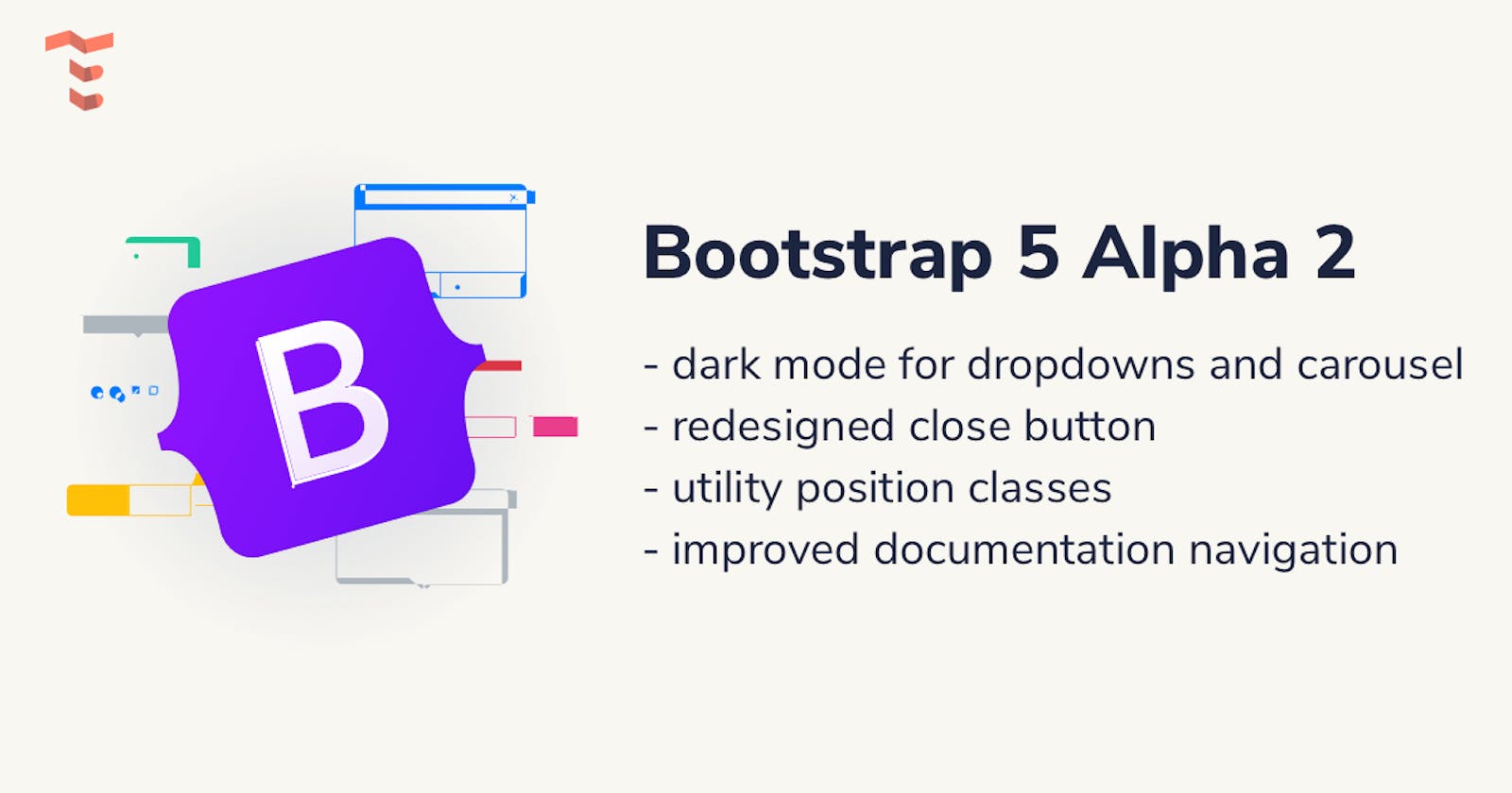
Bootstrap 5 Alpha 2 changes: dark mode for carousels and dropdowns and new utility position classes


Two days ago the alpha 2 version of Bootstrap 5 was launched introducing dark components, updated documentation navigation, a redesigned close button, position utility classes, and a few minor updates regarding styles.
As a reminder, Bootstrap 5 was launched back on the 26th of June, 2020 bringing huge changes, such as removing jQuery as a dependency, dropping support for Internet Explorer 10, and 11, introducing the Utility API, and lots of changes regarding the Javascript, CSS and HTML markup.
Introducing dark components
This may not come as a surprise, but it is a welcoming update to finally have some more dark components with the most popular CSS framework in the world. For now, there are two more components that are being added with a dark version: dark carousel and dark dropdowns.
Dark carousel
Switching to a dark version of a carousel component can easily be done by adding the .carousel-dark modifier class to the .carousel element. The values can be changed by updating the Sass variables.
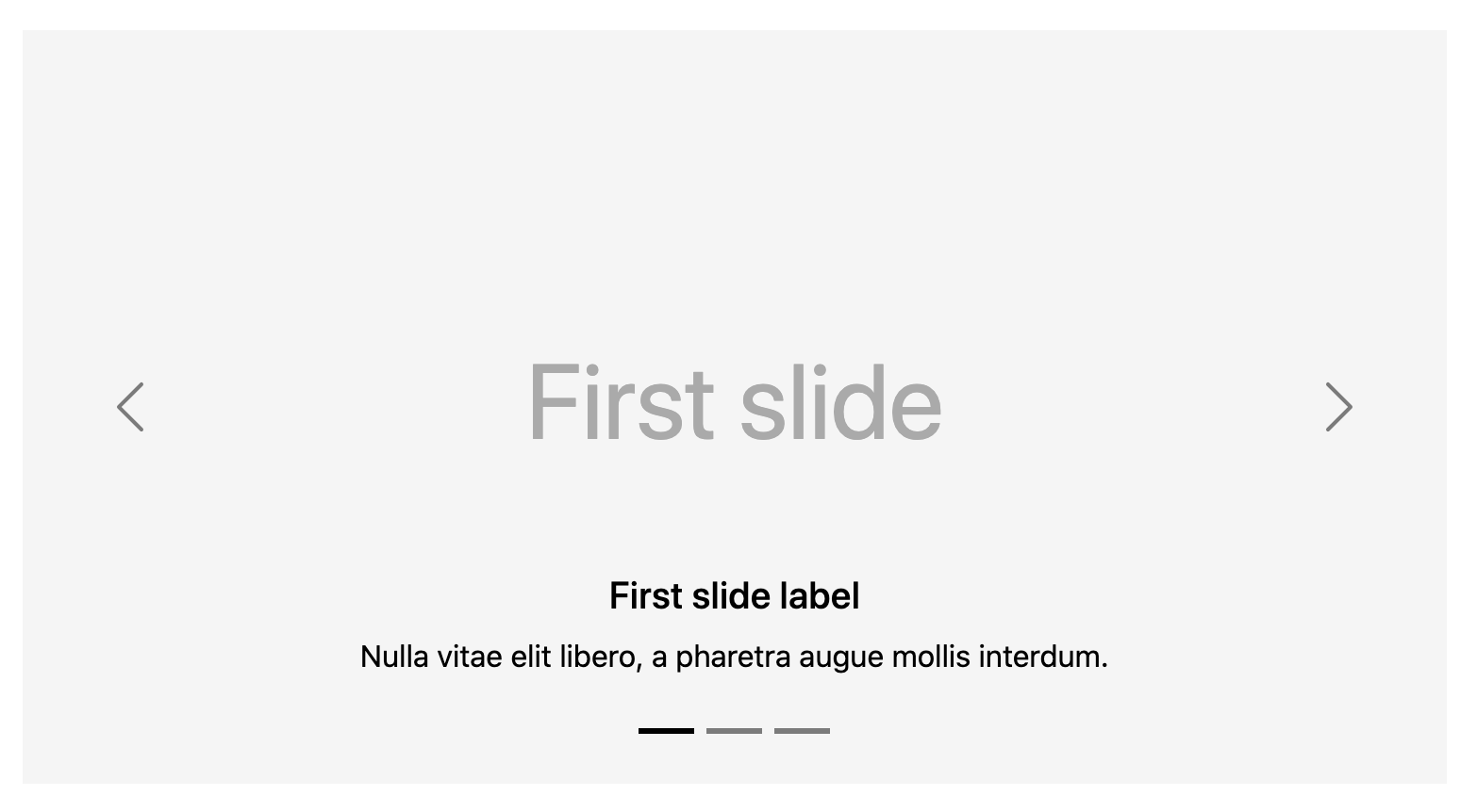
Here’s the markup that you can use:
<div id="carouselExampleDark" class="carousel carousel-dark slide" data-ride="carousel">
    <ol class="carousel-indicators">
    <li data-target="#carouselExampleDark" data-slide-to="0" class="active"></li>
    <li data-target="#carouselExampleDark" data-slide-to="1"></li>
    <li data-target="#carouselExampleDark" data-slide-to="2"></li>
    </ol>
    <div class="carousel-inner">
    <div class="carousel-item active" data-interval="10000">
        <img src="..." class="d-block w-100" alt="...">
        <div class="carousel-caption d-none d-md-block">
        <h5>First slide label</h5>
        <p>Nulla vitae elit libero, a pharetra augue mollis interdum.</p>
        </div>
    </div>
    <div class="carousel-item" data-interval="2000">
        <img src="..." class="d-block w-100" alt="...">
        <div class="carousel-caption d-none d-md-block">
        <h5>Second slide label</h5>
        <p>Lorem ipsum dolor sit amet, consectetur adipiscing elit.</p>
        </div>
    </div>
    <div class="carousel-item">
        <img src="..." class="d-block w-100" alt="...">
        <div class="carousel-caption d-none d-md-block">
        <h5>Third slide label</h5>
        <p>Praesent commodo cursus magna, vel scelerisque nisl consectetur.</p>
        </div>
    </div>
    </div>
    <a class="carousel-control-prev" href="#carouselExampleDark" role="button" data-slide="prev">
    <span class="carousel-control-prev-icon" aria-hidden="true"></span>
    <span class="visually-hidden">Previous</span>
    </a>
    <a class="carousel-control-next" href="#carouselExampleDark" role="button" data-slide="next">
    <span class="carousel-control-next-icon" aria-hidden="true"></span>
    <span class="visually-hidden">Next</span>
    </a>
</div>
Dark dropdowns
You can change the appearance of the dropdown items by adding the .dropdown-menu-dark modifier class to any .dropdown-menu element.
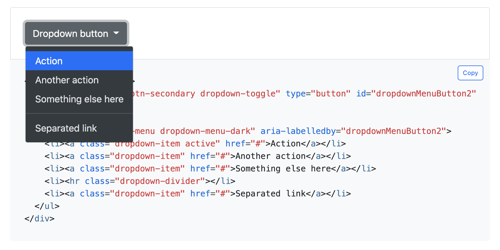
Here’s the markup that you can use:
<div class="dropdown">
    <button class="btn btn-secondary dropdown-toggle" type="button" id="dropdownMenuButton2" data-toggle="dropdown" aria-expanded="false">
    Dropdown button
    </button>
    <ul class="dropdown-menu dropdown-menu-dark" aria-labelledby="dropdownMenuButton2">
    <li><a class="dropdown-item active" href="#">Action</a></li>
    <li><a class="dropdown-item" href="#">Another action</a></li>
    <li><a class="dropdown-item" href="#">Something else here</a></li>
    <li><hr class="dropdown-divider"></li>
    <li><a class="dropdown-item" href="#">Separated link</a></li>
    </ul>
</div>
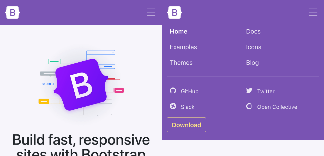
Redesigned docs navigation
The team behind Bootstrap decided to simplify the appearance of the online docs navigation by redesigning the items within it. It now should be easier to use and overview using smaller devices.
Updated close button
A new design has been brought to the close button renaming, redesigning, adding a new focus state, and a new color option. The class has been changed from .close to .btn-close and it no longer uses the × method but an SVG powered background-image via CSS solution.

New position utility classes
Personally, whenever I created a new instance of a Bootstrap project, the first thing I did was create some additional positioning classes to absolutely position certain elements. It’s great to see that this is now a default feature of the framework and it will definitely save some time and effort for the developers along the road.
Use the new top, right, bottom and left modifier classes to absolutely position elements. Check out the positioning documentation.
What to expect for Alpha 3?
According to the official blog post, some of the expected changes for the next Alpha version will be an RTL support, expanding the Utility API options, offcanvas support for the new side modals.
Getting started
If you want to get started using the newest Alpha version of Bootstrap 5 you can go check out our latest tutorial about Bootstrap 5 and learn how to get started using it without jQuery.
Free and Premium templates using Bootstrap 5
We are a team of designers and developers building themes, templates and UI kits and we already have finished a couple of projects using Bootstrap 5. Check out our latest Bootstrap 5 themes, templates and UI Kits by browsing the official list of projects at Themesberg.