


A common practice with Material-UI is to wrap a component around another to extend the wrapped component in some fashion. For example, the Card component wraps the Paper component. The Card explicitly defines a set of props it allows and transfers any other props down to the Paper component. This practice keeps things clean and composable.
This is a good practice when building your own custom component libraries as well. When writing non-typed Javascript, this is fairly opaque for better or worse. However, establishing allowed props can be confusing when converting components to strict TypeScript since we need a bit more transparency into what the wrapped component's allowed prop are. Below is what I learned from my first attempt at such a conversion.
Example 1: Passing Along All Props
Javascript
The following is a custom SVG icon for Twitter I utilize in IconButtons, etc. It allows for all the same props as Material-UI's SVGIcon. For my purposes, I don't care what these props are. If MUI adds more props in a later release, I want to support them without changing my code. As such, I do not want to explicitly have to define these props. Here's how I accomplish this in non-typed Javascript currently:
// SVG source: Twitter icon from: https://iconmonstr.com/twitter-1-svg/
import React from 'react';
import SvgIcon from '@material-ui/core/SvgIcon';

export default function Instagram(props) {
  return (
    <SvgIcon viewBox="0 0 24 24" {...props}>
      <path d="M21.231 0h-18.462c-1.529 0-2.769 1.24-2.769 2.769v18.46c0 1.531 1.24 2.771 2.769 2.771h18.463c1.529 0 2.768-1.24 2.768-2.771v-18.46c0-1.529-1.239-2.769-2.769-2.769zm-9.231 7.385c2.549 0 4.616 2.065 4.616 4.615 0 2.549-2.067 4.616-4.616 4.616s-4.615-2.068-4.615-4.616c0-2.55 2.066-4.615 4.615-4.615zm9 12.693c0 .509-.413.922-.924.922h-16.152c-.511 0-.924-.413-.924-.922v-10.078h1.897c-.088.315-.153.64-.2.971-.05.337-.081.679-.081 1.029 0 4.079 3.306 7.385 7.384 7.385s7.384-3.306 7.384-7.385c0-.35-.031-.692-.081-1.028-.047-.331-.112-.656-.2-.971h1.897v10.077zm0-13.98c0 .509-.413.923-.924.923h-2.174c-.511 0-.923-.414-.923-.923v-2.175c0-.51.412-.923.923-.923h2.174c.511 0 .924.413.924.923v2.175z" />
    </SvgIcon>
  );
}
TypeScript
With TypeScript we need to be more explicit what props are allowed for our component. Since in this example, we don't care and simply transfer them to the wrapped SvgIcon component, we need to expose what SvgIcon's props are. It took a bit to find in the source code, but luckily, Material-UI exports their component's types for consumption.
Here is the converted component:
// Twitter icon from: https://iconmonstr.com/twitter-1-svg/
import React from 'react';
import SvgIcon, { SvgIconProps } from '@material-ui/core/SvgIcon';

const Twitter: React.FunctionComponent<SvgIconProps> = props => {
  return (
    <SvgIcon viewBox="0 0 24 24" {...props}>
      <path d="M24 4.557c-.883.392-1.832.656-2.828.775 1.017-.609 1.798-1.574 2.165-2.724-.951.564-2.005.974-3.127 1.195-.897-.957-2.178-1.555-3.594-1.555-3.179 0-5.515 2.966-4.797 6.045-4.091-.205-7.719-2.165-10.148-5.144-1.29 2.213-.669 5.108 1.523 6.574-.806-.026-1.566-.247-2.229-.616-.054 2.281 1.581 4.415 3.949 4.89-.693.188-1.452.232-2.224.084.626 1.956 2.444 3.379 4.6 3.419-2.07 1.623-4.678 2.348-7.29 2.04 2.179 1.397 4.768 2.212 7.548 2.212 9.142 0 14.307-7.721 13.995-14.646.962-.695 1.797-1.562 2.457-2.549z" />
    </SvgIcon>
  );
};

export default Twitter;
The key pieces here:
- We imported the non-default export
SvgIconPropsfrom Material-UI - We explicitly define our React Functional component with the
SvgIconPropsas the prop definition. - Continue to wholesale transfer the Twitter component props directly to the
SvgIconcomponent.
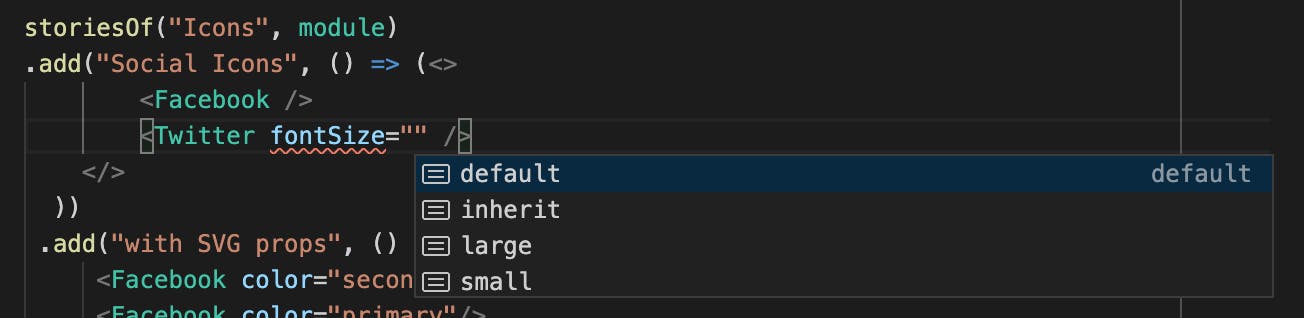
Now the TypeScript compiler is happy. Since VSCode plays well with TypeScript, I can leverage the type definitions of the SVGIcon to do nice things like autocomplete allowed values. Win win.
Now that we can transfer all props in our component, let's explore having our own props and passing the rest to Material-UI.
Example 2: Using Custom Props
Let's continue this example, but implement a SocialButton component. It will accept a superset of Material-UI's Button props, but will establish some defaults and also use a custom prop service. I will use this to map which of my custom icons should be used.
Note: I could simply pass the Twitter icon as a child to SocialButton and mimic the behavior of IconButton, but I like to be a bit more explicit.
Javascript
// Social Button for Internal Social Links and Profile Links, etc
import React from 'react';
import PropTypes from 'prop-types';
import { makeStyles } from '@material-ui/core/styles';
import IconButton from '@material-ui/core/IconButton';

import TwitterIcon from '../../icons/Twitter';
import FacebookIcon from '../../icons/Facebook';
import InstagramIcon from '../../icons/Instagram';
import YouTubeIcon from '../../icons/YouTube';
import VimeoIcon from '../../icons/Vimeo';
import OtherLinkIcon from '../../icons/OtherLink';

const serviceIconMap = {
  instagram: InstagramIcon,
  facebook: FacebookIcon,
  twitter: TwitterIcon,
  youtube: YouTubeIcon,
  vimeo: VimeoIcon,
  other: OtherLinkIcon
};

const useStyles = makeStyles(theme => ({
  // Override IconButton defaults: root is applied to Button root.
  // TODO: Might be easier to override Button vs. IconButton ?
  root: {
    borderRadius: 0,
    margin: `${theme.spacing(1)}px`,
    backgroundColor: theme.palette.primary.main,
    color: theme.palette.common.white,
    '&:hover': {
      backgroundColor: theme.palette.primary.dark
    }
  },
}));

export default function SocialButton({ component, service, ...rest }) {
  let classes = useStyles();

  // Default to use anchor tags
  let ButtonComponent = component ? component : 'a';

  // Resolve
  let IconComponent = serviceIconMap[service] || serviceIconMap.other;

  return (
    <IconButton
      component={ButtonComponent}
      {...rest}

      aria-label={service}
      classes={{root: classes.root}}
    >
      <IconComponent fontSize="inherit"/>
    </IconButton>
  );
}

SocialButton.propTypes = {
  service: PropTypes.string.isRequired,
  component: PropTypes.func
};
High level, the SocialButton component:
- Wraps
IconButton - Defines some branded CSS to modify the appearance of
IconButton - Forces
IconButtonto use an anchor tag (a) rather than thebuttondefault component. - Defines a mapping of
serviceprop values to their icon component
TypeScript
The above works great. However, when converting to TypeScript, we have to somehow combine our service prop with the IconButton allowed props. It would also be nice to explicitly define what values of service are allowed so we can autocomplete in VSCode. After much heads cratching and digging through Material-UI's source, I cam up with the following solution:
// Social Button for Internal Social Links and Gallery Links, targetClasses
import React, {ElementType} from 'react';
import { makeStyles } from '@material-ui/core/styles';
import IconButton, {IconButtonProps} from '@material-ui/core/IconButton';

import TwitterIcon from '../../icons/Twitter';
import FacebookIcon from '../../icons/Facebook';
import InstagramIcon from '../../icons/Instagram';
import TumblrIcon from '../../icons/Tumblr';
import YouTubeIcon from '../../icons/YouTube';
import VimeoIcon from '../../icons/Vimeo';
import OtherLinkIcon from '../../icons/OtherLink';
import { SvgIconProps } from '@material-ui/core';

// Define allowed service types
type ServicesType = 'instagram' | 'facebook' | 'twitter' | 'tumblr' | 'youtube' | 'vimeo' | 'other';

// Define map of service types and Renderer
const serviceIconMap: Record<ServicesType, ElementType<SvgIconProps>> = {
  instagram: InstagramIcon,
  facebook: FacebookIcon,
  twitter: TwitterIcon,
  tumblr: TumblrIcon,
  youtube: YouTubeIcon,
  vimeo: VimeoIcon,
  other: OtherLinkIcon
};

// Define SocialButton Prop Types
interface SocialButtonProps extends IconButtonProps {
  service:  ServicesType,
  component?: ElementType,
}

// Override IconButton defaults: root is applied to Button root.
// TODO: Might be easier to override Button vs. IconButton ?
const useStyles = makeStyles(theme => ({
  root: {
    borderRadius: 0,
    margin: `${theme.spacing(1)}px`,
    backgroundColor: theme.palette.primary.main,
    color: theme.palette.common.white,
    '&:hover': {
      backgroundColor: theme.palette.primary.dark
    }
  },
}));


const SocialButton: React.FunctionComponent<SocialButtonProps> = ({component, service, ...rest}) => {
  let classes = useStyles();

  // Default to use anchor tags
  let ButtonComponent: ElementType = component ? component : 'a';

  // Resolve Icon component for service
  let IconComponent = serviceIconMap[service] || serviceIconMap.other;

  return (
    <IconButton
      component={ButtonComponent}
      {...rest }
      aria-label={service}
      classes={{root: classes.root}}
    >
      <IconComponent fontSize="inherit"/>
    </IconButton>
  );
}

export default SocialButton;
There is a fair amount to unpack there. However, here are the highlights:
ServicesTypedefines a type that allows only specific string values.serviceIconMapis map of service strings to our custom icon components that wrapSvgIconfrom Example 1. The keys of the map must be a value inServicesTypeor TypeScript will complain.SocialButtonPropsis an interface that extends theIconButtonprops. Now we have a prop definition that includes our service and whatever the IconButton props are.
Back in VSCode, we can see the benefit of defining the ServicesType by a handy autocomplete of service names.
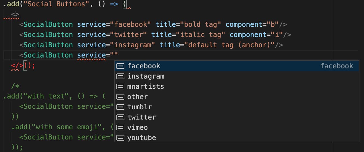
Once we add a SocialButton for youtube to our examples, the output looks like:

... and the markup looks like:
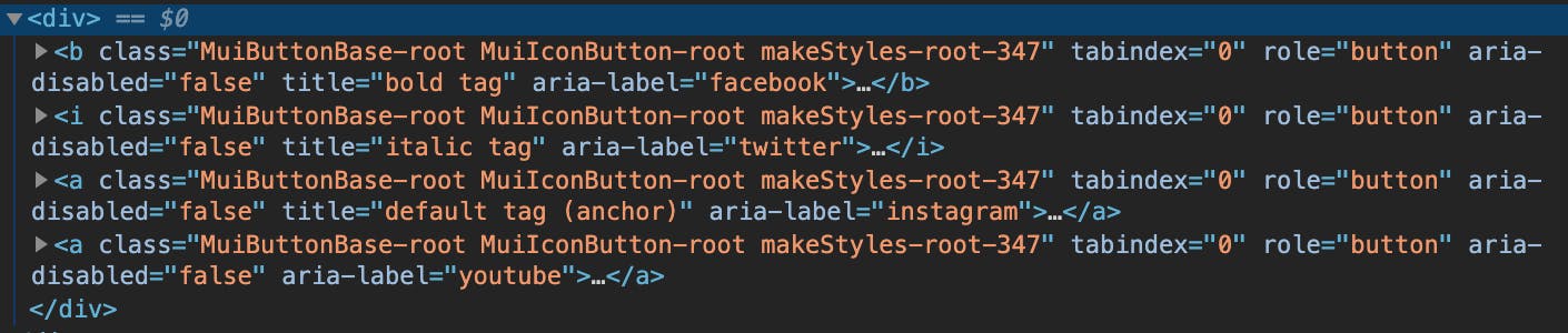
Things of note:
- The
componentelement is indeed rendered with our default anchor tag. Remember the default forIconButtonisbutton. - Attributes we don't care about (html
title) are forwarded on to the Material-UI IconButton element.
Conclusion
Material-UI exposes their types quite well and we can extend those types to easily transfer props to base components. By leveraging these types and our own custom types, we can the added benefit of strongly typed props and nice features from the IDE like autocomplete.
This is my first time converting existing components utilizing Material-UI to TypeScript. If you have a better solution or find a typo, point it out in the comments. Additionally, check out other programming articles at blainegarrett.com or follow me on twitter @blainegarrett.
Image Credit: Interior of the 20-foot diameter vacuum tank at the NASA Lewis Research Center's Electric Propulsion Laboratory. Original from NASA . Digitally enhanced by rawpixel. by NASA is licensed under CC0 1.0