


When designing layouts using element queries, the biggest shift in thinking is learning how to stop viewing the DOM from the top down and from the perspective of only the root HTML element, and to start thinking about individual elements on the page from their own perspectives within the document.
The old paradigms of “desktop-first” and “mobile-first” responsive design aren’t relevant any longer — the new way of building layouts approaches design “element-first.” Using element queries enables you to work on the individual parts that make up a layout, in isolation from one another, styling them to a greater level of detail. If you are using a modular approach for your back-end code already but have so far been unable to package your CSS with your modules because of the difficulties of styling with media queries alone, then element queries will finally allow you to modularize your styles in the same way.
Thinking Element-First
Element-first design is in the same spirit as the atomic design principle but looks different in practice from how most people have implemented atomic design in the past.
For example, let’s say you have some HTML like the following, and the desired responsive behavior can be explained as, “The search input and button are displayed side by side until the form gets too narrow. Then, both the input and the button should be stacked on top of each other and displayed full width.”
<form>
  <input type=search>
  <input type=button value=Search>
</form>
Desktop-First Approach
In a desktop-first mindset, you would write styles for the desktop layout first and then add responsive support for smaller screens.
input {
  width: 50%;
  float: left;
}
@media (max‐width: 600px) {
  input {
    width: 100%;
    float: none;
  }
}
Mobile-First Approach
In a mobile-first mindset, you would design the mobile view first and add support for the side-by-side view only when the screen is wide enough.
input {
  width: 100%;
}
@media (min‐width: 600px) {
  input {
    width: 50%;
    float: left;
  }
}
Element-First Approach
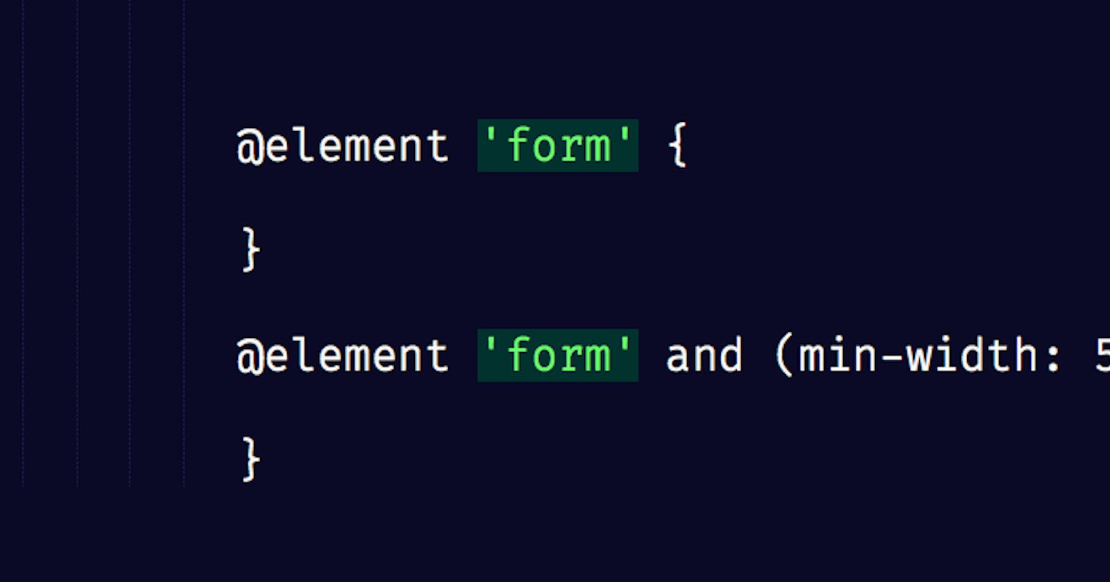
In the first two examples, the media breakpoint was set to 600 pixels, and not because that’s how wide the inputs will be when they switch. Chances are, the search input is probably inside at least one parent element that would have margins or padding. So, when the browser is 600 pixels wide, those inputs might be somewhere around 550 or 525 pixels wide on the page. In a desktop-first or mobile-first approach, you’re always setting breakpoints based on the layout and how elements show up within it. With an element-first layout, you’re saying, “I don’t care how wide the browser is. I know that the sweet spot for where I want the inputs to stack is somewhere around 530 pixels wide.” Instead of using a media query to swap that CSS based on the browser’s dimensions, with element-first design, we would scope our responsive style to the form element itself, writing a style like this:
input {
  width: 100%
}
@element 'form' and (min‐width: 530px) {
  $this input {
    width: 50%;
    float: left;
  }
}
The code is similar to that of the two previous methods, but now we are free to display this search input anywhere — in a sidebar or full width. We can use it in any layout on any website, and no matter how wide the browser is, when the form itself doesn’t have enough room to display the inputs side by side, it will adapt to look its best.
The next time you need to build a layout, why not try the element-first approach?
Element Query Demos
- Blockquote Style
- Calendar
- Content Demo
- Counting Children Demo
- Date Demo
- Zastrow-style Element Query Demo Demo
- Flyout Demo
- Headline Demo
- Media Player Demo
- Message Style Demo
- Modal Demo
- Nav Demo
- Parent Selector Demo
- Pricing Chart Demo
- Responsive Tables Demo
- Scroll-triggered Blocker Demo
- Signup Form Demo
- Testimonials Block Demo
- Tweet-Counter Demo
- JS Variables Demo
- Responsive Scaling Demo
adapted from a longer article on Smashing Magazine: The Search For The Holy Grail: How I Ended Up With Element Queries, And How You Can Use Them Today