


A while ago I found myself building a responsive website that had large featured photos on every page. As I built the responsive styles for that page I felt the need to pick one part of the image, a focal point, and use background-position in CSS to change the position of the background images so if they were narrow the focal point of the image was always visible inside the element.
This worked for our site because the container holding the images was full-width, so @media queries made that simple - but what if the element with the background image set isn't full-width - or worse yet, what if you need to change the background-position based on the element's dimensions instead of the screen's dimensions.
Well, using EQCSS for element queries we can write a selector that only targets elements that have a specific filename set as their background image (thanks to a little JavaScript function), and we are also able to base the responsive styles for our background images based on the aspect ratio of the element they are set on.
What this means is that now we can write one set of responsive background-position rules for each image we have, and no matter what element we set it as a background for, and no matter what size or shape that elements appears on the page - our photo will always show up with the best positioning for the space it has been given.
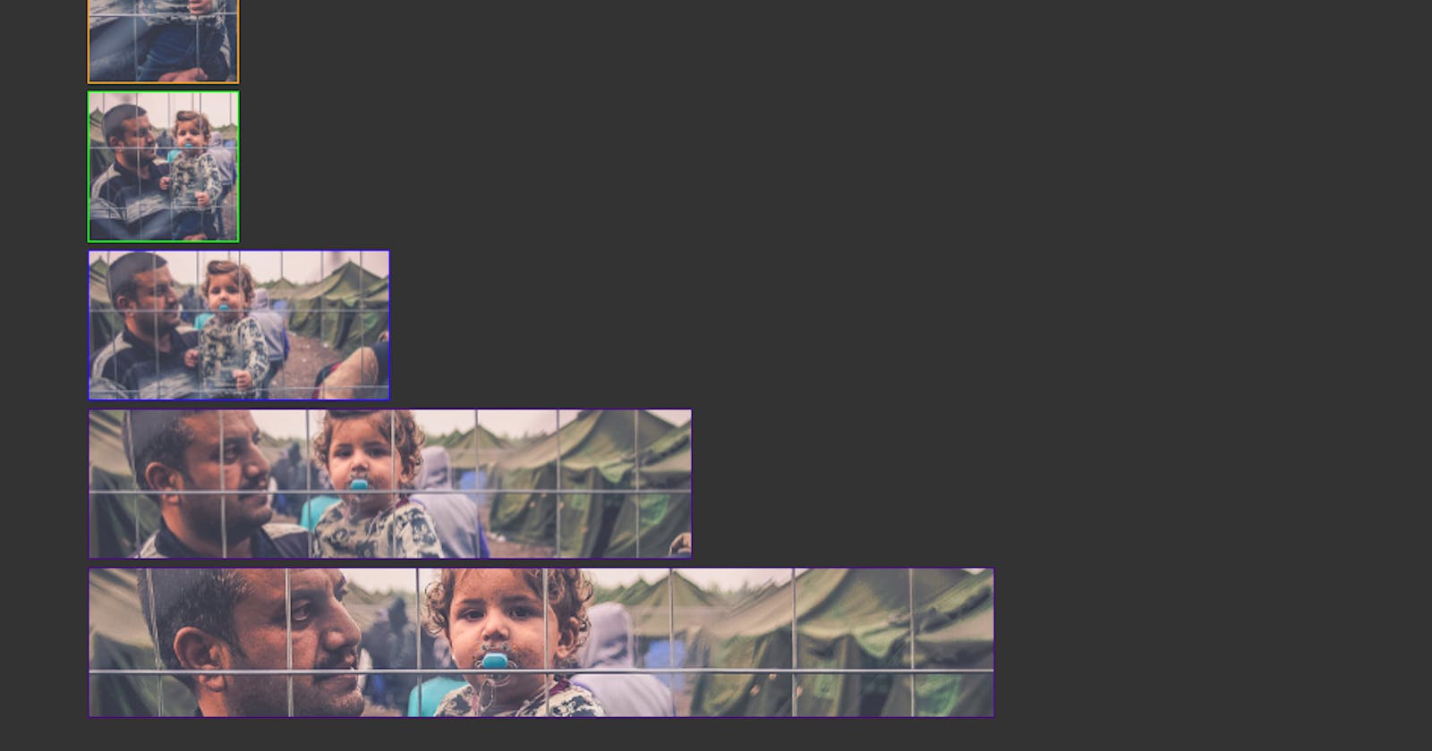
Filename:
family.jpg
JavaScript Helper Function:
function isBG(element,filename){
  var bg = window.getComputedStyle(element).backgroundImage
  return (bg.indexOf(filename) !== -1)
}
CSS Styles:
div {
  margin: 5px;
  background-size: cover;
}
.family {
  background-image: url('http://freshstarttoronto.com/img/family.jpg');
}
EQCSS styles for family.jpg:
@element 'div' and (max-aspect-ratio: 1/1) {
  eval("isBG($it,'family.jpg')? '$this' : ''") {
    background-position: 15% 25%;
  }
}
@element 'div' and (max-aspect-ratio: 1/2) {
  eval("isBG($it,'family.jpg')? '$this' : ''") {
    background-position: 20% 25%;
  }
}
@element 'div' and (max-aspect-ratio: 1/4) {
  eval("isBG($it,'family.jpg')? '$this' : ''") {
    background-position: 18% 25%;
  }
}

@element 'div' and (min-aspect-ratio: 1/1) {
  eval("isBG($it,'family.jpg')? '$this' : ''") {
    background-position: 0% 25%;
  }
}
@element 'div' and (min-aspect-ratio: 2/1) {
  eval("isBG($it,'family.jpg')? '$this' : ''") {
    background-position: 0% 30%;
  }
}
@element 'div' and (min-aspect-ratio: 4/1) {
  eval("isBG($it,'family.jpg')? '$this' : ''") {
    background-position: 0% 40%;
  }
}
The rules are wrapped in container queries for div elements (because in the demo that's the type of element I'm applying the background to) and the individual rules are set with a selector that checks for the presence of a specific filename (in this case family.jpg) on the currently scoped element ($it) using the JavaScript function isBG(). If this returns true, the following CSS rule applied to $this and applies to the scoped element, otherwise if that is not the filename of the set background image the rule has no selector and applies its properties to no element.
Here's a demo with styles written for a few different images: http://codepen.io/tomhodgins/pen/wodVwo
Thats a fresh new take on responsive art-direction!