


Hi all, thanks for being a part of our healthy community of software developers. At Hashnode, we love reading all the feedback from our users, and we take them seriously. With this "Design Refresh" our target was to improve various sections of Hashnode instead of completely redesigning them. We had two primary goals with this design:
- Clean and distraction-free
- Improved readability
If you have recently visited Hashnode.dev , you might have expected this change is coming to Hashnode.com very soon. When we announced the alpha release of Hashnode.dev two weeks back, many users loved the clean interface and its ease of use. We liked those changes too, and we were eager to bring that design language to Hashnode.com.
So, here are a couple of prominent changes, if you haven't noticed them already:
- We started by making the background white (
#FFFFFF), to make the whole website look bright and fresh.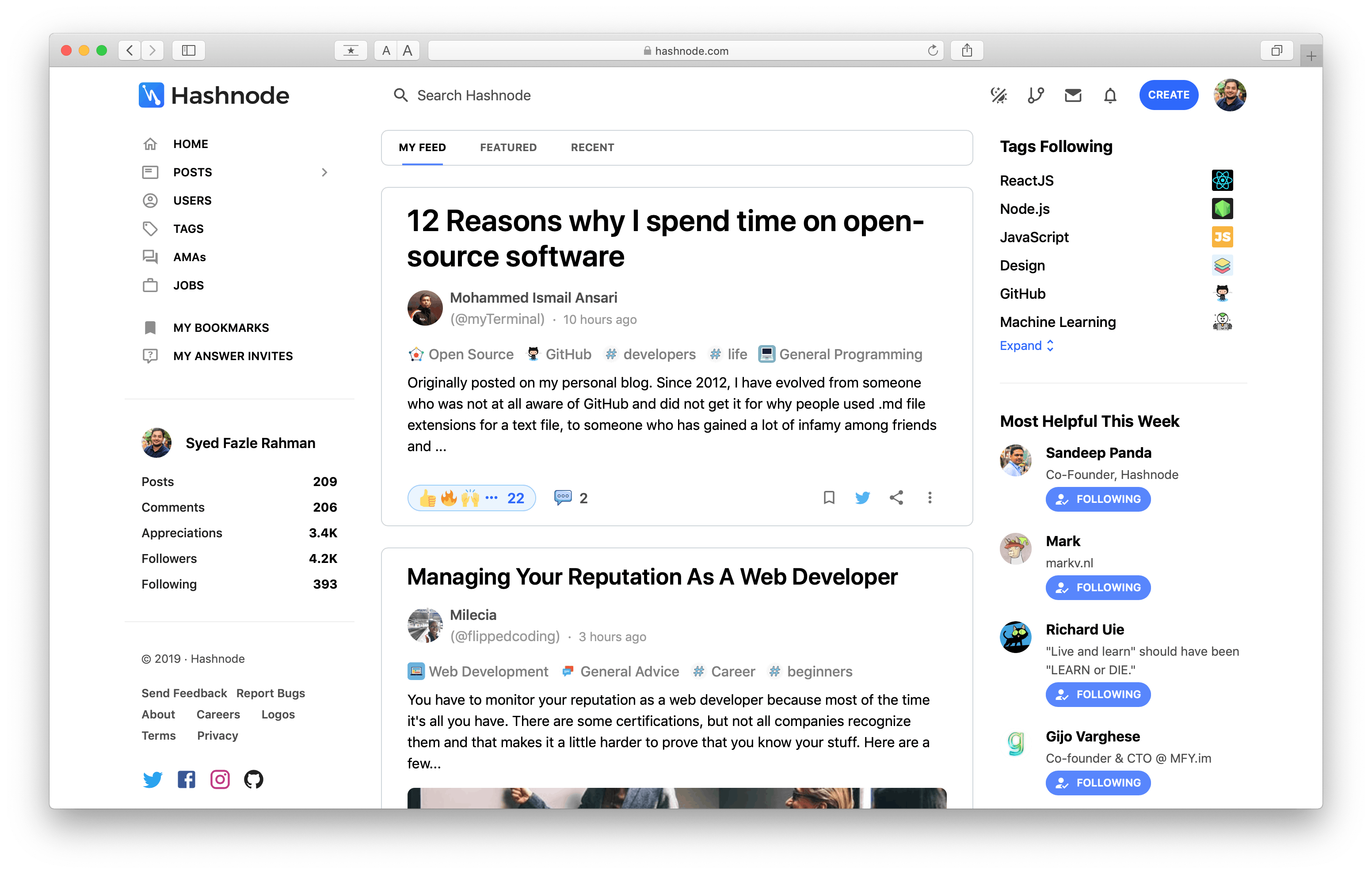
- We reduced the width of the website from 1400px to 1270px. It helped in reducing the stress on eyes and mouse movement between various sections.
- Fewer boxes or cards. Components present on the right column and left columns do not have borders anymore. Instead, we used more spaces to make them look different. As per our new design rules, only the cards in the feed will have boxes to grab user attention.
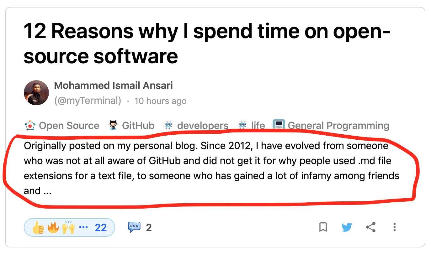
- Better post cards: we got rid of unnecessary negative spaces to create uniformity inside post cards. The tags have a logo beside them, and the post brief is back. Many users complained that they have to load the post to read more about it. With post brief, you won't have that problem now.
Also, post cards will now help you easily differentiate between questions, stories, and AMA with the help of big and bold labels. Post cards without labels are stories.
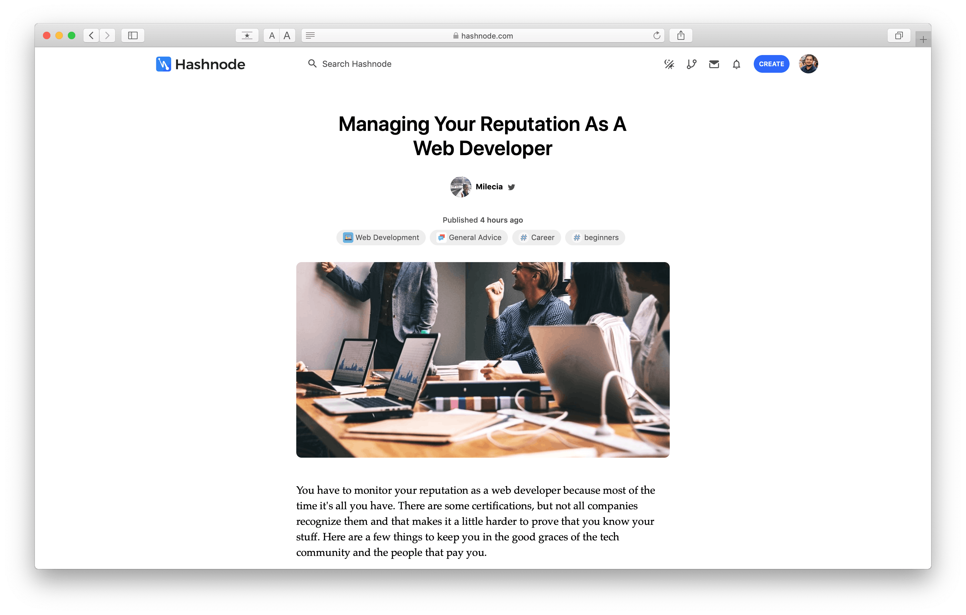
- The all-new Beautiful Story Canvas: The new story pages are full width and clean. They have no sidebars or prompts. Your rich posts with code snippets, embeds and screenshots are expected to look better now!
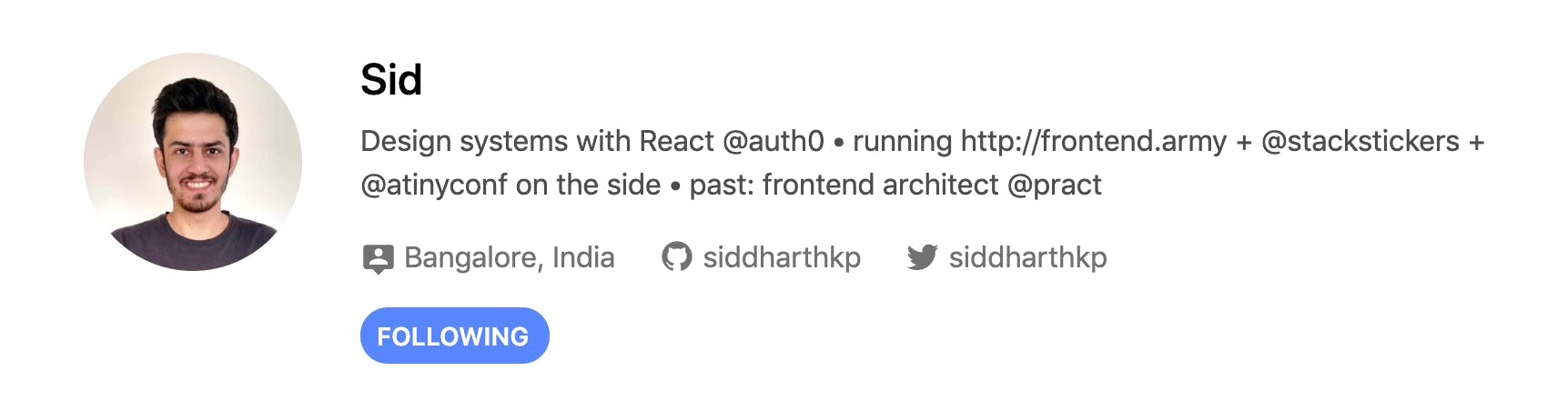
- The new author card below every story: This new card is expected to give authors more exposure. Show off your Twitter and GitHub profiles and get more followers.
- And many other misc UX changes which you will notice in various areas if you are an active Hashnoder.
As always, we are very eager to hear your feedback on this Design Refresh.
Do you like it? Do you hate it? Do you want some improvements? Please write them down in the comments. Your suggestions will help us build a better community for developers. Cheers! 🍺