How to customize Hashnode Headless CMS using TailwindCSS


Recently Hashnode released their headless CMS which is built specifically for running blogs.
It comprises their Next.js Starter Kit and GraphQL APIs to construct your blog's homepage, articles, comments, search functionality, and more.
In this article, lets embody the saying ''Hashnode's publishing power, your custom design" as we customize Next.js Starter Kit blog using TailwindCSS
Setup and Installation
Let start by installing the Nextjs Starter Kit locally, first head to the projects Github repository and you can either fork or clone the project.
In this article I will go with the cloning approach by running this command
git clone https://github.com/Hashnode/starter-kit.git
The Starter Kit repository is organized as a mono-repo, housing multiple themes. To begin customization, navigate to the "packages/blog-starter-kit/themes/" directory in your local repository, where three distinct themes await: enterprise, hashnode, and personal.
Choose your preferred theme and open it in your editor by either using the terminal with commands like cd packages/blog-starter-kit/themes/enterprise or navigating through your file explorer.
In this walkthrough, we'll focus on the enterprise theme, but the principles apply on all themes. Once inside your chosen theme, the folder structure becomes accessible for modification.
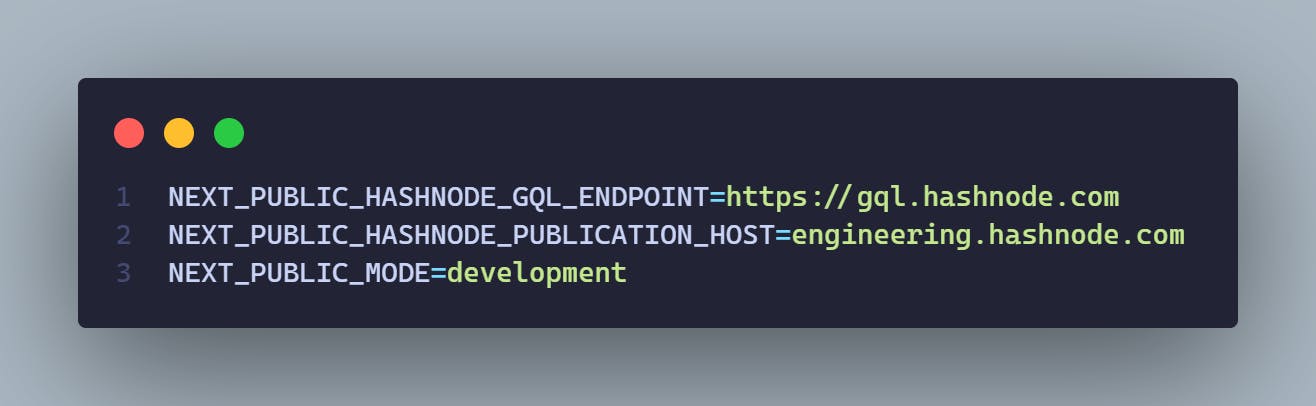
Within the theme, locate the .env.example file and rename it to .env.local. Customize the environment variables as needed for your site integration or leverage existing variables like shown in image below
Next, in your terminal, run the command pnpm install to install the required packages. Ensure that you have pnpm installed globally on your machine for this to work
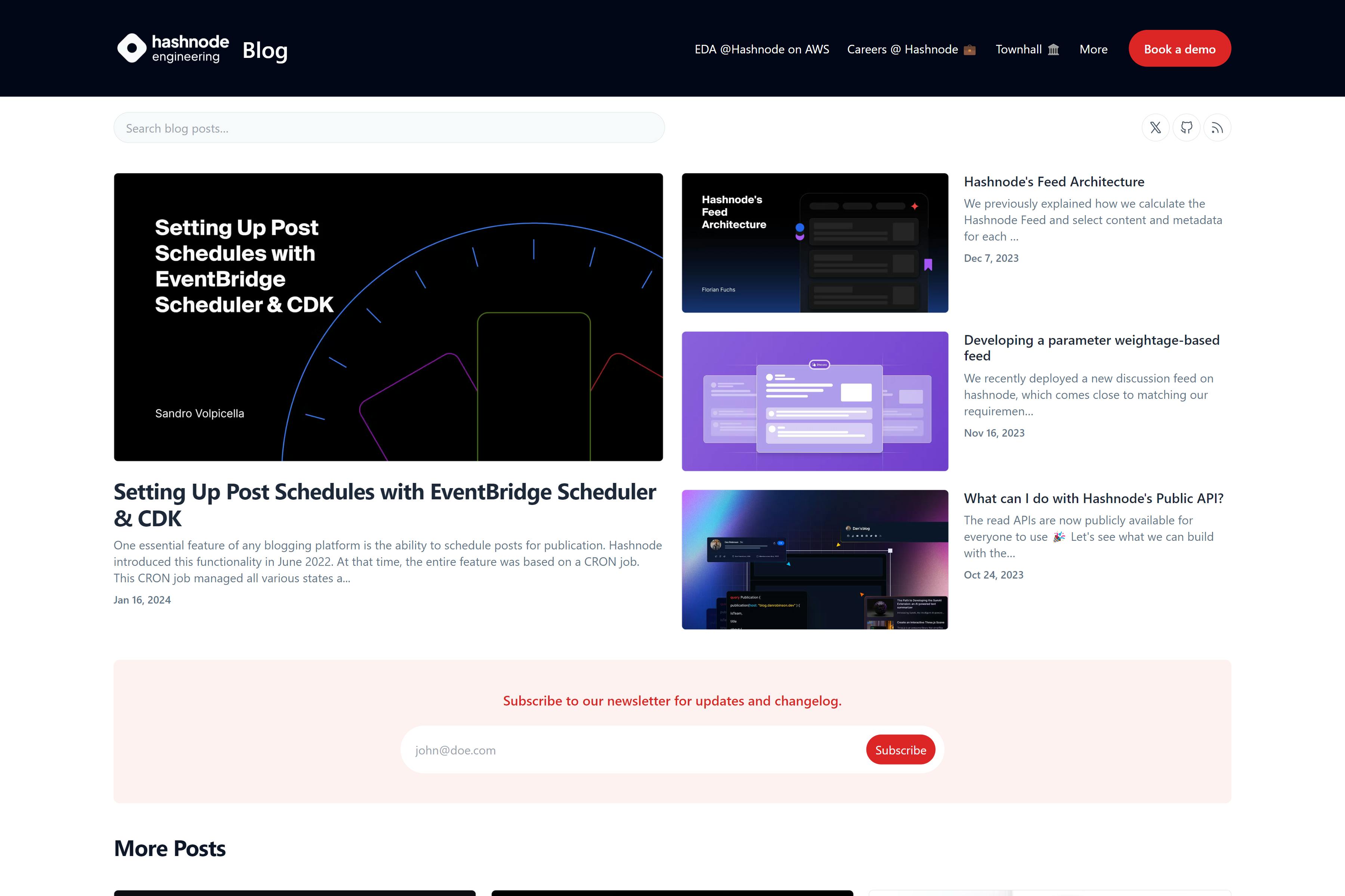
Once the packages are installed, fire up the development server with pnpm dev. Now, you can preview it on the browser
Tailwind Customizations
By default the project comes with tailwindcss, this can be observed by the presence of tailwind.config.js file, so we can start customizing the project according to our likings lets start with:
Colors Customizations
By default the enterprise version uses blue color as the primary color as seen below in the
tailwind.config.jsfile snippet/** @type {import('tailwindcss').Config} */ const colors = require('tailwindcss/colors'); module.exports = { content: ['./components/**/*.tsx', './pages/**/*.tsx'], darkMode: 'class', theme: { extend: { colors: { 'accent-1': '#FAFAFA', 'accent-2': '#EAEAEA', 'accent-7': '#333', success: '#0070f3', cyan: '#79FFE1', primary: colors.blue, //primary color }, ..... }You will also notice an import to
tailwindcss/colorsat the top of the configuration file. This enables to curate your colors from tailwind default color palette instead of defining your own custom palette.In this starter-kit you will notice
'primary'set to inherit all blue colors from tailwind blue color paletteTo make your project unique, consider changing the primary color. For instance, let’s switch it to red and observe the visual impact.
Customizing UI elements
By using tailwind we can also customize the UI elements lets say the cards, images, fonts and other by adjusting their tailwind classes in their respective components. We can also customize the blog by creating a new components style them with tailwindcss and set them up in the UI
Theme Switcher
Now, lets wrap up the customizations by building a simple theme switcher and customize it using tailwind
Tailwind includes a dark variant that lets you style your site differently when dark mode is enabled
The main two methods used are to achieve dark-mode in tailwind are:
Media strategy
The media strategy that uses prefers-color-scheme CSS media feature that sets dark or light mode based on system preference and this is tailwind's default strategy
Selector strategy
The selector strategy which before tailwindv3.4.1 was known as
classstrategy support toggling dark mode manually instead of relying on the operating system preference, now because this is not the default to use it we need to add this line in ourtailwind.config.jsfile/** @type {import('tailwindcss').Config} */ module.exports = { darkMode: 'selector',// for v3.4.1 and above darkMode: 'class' // for version less than 3.4.1 // ... }
Because our project as the time of this writing uses tailwind v3.3.3 you will observe it uses the class strategy in the tailwind.config.js file instead of the newer selector strategy (a possible pull request).
Now that we have understood the different strategies used to achieve dark-mode in tailwind lets proceed by installing a package that will enable as to achieve theme switching easily in Next.js called next-themes
Lets install it using the command
pnpm install next-themes
Then we can create a ThemeProvider on the pages/_app.tsx file like shown below
// pages/_app.tsx
import { AppProps } from 'next/app';
import '../styles/index.css';
import { ThemeProvider } from 'next-themes'

export default function MyApp({ Component, pageProps }: AppProps) {
        return (
        <ThemeProvider attribute="class">
            <Component {...pageProps} />
        </ThemeProvider>
    );
}
The ThemeProvider attribute prop is set to value class because our Nextjs application uses tailwind class strategy to achieve dark-mode.
Now our provider is set lets add the required components to toggle the theme
Inside the root directory navigate to components\icons\svgs .Inside the directory we are going to create two more SVG icons the Moon(MoonSVG.js) and Sun( SunSVG.js) icons.
//SunSVG.js
import React from 'react';

export default class SunSVG extends React.Component {
    render() {
        return (
            <svg
                className={this.props.className}
                viewBox="0 0 15 15"
                fill="none"
                xmlns="http://www.w3.org/2000/svg"
            >
                <path
                    d="M7.5 0C7.77614 0 8 0.223858 8 0.5V2.5C8 2.77614 7.77614 3 7.5 3C7.22386 3 7 2.77614 7 2.5V0.5C7 0.223858 7.22386 0 7.5 0ZM2.1967 2.1967C2.39196 2.00144 2.70854 2.00144 2.90381 2.1967L4.31802 3.61091C4.51328 3.80617 4.51328 4.12276 4.31802 4.31802C4.12276 4.51328 3.80617 4.51328 3.61091 4.31802L2.1967 2.90381C2.00144 2.70854 2.00144 2.39196 2.1967 2.1967ZM0.5 7C0.223858 7 0 7.22386 0 7.5C0 7.77614 0.223858 8 0.5 8H2.5C2.77614 8 3 7.77614 3 7.5C3 7.22386 2.77614 7 2.5 7H0.5ZM2.1967 12.8033C2.00144 12.608 2.00144 12.2915 2.1967 12.0962L3.61091 10.682C3.80617 10.4867 4.12276 10.4867 4.31802 10.682C4.51328 10.8772 4.51328 11.1938 4.31802 11.3891L2.90381 12.8033C2.70854 12.9986 2.39196 12.9986 2.1967 12.8033ZM12.5 7C12.2239 7 12 7.22386 12 7.5C12 7.77614 12.2239 8 12.5 8H14.5C14.7761 8 15 7.77614 15 7.5C15 7.22386 14.7761 7 14.5 7H12.5ZM10.682 4.31802C10.4867 4.12276 10.4867 3.80617 10.682 3.61091L12.0962 2.1967C12.2915 2.00144 12.608 2.00144 12.8033 2.1967C12.9986 2.39196 12.9986 2.70854 12.8033 2.90381L11.3891 4.31802C11.1938 4.51328 10.8772 4.51328 10.682 4.31802ZM8 12.5C8 12.2239 7.77614 12 7.5 12C7.22386 12 7 12.2239 7 12.5V14.5C7 14.7761 7.22386 15 7.5 15C7.77614 15 8 14.7761 8 14.5V12.5ZM10.682 10.682C10.8772 10.4867 11.1938 10.4867 11.3891 10.682L12.8033 12.0962C12.9986 12.2915 12.9986 12.608 12.8033 12.8033C12.608 12.9986 12.2915 12.9986 12.0962 12.8033L10.682 11.3891C10.4867 11.1938 10.4867 10.8772 10.682 10.682ZM5.5 7.5C5.5 6.39543 6.39543 5.5 7.5 5.5C8.60457 5.5 9.5 6.39543 9.5 7.5C9.5 8.60457 8.60457 9.5 7.5 9.5C6.39543 9.5 5.5 8.60457 5.5 7.5ZM7.5 4.5C5.84315 4.5 4.5 5.84315 4.5 7.5C4.5 9.15685 5.84315 10.5 7.5 10.5C9.15685 10.5 10.5 9.15685 10.5 7.5C10.5 5.84315 9.15685 4.5 7.5 4.5Z"
                    fill="currentColor"
                    fill-rule="evenodd"
                    clip-rule="evenodd"
                ></path>
            </svg>
        );
    }
}
//MoonSVG.js
import React from 'react';

export default class MoonSVG extends React.Component {
    render() {
        return (
            <svg
                className={this.props.className}
                viewBox="0 0 15 15"
                fill="none"
                xmlns="http://www.w3.org/2000/svg"
            >
                <path
                    d="M2.89998 0.499976C2.89998 0.279062 2.72089 0.0999756 2.49998 0.0999756C2.27906 0.0999756 2.09998 0.279062 2.09998 0.499976V1.09998H1.49998C1.27906 1.09998 1.09998 1.27906 1.09998 1.49998C1.09998 1.72089 1.27906 1.89998 1.49998 1.89998H2.09998V2.49998C2.09998 2.72089 2.27906 2.89998 2.49998 2.89998C2.72089 2.89998 2.89998 2.72089 2.89998 2.49998V1.89998H3.49998C3.72089 1.89998 3.89998 1.72089 3.89998 1.49998C3.89998 1.27906 3.72089 1.09998 3.49998 1.09998H2.89998V0.499976ZM5.89998 3.49998C5.89998 3.27906 5.72089 3.09998 5.49998 3.09998C5.27906 3.09998 5.09998 3.27906 5.09998 3.49998V4.09998H4.49998C4.27906 4.09998 4.09998 4.27906 4.09998 4.49998C4.09998 4.72089 4.27906 4.89998 4.49998 4.89998H5.09998V5.49998C5.09998 5.72089 5.27906 5.89998 5.49998 5.89998C5.72089 5.89998 5.89998 5.72089 5.89998 5.49998V4.89998H6.49998C6.72089 4.89998 6.89998 4.72089 6.89998 4.49998C6.89998 4.27906 6.72089 4.09998 6.49998 4.09998H5.89998V3.49998ZM1.89998 6.49998C1.89998 6.27906 1.72089 6.09998 1.49998 6.09998C1.27906 6.09998 1.09998 6.27906 1.09998 6.49998V7.09998H0.499976C0.279062 7.09998 0.0999756 7.27906 0.0999756 7.49998C0.0999756 7.72089 0.279062 7.89998 0.499976 7.89998H1.09998V8.49998C1.09998 8.72089 1.27906 8.89997 1.49998 8.89997C1.72089 8.89997 1.89998 8.72089 1.89998 8.49998V7.89998H2.49998C2.72089 7.89998 2.89998 7.72089 2.89998 7.49998C2.89998 7.27906 2.72089 7.09998 2.49998 7.09998H1.89998V6.49998ZM8.54406 0.98184L8.24618 0.941586C8.03275 0.917676 7.90692 1.1655 8.02936 1.34194C8.17013 1.54479 8.29981 1.75592 8.41754 1.97445C8.91878 2.90485 9.20322 3.96932 9.20322 5.10022C9.20322 8.37201 6.82247 11.0878 3.69887 11.6097C3.45736 11.65 3.20988 11.6772 2.96008 11.6906C2.74563 11.702 2.62729 11.9535 2.77721 12.1072C2.84551 12.1773 2.91535 12.2458 2.98667 12.3128L3.05883 12.3795L3.31883 12.6045L3.50684 12.7532L3.62796 12.8433L3.81491 12.9742L3.99079 13.089C4.11175 13.1651 4.23536 13.2375 4.36157 13.3059L4.62496 13.4412L4.88553 13.5607L5.18837 13.6828L5.43169 13.7686C5.56564 13.8128 5.70149 13.8529 5.83857 13.8885C5.94262 13.9155 6.04767 13.9401 6.15405 13.9622C6.27993 13.9883 6.40713 14.0109 6.53544 14.0298L6.85241 14.0685L7.11934 14.0892C7.24637 14.0965 7.37436 14.1002 7.50322 14.1002C11.1483 14.1002 14.1032 11.1453 14.1032 7.50023C14.1032 7.25044 14.0893 7.00389 14.0623 6.76131L14.0255 6.48407C13.991 6.26083 13.9453 6.04129 13.8891 5.82642C13.8213 5.56709 13.7382 5.31398 13.6409 5.06881L13.5279 4.80132L13.4507 4.63542L13.3766 4.48666C13.2178 4.17773 13.0353 3.88295 12.8312 3.60423L12.6782 3.40352L12.4793 3.16432L12.3157 2.98361L12.1961 2.85951L12.0355 2.70246L11.8134 2.50184L11.4925 2.24191L11.2483 2.06498L10.9562 1.87446L10.6346 1.68894L10.3073 1.52378L10.1938 1.47176L9.95488 1.3706L9.67791 1.2669L9.42566 1.1846L9.10075 1.09489L8.83599 1.03486L8.54406 0.98184ZM10.4032 5.30023C10.4032 4.27588 10.2002 3.29829 9.83244 2.40604C11.7623 3.28995 13.1032 5.23862 13.1032 7.50023C13.1032 10.593 10.596 13.1002 7.50322 13.1002C6.63646 13.1002 5.81597 12.9036 5.08355 12.5522C6.5419 12.0941 7.81081 11.2082 8.74322 10.0416C8.87963 10.2284 9.10028 10.3497 9.34928 10.3497C9.76349 10.3497 10.0993 10.0139 10.0993 9.59971C10.0993 9.24256 9.84965 8.94373 9.51535 8.86816C9.57741 8.75165 9.63653 8.63334 9.6926 8.51332C9.88358 8.63163 10.1088 8.69993 10.35 8.69993C11.0403 8.69993 11.6 8.14028 11.6 7.44993C11.6 6.75976 11.0406 6.20024 10.3505 6.19993C10.3853 5.90487 10.4032 5.60464 10.4032 5.30023Z"
                    fill="currentColor"
                    fill-rule="evenodd"
                    clip-rule="evenodd"
                ></path>
            </svg>
        );
    }
}
Now we can create a component to render the Icons conditionally: Sun icon when its dark mode and Moon Icon when it is light mode.
//components/theme-switcher.tsx
import { useTheme } from 'next-themes';
import { useEffect, useState } from 'react';

import MoonSVG from './icons/svgs/MoonSVG';
import SunSVG from './icons/svgs/SunSVG';

const ThemeSwitch = () => {
    const [mounted, setMounted] = useState(false);
    const { theme, setTheme } = useTheme();

    useEffect(() => {
        setMounted(true);
    }, []);

    if (!mounted) {
        return null;
    }

    return (
     <>
       <button
          onClick={() => setTheme(theme === 'light' ? 'dark' : 'light')}>
            <SunSVG className="h-[1.5rem] w-[1.3rem] dark:hidden" />
            <MoonSVG className="hidden h-5 w-5 dark:block" />
            <span className="sr-only">Toggle theme</span>
        </button>
     </>
    );
};

export default ThemeSwitch;
In the code snippet above, we are using the useTheme hook to get the current theme (theme) and the function to set the theme (setTheme).
The useEffect hook is used to set mounted to true after the initial render. This ensures that the component is mounted before attempting to render the theme switch button.
The onClick event of the button triggers a function that toggles the theme between 'light' and 'dark'.
The visibility of these icons is controlled based on the current theme. The dark:hidden and dark:block classes are used to show/hide the icons based on whether the dark theme is active or not.
We can now add our ThemeSwitch component to the header component.
//components/header.tsx

//other imports
import ThemeSwitch from './theme-switcher';

export const Header = () => {
// other code
    return (
    <header className="border-b bg-slate-950 py-10 dark:border-neutral-800 dark:bg-neutral-900">
        <div className="col-span-2 flex flex-row items-center justify-end gap-5 text-slate-300 lg:col-span-3">
            <nav className="hidden lg:block">{navList}</nav>
            <Button href={baseUrl} as="a" type="primary" label="Book a demo" />
            <!--Add theme-switch component here-->
            <ThemeSwitch/>
        </div>
    </header>
    );
};
By doing just that we have successfully implemented the Theme Switcher functionality.

Conclusion
In summary, Tailwind CSS allows us to quickly and easily change the look of our blog. We can tweak things like card layouts, fonts, colors, and more using simple classes. Feel free to play around with it! If you have any questions or ideas, drop them in the comments, and I'll be happy to help. Happy coding!