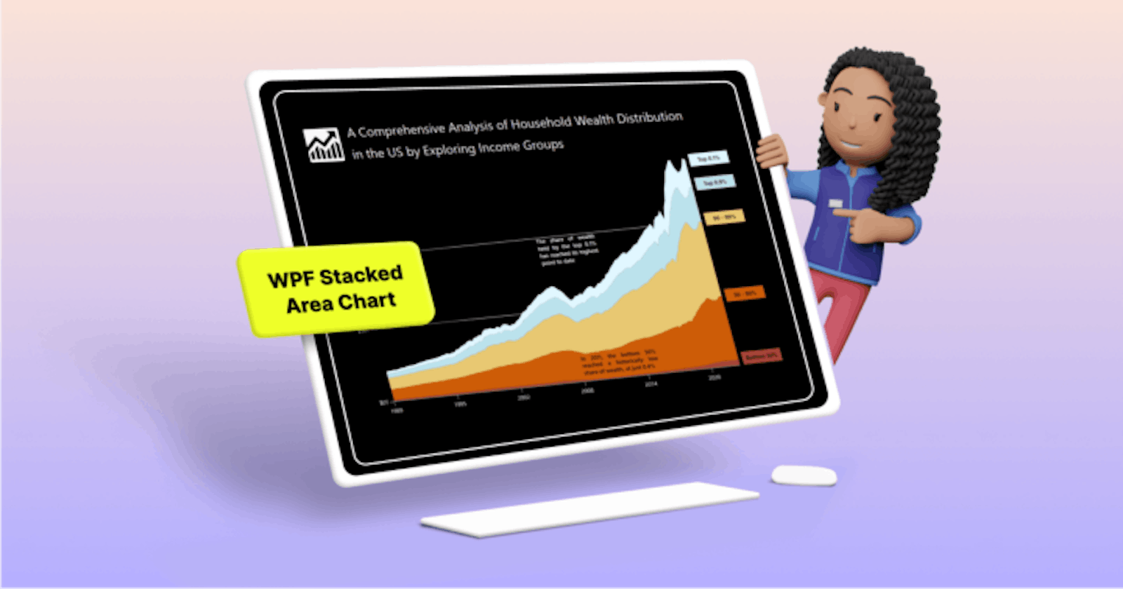
GayathriRamalingamgayathriramalingam.hashnode.dev·Apr 17, 2024Chart of the Week: Creating a WPF Stacked Area Chart to Visualize Wealth Distribution in the U.S.TL;DR: Learn to visualize wealth distribution in the U.S. from 1990 to 2023 using Syncfusion WPF Stacked Area Chart. Explore a step-by-step guide on data preparation, chart layout design, customization, and more. Dive into insightful analysis with th...chartAdd a thoughtful commentNo comments yetBe the first to start the conversation.