GAJULA VAISHNAVIvaishnavidevdiary.hashnode.dev·Jan 10, 2025The Basics of Display: Flex in CSS for Beginnersdisplay: flex A one dimensional layout system (either in rows or columns ,but not in both directions simultaneously. Items are aligned in main axis (horizontal by default). These helps to align and distribute space among items in a container. Propert...flexbox
Danilo Buenafe Jrjhayr1231.hashnode.dev·Nov 24, 2024Activity 33: Angular Recipe GridStep-by-Step Documentation Create a List of Object Data Structures: recipe.service.ts recipe.model.ts recipe.component.ts recipe.component.html Creating recipe.service.ts Purpose: To centralize data operations for managing recipes. Key Meth...Angular
Danilo Buenafe Jrjhayr1231.hashnode.dev·Nov 24, 2024Activity 32: Angular Library GridCreate a List of Object Data Structures: book.service.ts book.model.ts book.component.ts book.component.html Step 1: Create the Book Model Create a Book model that includes the necessary fields for each book, including the rating. export inter...Firebase
Danilo Buenafe Jrjhayr1231.hashnode.dev·Nov 24, 2024Activity 31: Angular Ecommerce Product ListStep-by-Step Documentation Create a List of Object Data Structures Product Service: To manage product data. Product Model: To define the structure of the product data. Product Component: To display and interact with the product list. Product C...Angular
Surya Durgeshsuryatechie.hashnode.dev·Sep 27, 2024Flexbox Fundamentals: Creating Flexible LayoutsFlexbox, short for Flexible Box Layout, is a powerful CSS layout module that allows you to create complex, responsive layouts with ease. Unlike traditional layouts (like floats or grid systems), Flexbox is designed to distribute space dynamically and...1 likeCSS
Saurav Kumarblog.sauraverse.com·Aug 24, 2024Mastering CSS Flexbox: A Comprehensive Guide to Modern LayoutsCSS Flexbox is a powerful layout module that has revolutionized the way developers design responsive and dynamic web layouts. Introduced as a solution to the limitations of traditional CSS layouts, Flexbox offers a flexible, efficient, and intuitive ...CSS
Muhammad umairumairdev.hashnode.dev·Jul 1, 2024Flexbox: A Beginner's GuideFlexbox, or Flexible Box Layout, is a powerful layout tool in CSS (Cascading Style Sheets) that helps developers create responsive and flexible web designs. If you're new to web development or just want to understand what Flexbox is and how to use it...56 readsflexbox
Namya Shahbigsmoke.hashnode.dev·Dec 24, 2023Basic CSS Questions Part 2What does the line-height property control in CSS? It sets the height of a line box. How do you add a border to an element in CSS? Using the border property. Explain the difference between padding and margin. Padding is the space inside an ele...line height
himanshugopalkdwivedi.hashnode.dev·Dec 8, 2023Mastering Flexbox in CSS(lt.25)Introduction: flexbox, also known as the Flexible Box Layout Module, is a powerful way of designing a responsive layout in CSS in a one-dimensional axis. Benefits of using Flexbox: Flexibility and responsiveness: Flexbox makes adaptation easy for di...10 likesflexbox
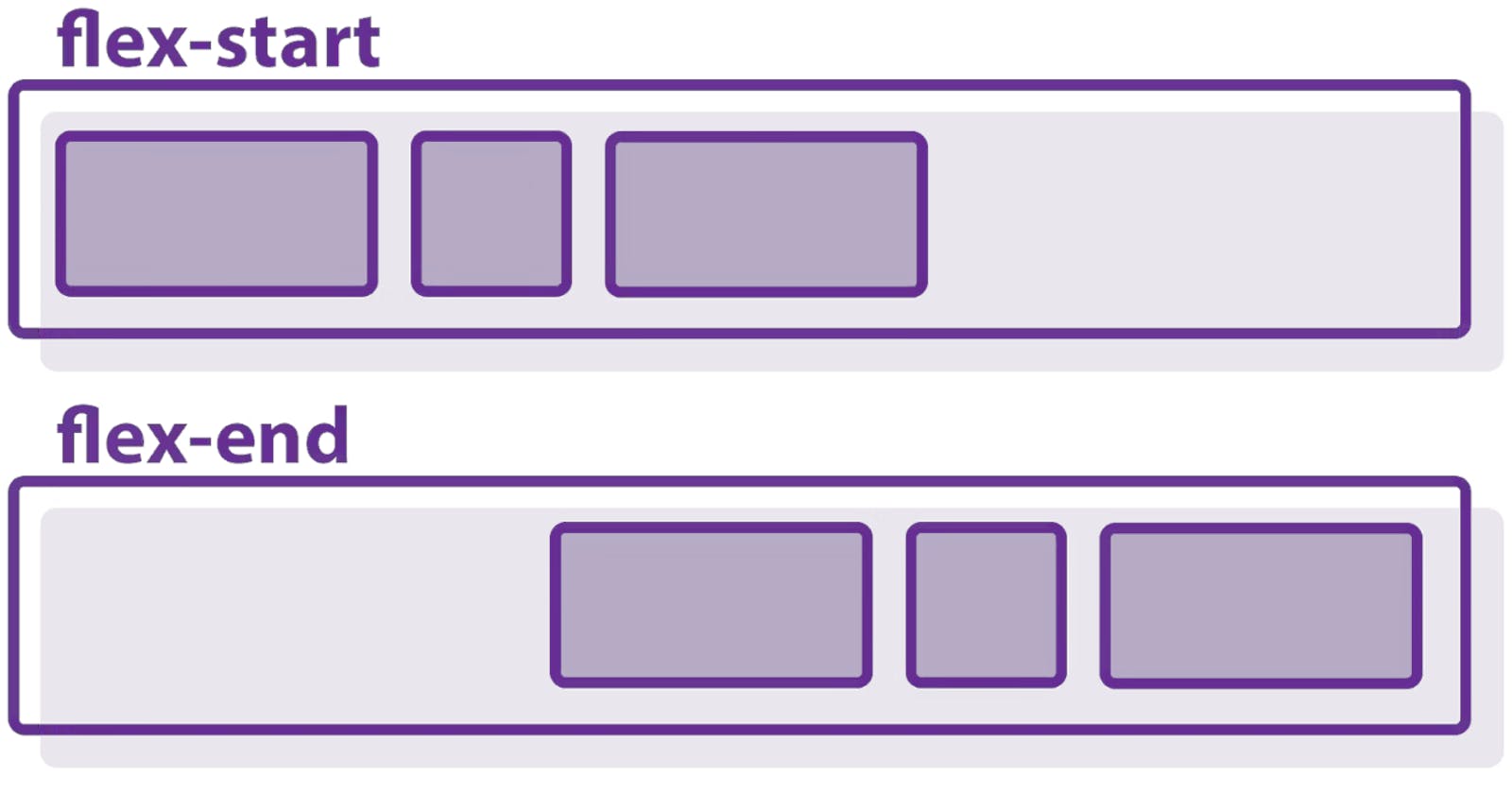
devansh vermatyrogeek.hashnode.dev·Oct 17, 2023CSS : Flex, Flexbox and AlignmentFlex It is used to fit the item in the space available in the flex container. #flex-container { display: flex; font-family: Consolas, Arial, sans-serif; } flex-basis: sets the initial main size of a flex item. flex-grow: it assigns the space to ...CSS