khushnumakushnuma.hashnode.dev·Dec 16, 2024What Are Media Queries, and Why Are They Important in Full Stack Development?In today’s digital landscape, where users access websites on a multitude of devices, creating responsive designs is a top priority for developers. Media queries play a crucial role in making websites adaptable to various screen sizes, orientations, a...media queries
Fred Douglasfrederick1.hashnode.dev·Oct 16, 2024Mastering CSS Media Queries: A Guide for Beginners and IntermediatesIn the world of web development, responsive design is essential. Users today access websites from a variety of devices, each with different screen sizes and resolutions. CSS media queries enable developers to create fluid and adaptive layouts that lo...21 likes·40 readsHTML5
Michael Baisdenmikesselftaughtbolg.hashnode.dev·Sep 25, 2024HTML and CSS bringing it all together!Intro This is my CSS Part 2. In the previous article, I covered the basics of CSS, including what CSS is, the syntax, and some common properties. Now that we have an understanding of HTML and CSS, I will show you how to use them together. I'll explai...My self-taught journey to Programing and the technologies!CSS
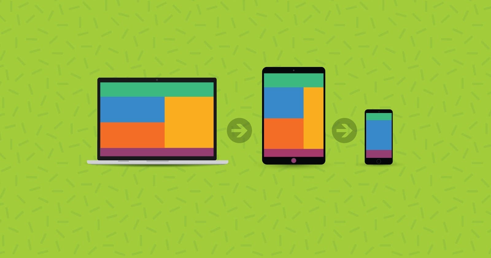
Craig Bucklerblog.craigbuckler.com·Aug 27, 2024Modern Media Queries: Beyond Browser WidthsCSS3 Media Queries are the power behind Responsive Web Design. Rather than building separate sites to target mobile, desktop, and other devices, developers could create a single site which responded to the dimensions of the viewport. Layout technique...media queries
Silent Story Tellersilentstoryteller.hashnode.dev·Jul 20, 2024Mastering the Media List: Best Practices for Effective PR OutreachCreating a media list is a fundamental component of any successful public relations strategy. However, simply having a media list isn't enough; it's about mastering how to use it effectively to achieve your PR goals. In this article, we'll explore be...media queries
Christopher Wilsontechshopper.hashnode.dev·Jul 10, 2024The Nuances of Responsive Design: How to Create a User-Friendly Interface for All DevicesIn today's digital landscape, creating a user-friendly interface that works seamlessly across all devices is paramount. With the myriad of devices accessing the web, from desktop computers to smartphones, ensuring that your website provides an optima...user-friendly interface
Nayyumnavyum.hashnode.dev·Apr 30, 2024Crafting Responsive Web Designs with HTML: A Beginner's GuideIn today's digital landscape, where users access websites from a multitude of devices, creating a responsive web design is no longer an option – it's a necessity. Responsive web design ensures that your site adapts seamlessly to various screen sizes ...HTMLResponsive
Victor Nitecodeument.hashnode.dev·Apr 29, 2024Understanding CSS View Ports for Responsive DesignIn this article, we'll break down one of the most important concepts in modern web design: CSS Viewports. Whether you're just starting your frontend journey or you're an experienced developer fine-tuning your responsive design skills, understanding v...CSS
Gokil Pgokilp.co·Apr 14, 2024Media QueryIn the rapidly evolving field of web development, ensuring that your website shines on all devices and screen sizes has become a top priority. The days of designing exclusively for desktop computers are long gone; today, users navigate the web using ...WeMakeDevs
pranjalipranjali14.hashnode.dev·Feb 23, 2024Media query in CSSMedia queries play a crucial role in responsive web design by enabling developers to create layouts that adapt and respond to the size and capabilities of the device being used to view the website. Why Media queries important ? Media queries are impo...iwritecode