1013 Lizydataanalystjourney.hashnode.dev·Oct 18, 2024Mastering Data Insights: An End-to-End Tableau Project JourneyTable of Contents 1.Objective 2.Load the dataset 3.Visualizations 3.1 Maps (normal map, filled map) 3.2 Text tables 3.3 Heat tables 3.4 Highlighted tables 3.5 Pie Chart 3.6 Packed Bubbles 3.7 Bar Graphs 3.8 Column Charts 3.9 Include and Exclude in Ta...text tables
Ankit Sharmaankitsharma991.hashnode.dev·Jan 2, 2024Analysis of Programming Languages Usage in a Software Development EnvironmentINTRODUCTION In a software development environment, the analysis of programming languages usage is a critical aspect that influences the efficiency, scalability, and maintainability of the developed software. The choice of programming language is oft...36 readsHistogram
Prateek Sharmatechieblossom.hashnode.dev·Sep 17, 2023Animated N-Pie Chart in FlutterHello Flutter Learners, I saw a micro-animation in the OneFootball app. This animation shows a pie chart with 3 sections each representing the number of wins, losses and draws for a team in one season. The above gif shows the animation in slow motio...5 likes·294 readsFlutter AnimationFlutter
Emmanuel Olokeemmanueloloke.hashnode.dev·Mar 3, 2023Building Charts with React and ChartJSIntroduction Data visualization tools are powerful for analyzing and communicating complex data sets in a more accessible and intuitive way. With the advent of modern web technologies, creating interactive data visualizations has become easier than e...3 likes·282 readsReact
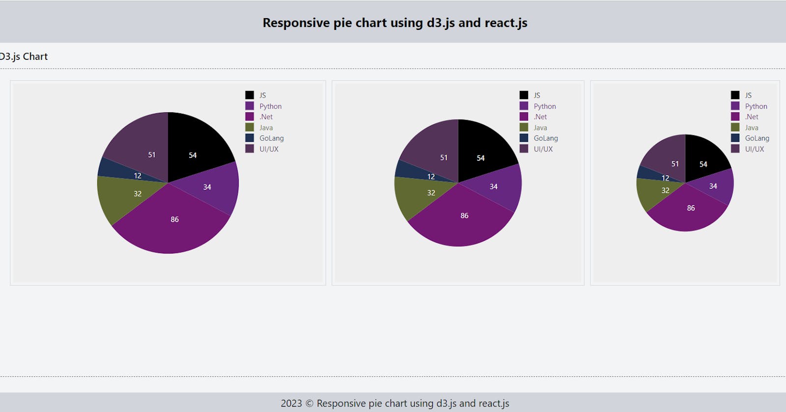
LuKmanlukman.hashnode.dev·Feb 14, 2023Creating a responsive pie chart using d3.js in React.jsPie charts are an effective way to represent data as a proportion of a whole. D3.js is a popular JavaScript library that provides various tools for data visualization. In this blog, we will go over the steps to create a pie chart using D3.js in a Rea...374 readsD3.jsD3.js
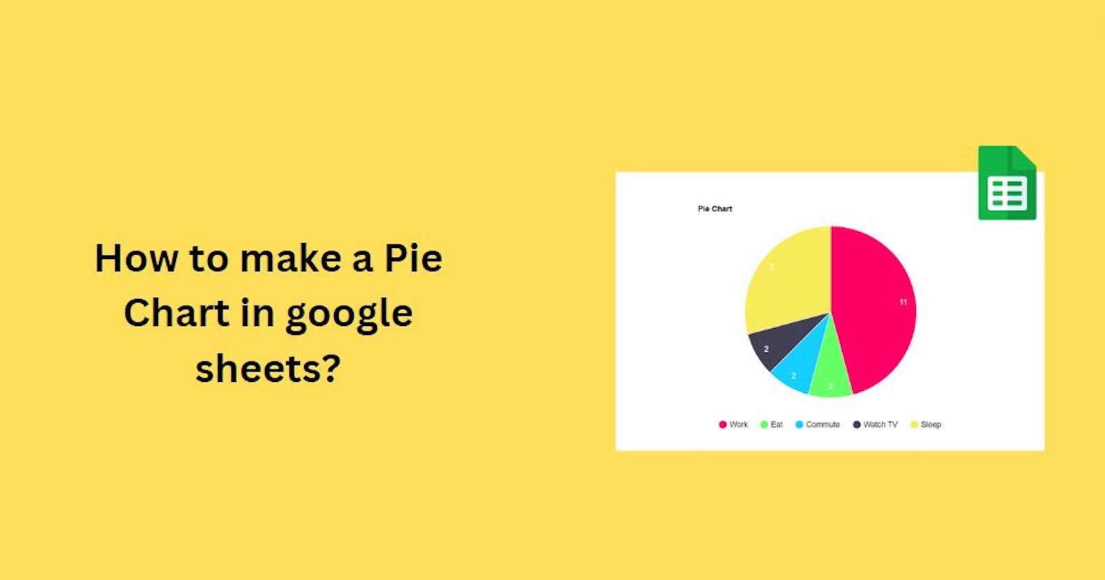
Sujit Maliprolearn4u.hashnode.dev·Jan 31, 2023How to make a Pie Chart in google sheets?To make a line graph in Google Sheets, follow these steps: Step 1: Enter the data Enter your data in your sheets.E.g. Step 2: Select the data The second step after step 1 is to select the data. Step 3: Click on Insert Chart Click on "Insert Chart" ...10 likes·44 readsgoogle sheets