Astrokitastrokit.hashnode.dev·Nov 18, 2024Responsive Login & Register Form Page FreeCrafting Seamless User Experiences with a Responsive Login & Register Form Page In today’s digital landscape, an efficient and visually appealing responsive login & register form page is paramount for creating engaging user experiences across platfor...Discussaccount
OBULIPURUSOTHAMAN Kobulipurusothaman.hashnode.dev·Oct 25, 2024Applications / ServicesApplication / Services Here we can take example of client – server architecture In Client side the piece of code is running , and the Server side piece of code is running these both will I tract to each other and provides the required data Client App...DiscussApplications
Rishi Bakshirishibakshi.hashnode.dev·Oct 10, 2024Mastering Loading States in Next.js: Effective Use of Suspense and loading.tsxWhen dealing with server components and fetching data in Next.js, a common mistake is neglecting to handle the loading state effectively. Imagine you're loading product data in a server component, and while the API request is being processed, the pag...Discuss·12 likes·73 readsYou Don't Know Next.jsNext.js
Abeer Abdul Ahadabeer.hashnode.dev·Sep 5, 2024Lazy Loading, Suspense and Error Boundary in React ExplainedLazy Loading and Suspense Lazy loading and suspense both could have been separate concepts and thus it seems the explanations should be separate. But in real world apps most of the time you will see they works hand-in-hand. So, this is why I am cover...DiscussReactReact
Jakegcee.hashnode.dev·Jul 9, 2024프론트엔드 반응형 테스트 도구모음💡 프론트엔드 개발을하면서 반응형 테스트를 좀 더 쉽게하기위해서 찾아본 것들입니다. Responsively APP 첫번째는 Responsively App입니다. 아래 화면처럼 모바일, 패드, 데스크탑을 3개의 화면을 동시에 키고 테스트해 볼 수 있습니다.그리고 오른쪽 상단에 있는 카메라 버튼을 누르면 각각의 화면을 캡쳐하는 기능도있습니다.개발하면서 혼자서 반응형 기기별로 테스트 해보기 좋습니다.홈페이지에 들어가서 각 pc환경에 맞게 다운로...DiscussProgramming studyresponsive
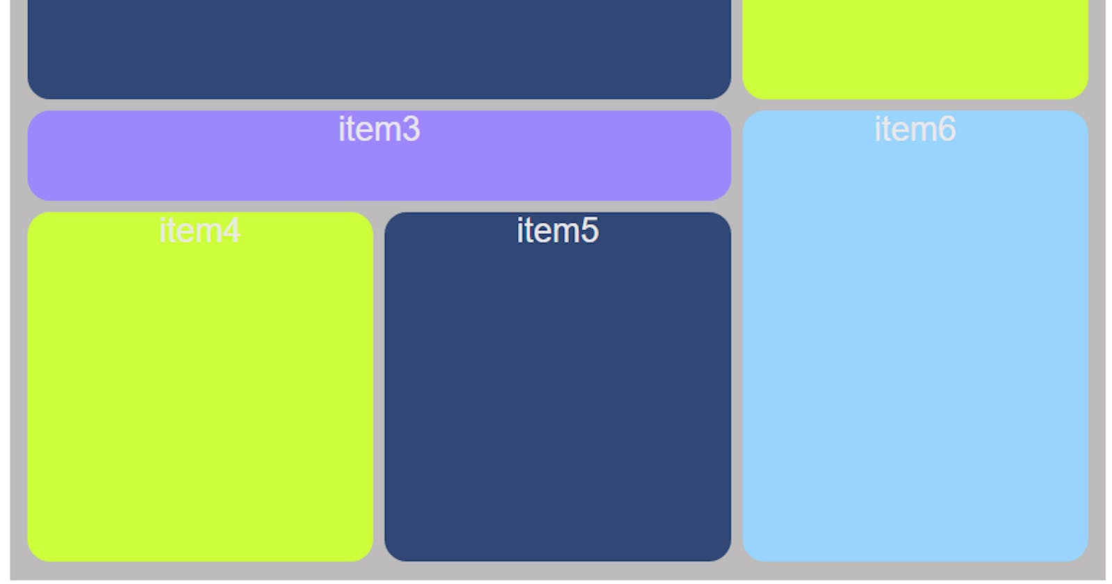
Leilanleilan.hashnode.dev·Mar 9, 2024Bento Responsive Grid Design with CSS GridFirst creating a container element that will serve as our grid container. Inside, we'll have items named item1,item2 and... . <div class="container"> <div class="item item1">item1</div> <div class="item item2">item2</div> <div c...Discuss·2 likes·35 readsbento grid
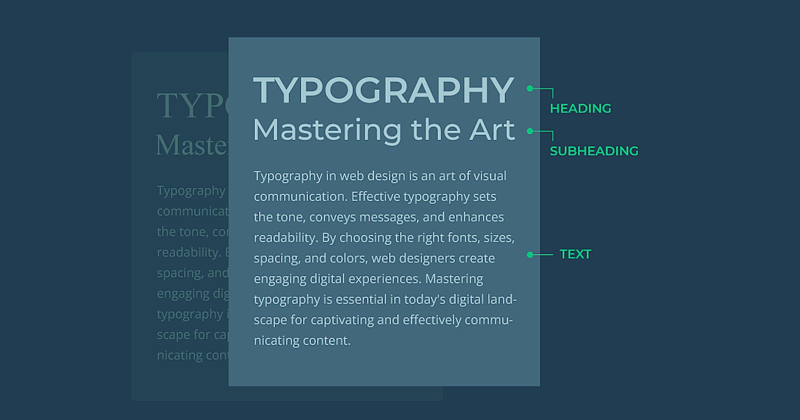
md3bmmd3bm.hashnode.dev·Feb 7, 2024Mastering Responsive Typography: Best Practices of the CSS SASS MixinIn today's digital landscape, responsive design has become a fundamental aspect of web development. Ensuring that our websites adapt seamlessly to different screen sizes and devices is crucial for delivering an optimal user experience. One key elemen...Discuss·31 readsCSS
Ugbuku Oghale Michelledevmichelle.hashnode.dev·Jan 26, 2024What I learnt this week: Thinking responsively✓ Making your webpage fit into any screen size is one of the very important jobs of a web developer. If a webpage developed is not made to be responsive to different screen sizes, it causes a whole lot of weirdness to the view in other sized screens....Discusswebdev
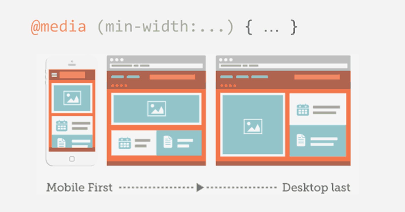
ABIcoder0z.hashnode.dev·Dec 13, 2023📝 The Ultimate Media Query GuideIn this guide, We are going to Learn Media Query in CSS Which is important topic for Today’s world. Because more than 50% users use Mobile phones to Visit websites. So There is no reason to not learn Media Query. Let’s dive into Media Query. Table of...Discussmedia queries
Boyd Timmermanbtimmerman.hashnode.dev·Dec 1, 2023Arranging Oracle APEX items & buttonsAPEX uses the 12 columns grid layout system for arranging components on a page. Sometimes this grid layout isn't sufficient when you're aligning components, especially when working with an odd number of components. This article will guide you through...Discuss·1 like·210 reads#oracle-apex