


What is CSS animations?
CSS Animation let HTML elements gently change from one set of style to another.
Here we use two things to use an animation i.e. the @keyframe rule and the animation properties.
What is the @keyframe rule?
The @keyframes rule lets us define, sets of styles that are generally transitioned to get an animation. You can see these sets of styles as frames, like in a frame by frame animation.
You can do it in two types by using:
We can use from & to selector.
@keyframe animation_name {
from{
 background-color: black;
     }
to{
 backgroun-color: white;
 }
}
We can also use percentage selector.
@keyframe animation_name {
0%{
 background-color: black;
     }
100%{
 backgroun-color: white;
    }
}
What is animation property?
The animation property lets us use the previously defined @keyframe rule as a frame by frame animation.
Animation Properties can be divided into 6 properties
- animation-name
- animation-duration
- animation-timing-function
- animation-delay
- animation-iteration-count
- animation-direction
1 . animation-name
The animation-name takes the name of the previously defined @keyframe rule as its value.
An element to be animated in @keyframe is called by its animation-name.
h1{
 animation: animation_name;
}
2. animation-duration
The animation-duration property defines how long will it take for now interaction of the animation to be complete. It takes time as value, so we usually use ms or s units.
h1{
  animation: animation_name 2s; /* or 2000ms */
}
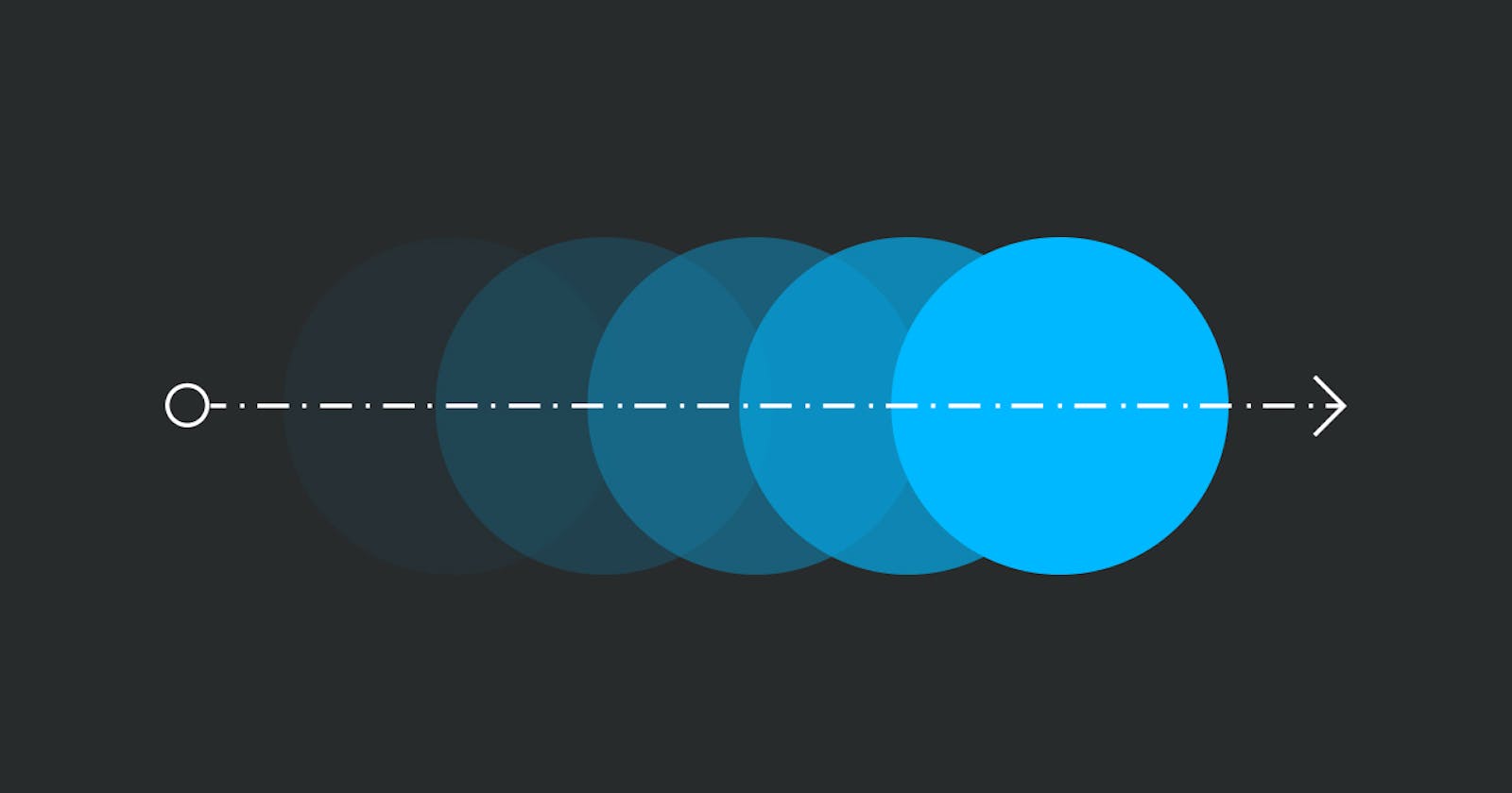
3. animation-timing-function
The animation-timing function specifies the speed curve of the animation. It can have any one of the following values.
- ease: Animation starts slow, then becomes fast and ends slowly.
Default Value - linear: Animation has the same speed from start to end.
- ease-in: Animation starts slowly and gently speed increases until the end.
- ease-out: Animation starts quickly and ends slowly.
- ease-in-out: Animation starts slowly and gently speeds up and then slows down towards the end.
- cubic-bezier(n,n,n,n): We can define our own animation time using it. The n values should be in the range of 0-1.
h1{
   animation: animation_name 2s ease;
}
4. animation-delay
The animation-delay specified a delay after which that animation will start.
h1{
  animation: animation_name 2s linear 1s;  /* 1s is the delay time*/
}
5. animation-iteration-count
The animation-iteration-count specifies how many times an animation will run. we can use number values i.e 1, 2,3 etc or infinite.
h1{
  animation: animation_name 2s linear 1s infinite;

/* This animation will run for an infinite number of times*/
}
6. animation-direction
The animation-direction specifies how the animation should be played i.e forward, backward or in alternate cycles. Here are it's the different values being used.
- normal: Animation is played forward.
Default value - reverse: Animation is played backwards.
- alternate: Animation is played forwards first and then backwards.
- alternate-reverse: Animation is played backwards first and then forwards.
h1{
  animation: animation_name 2s linear 1s infinite normal;
 }
🙏Thank You to be till the last of the article.
I Hope, you learn a lot of things and are ready to make awesome animation.😉 In this article, I have noted down all the basic concepts you required to start Animation in CSS.
But, it is just the beginning so keep hustling🏃♀️ and learn new values & properties. Keep experimenting!! 🧪 new things and expand your knowledge.⚡
Do Follow me on Twitter to get daily tips and tricks on Web-Development.