
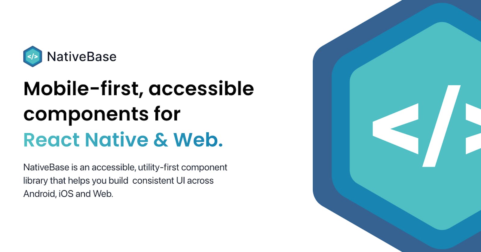


We are stumped and excited at the same time. No one predicted we would come this far with a UI component library for React Native. Back in 2016, we built a starter kit for React Native and pulled out reusable components in a separate library. We dubbed it NativeBase.
The first version was just a bunch of components bundled together in an NPM package. Later, we released v2.0. It was quite an improvement considering the platform-level design philosophies of Material and Cupertino design. Things have evolved since then.
With over 55,000 dependent projects and almost 16,000 stars on Github, we are ready for NativeBase 3.0—the new paradigm of the utility-first library which makes the components reusable and adheres to a wide spectrum of design. We strongly believe that its capabilities are the need of the hour.
We have tried our best to make the library flexible and customizable. But that is not what makes NativeBase 3.0 a game-changer. It is the fact that it is now universal, it works on all the platforms, web and mobile. It behaves natively on those platforms with focused support for accessibility (keyboard, mouse, screen readers). And how can I not mention, the most important feature (well at least for a lot of us)—the dark mode.
We stand in the middle of a very exciting time in tech when all the platforms are merging. And thanks to React Native and the folks in the community, this transformation is being made possible.
We, the NativeBase team, are doing our part to take this journey forward that would eventually help millions build quality software faster.
What’s new and improved?
Themability
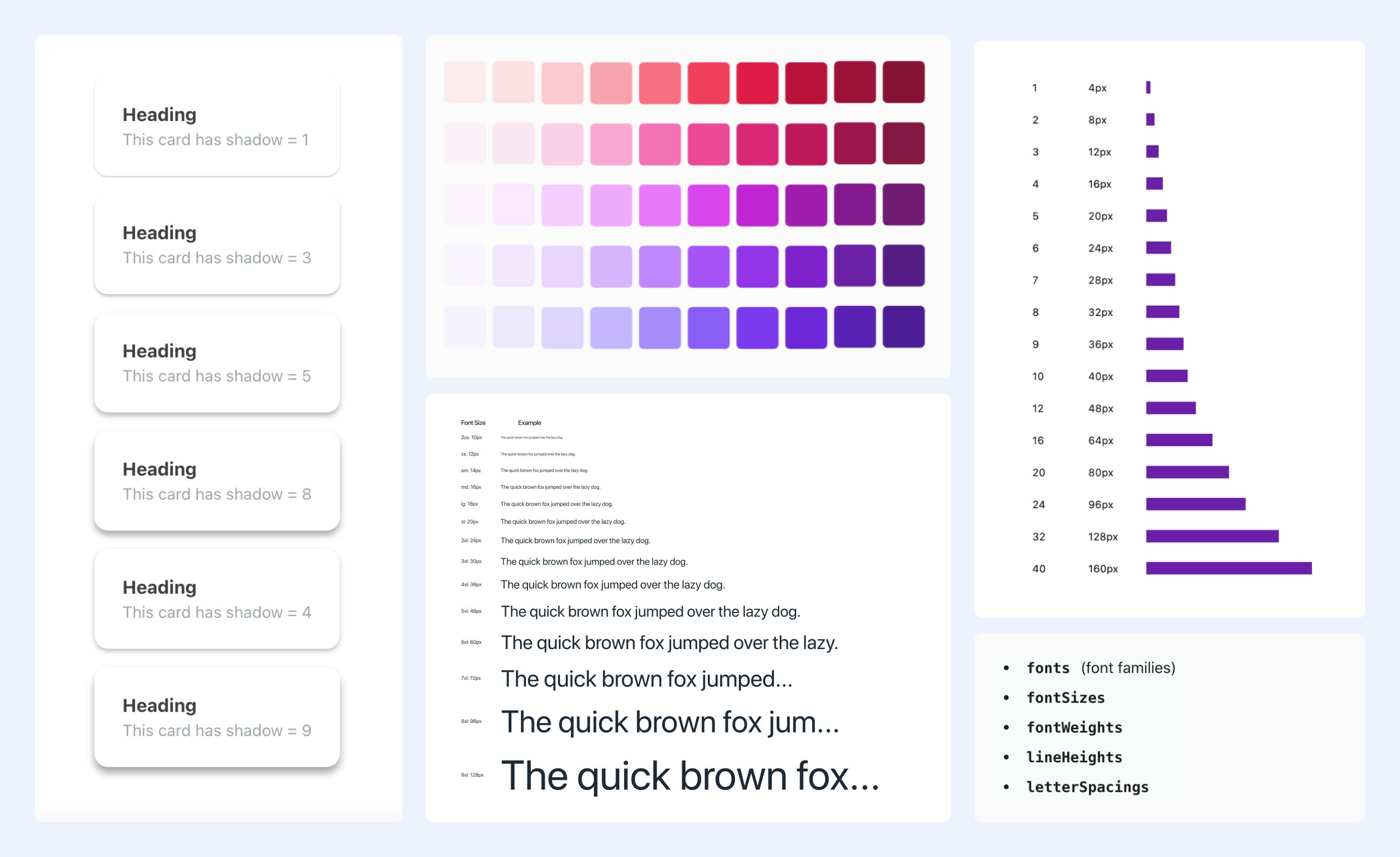
Based on the Styled System Theme specification, NativeBase 3.0 has highly themeable core components. Using it, you can easily define features like your app’s color palette, type scale, font stacks, breakpoints, and border-radius values. The only limitation is your imagination!.
Out of the box Accessibility
Integrated with React ARIA and React Native ARIA, which provides React hooks, this feature enables you to build accessible design systems in no time. The customizability and consistency offered by our framework allow one to code to their heart’s content.

Utility Props
Inspired by Styled System so you can rapidly build custom UI components with constraint-based utility style props, the platform has been enhanced to provide expressive and consistent UI components which you can define according to your theme.
<Box px="3" py="2" mb="4" bg="primary.400" rounded="lg">
  <Text fontWeight="medium" color="white" fontSize="sm">
    Hey There!
  </Text>
</Box>
Customizable Theme
Theming is one of the core elements of NativeBase. You can customize the theme as per your liking. NativeBase theme is a complex object which can be easily extended and customized.
import React from "react";
import { NativeBaseProvider, extendTheme } from "native-base";
import { Content } from "./Content";

export default function () {
  const theme = extendTheme({
    colors: {
      // Add new color
      primary: {
        50: "#E3F2F9",
        100: "#C5E4F3",
        200: "#A2D4EC",
        300: "#7AC1E4",
        400: "#47A9DA",
        500: "#0088CC",
        600: "#007AB8",
        700: "#006BA1",
        800: "#005885",
        900: "#003F5E",
      },
      // Redefinig only one shade, rest of the color will remain same.
      amber: {
        400: "#d97706",
      },
    },
    config: {
      // Changing initialColorMode to 'dark'
      initialColorMode: "dark",
    },
  });

  return (
    <NativeBaseProvider theme={theme}>
      <Content />
    </NativeBaseProvider>
  );
}
Introducing Pseudo Props
Inspired by Chakra and other utility first libraries, we have also provided support for new Pseudo props. It covers various conditional domains like platforms, color modes, interaction states, etc.
<Button
  _hover={{
    _text: { color: "secondary.400" },
  }}
>
  Change My Color
</Button>
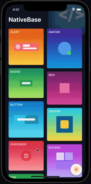
A demo—Kitchen Sink
To make NativeBase more comprehensible for users, we have also launched a simple demo app showcasing all the NativeBase components in action. Kitchen Sink gives an up-close demonstration of features like buttons, forms, and icons.
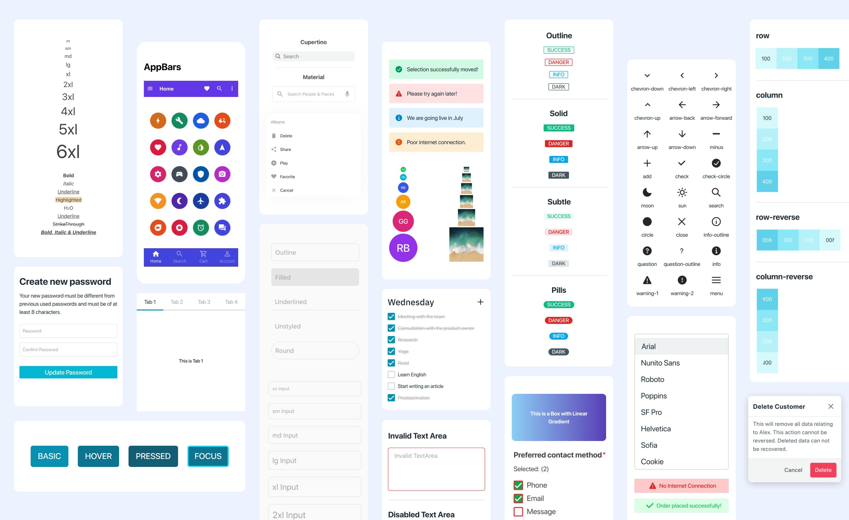
Rich Component Library
With NativeBase, you are spoilt for choice with over forty components pre-provided to enable seamless development. These components include buttons, action sheets, menus, spinners, popovers, breadcrumbs, and more.
Highly Responsive
NativeBase 3.0 allows you to provide object and array values to add responsive styles. This makes apps highly responsive and ideal for all kinds of display devices, from mobile phones to large desktops.
<Center
  bg="primary.400"
  rounded="xl"
  w={["24", "48", "72"]}
  h={{ base: "24", sm: "48", md: "72" }}
>
  This is a responsive box
</Center>
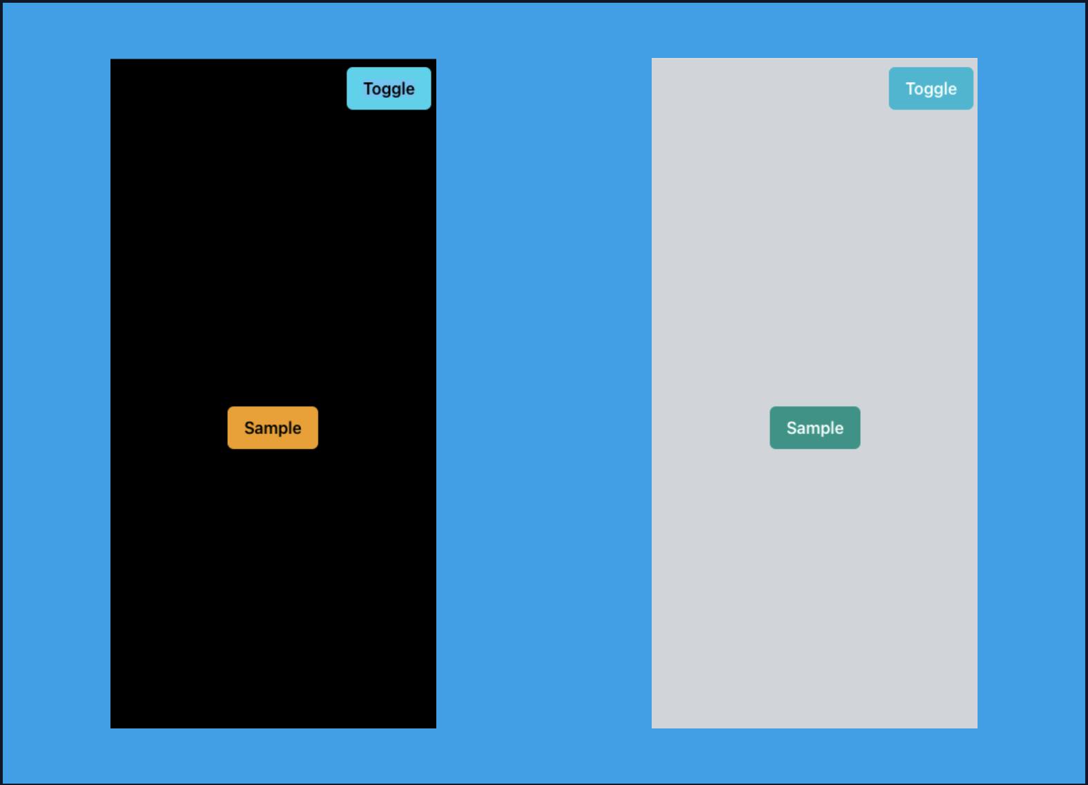
Introducing Dark Mode
NativeBase now supports dark and light themes by default. It just got a whole lot easier to build a dark mode setting for your apps.
function UseColorMode() {
  const { colorMode, toggleColorMode } = useColorMode();
  return (
    <Box flex={1} bg={colorMode === "dark" ? "black" : "coolGray.300"}>
      <Button m={2} ml="auto" onPress={toggleColorMode}>
        Toggle
      </Button>
      <Center flex={1}>
        <Button
          _light={{ bg: "teal.600", _text: { color: "white" } }}
          _dark={{ bg: "amber.500" }}
        >
          Sample
        </Button>
      </Center>
    </Box>
  );
}

export default function () {
  return (
    <NativeBaseProvider>
      <UseColorMode />
    </NativeBaseProvider>
  );
}
Consistent Across Platforms
Built using the React Native Framework, we are trying to bring to you a native experience that is consistent across all platforms. iOS, Android, or web— all features are created to be highly desirable for developers. You can also fast-track your dev process with universal components for reliable and organized coding.
The Future of NativeBase 2.0 & 3.0
Over the years, NativeBase has been used as the desired framework for over 50k projects worldwide. The same has happened for NativeBase 3.0 and we are humbled by the love we’ve received so far, in terms of downloads and starts received on GitHub.
With the onset of NativeBase 3.0, we thought it will be best to slow down NativeBase 2.0 and help users migrate to v3.0. NativeBase 2.0 will still be supported by us for the time being, which means that if your app is dependent on NativeBase 2.0 and you don’t want to upgrade just yet (which you should), you can continue to use it for as long as you like. We will also support critical bug fixes in v2.0 till March 2022.
The NativeBase 2.0 blog, however, is now deprecated but is still available as an archive where you can read about NB 2.0 and everything around the legacy NativeBase. Find it here.
We’re really excited to share NativeBase 3.0 with you and the rest of the community. We really hope that you like it and help us improve it. We also have plans of introducing a starter kit, NativeBase StartUp+, which are over 100+ production-ready UI screens that work on web and native platforms, which will be coming soon. Meanwhile, do follow us on our Discord channel and Twitter for further updates.