


I've been using Tailwind CSS a lot lately and although I love the new way of working with utility classes, I have to say that I miss having a base set of components to work with similar to Bootstrap or Bulma.
That is why I started a new series here on the DEV community on how to build commonly used web components using the utility classes from Tailwind CSS.

Last time I showed you how to build a file upload component and today I want to show you how you can build a toggle/switch element.
Tailwind CSS toggle/switch component
The first step towards building the toggle component is to set up the basic HTML code:
<label for="toggle-example">
  <input type="checkbox" id="toggle-example">
  <div></div>
  <span>Toggle me</span>
</label>
As you can see we wrapped all of the elements inside a label tag so that wherever you click it will toggle the checkbox. We also added an empty div tag which will later be used the background.
Let's now add the utility classes that are needed to styles the element:
<label for="toggle-example" class="flex items-center cursor-pointer relative mb-4">
  <input type="checkbox" id="toggle-example" class="sr-only">
  <div class="toggle-bg bg-gray-200 border-2 border-gray-200 h-6 w-11 rounded-full"></div>
  <span class="ml-3 text-gray-900 text-sm font-medium">Toggle me</span>
</label>
The toggle element is not complete yet, because we need to add a few pseudo classes which will be the dot that will move from left to right.
The easiest way to make it work is to install the Flowbite package from NPM and include it as a plugin in your Tailwind CSS project. Then this and other components from Flowbite will work.
Alternatively, you can also just add the following styles inside your CSS:
.toggle-bg:after {
    content: '';
    @apply absolute top-0.5 left-0.5 bg-white border border-gray-300 rounded-full h-5 w-5 transition shadow-sm;
}

input:checked + .toggle-bg:after {
    transform: translateX(100%);
    @apply border-white;
}

input:checked + .toggle-bg {
    @apply bg-blue-600 border-blue-600;
}
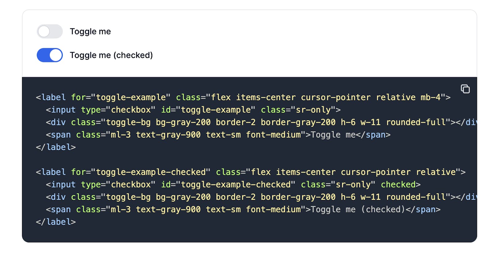
The final result should look like this:
You can also make the toggle component checked by default:
<label for="toggle-example-checked" class="flex items-center cursor-pointer relative">
  <input type="checkbox" id="toggle-example-checked" class="sr-only" checked>
  <div class="toggle-bg bg-gray-200 border-2 border-gray-200 h-6 w-11 rounded-full"></div>
  <span class="ml-3 text-gray-900 text-sm font-medium">Toggle me (checked)</span>
</label>
I hope that this tutorial helped you with your Tailwind CSS journey and expand the components that you can work with. Before you go, I would like to show you a Tailwind CSS component library that this toggle component is part of and which you can use to build websites even faster.
Flowbite - Tailwind CSS component library
As I've said earlier, this Tailwind CSS toggle component is part of a larger open source component library called Flowbite.

Flowbite is basically a set of UI components like buttons, alerts, badges, dropdowns, navbars built with the utility classes from Tailwind CSS but also includes interactive elements like tooltips and datepickers that can help you build websites even faster with Tailwind CSS.
You can quickly get started by installing Flowbite via NPM and then require it as a plugin inside your Tailwind CSS project or just use the CDN to try it out.