


React Hooks have landed in React v16.8.0 which makes me really excited. Apart from handling state and lifecycle inside functional components, they also allow us to build flexible components with ease.
A flexible component is one which can be used in many different situations and doesn't need drastic changes to fit new needs. Components become flexible if we make as little assumptions about its usage as possible. You thought the component needs only rendered text? Wrong! The designers want to add images inside it. Don't ask questions, just make it work. That's how we ended up here.

There are many ways to make components flexible. In this tutorial we will build flexible components which let the app handle its presentation while the component still abstracts the logic behind the scenes. These components which handle logic covertly use the "Compound Component" design pattern.
Flexible components in the wild
Before building our flexible components, let's see what flexible components look like.
Firstly, we have some components shipped in React Bootstrap. React Bootstrap is a pretty popular package for building UI with React and Bootstrap.
import Breadcrumb from 'react-bootstrap/Breadcrumb'

function App() {
  return (
    <Breadcrumb>
      <Breadcrumb.Item href="/">
        Home
      </Breadcrumb.Item>
      <Breadcrumb.Item href="/library">
        Library
      </Breadcrumb.Item>
      <Breadcrumb.Item active>
        Data
      </Breadcrumb.Item>
  </Breadcrumb>
  );
}
There is a Breadcrumb component inside which we have multiple Breadcrumb Items. At a first glance it looks very similar to HTML5 native select and option tags.
function App() {
  return (
    <select name="best-way-to-style">
      <option value="css" selected>CSS</option>
      <option value="inline-styles">Inline Styles</option>
      <option value="css-modules">CSS Modules</option>
      <option value="css-in-js">CSS in JS</option>
    </select>
  );
}
Think of compound components like the
<select>and<option>elements in HTML. Apart they don't do too much, but together they allow you to create the complete experience. — Kent C. Dodds
You might be wondering what that dot between Breadcrumb and Item is. We'll come to that later. The important takeaway from this example is that we are giving users some Lego blocks and the possibility to arrange them however they see fit.
The next example will shed more light on just how much flexibility we get with this approach.
import Pagination from 'react-bootstrap/Pagination'

function App() {
  const pages = [1, 2, 3, 4];
  const activePage = 2;

  return (
    <Pagination>
      <Pagination.First />
      <Pagination.Prev />

      {pages.map(page => (
        <Pagination.Item
          key={page}
          active={page === activePage}
         >
          {page}
        </Pagination.Item>
      ))}

      <Pagination.Next />
      <Pagination.Last style={{ color: '#000' }} />
    </Pagination>
  );
}
Here we have a Pagination component which acts as an umbrella for a number of compound components like First, Last, Prev, Next and Item.
Some obvious benefits highlighted in the following example:
1. Change the order of individual components
Right now First is rendering before Prev and Last is rendering after Next something similar to what we have in Example A.
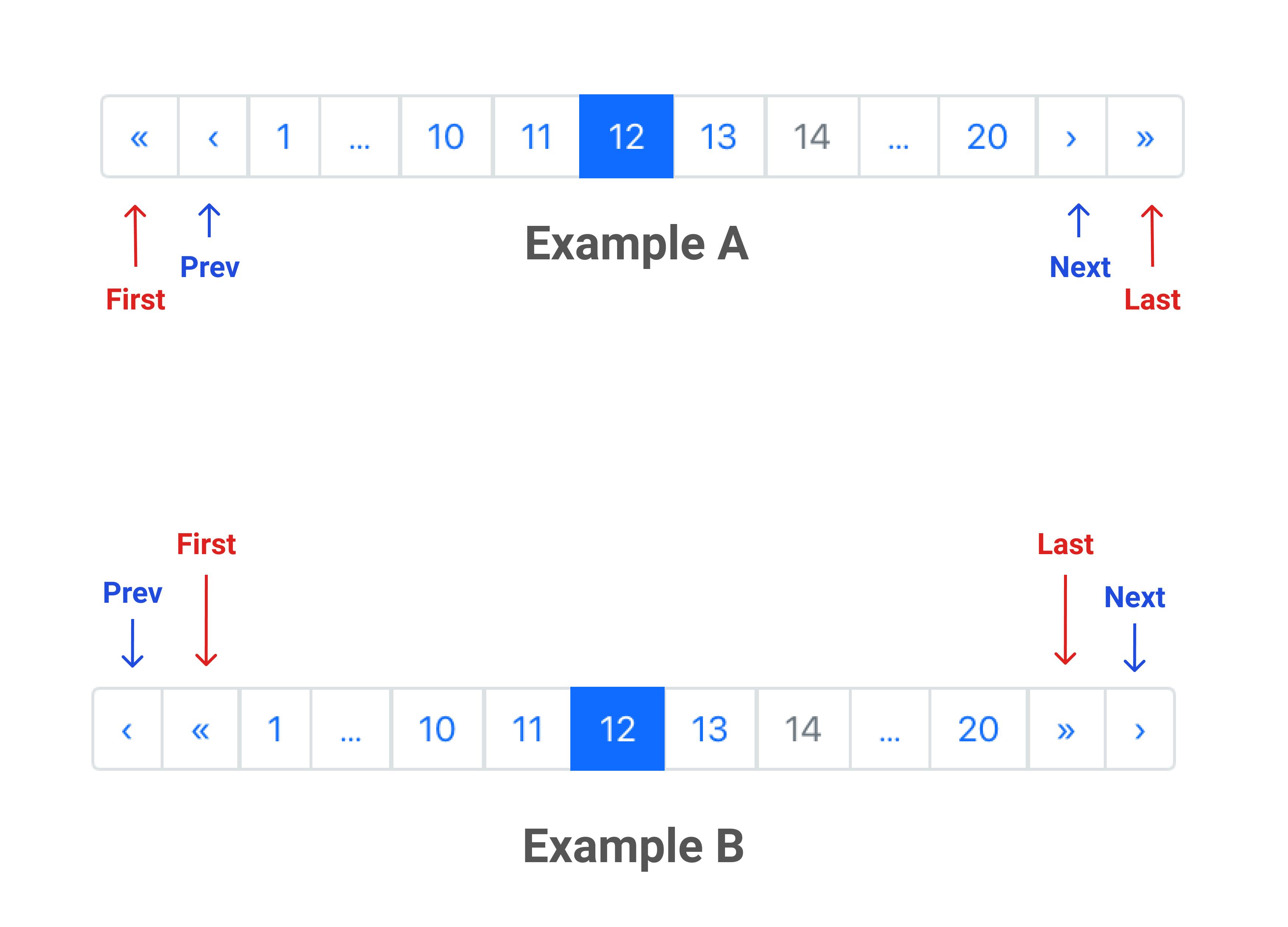
But what if our lovely designers want to have the Prev and the Last button like in Example B? Should we add some new props on the Pagination component?
<Pagination showPrevOnLeft={true} showNextonRight={true} />
No, we absolutely don't need to do this. Just like in HTML, we only need to change the order in which the Prev and First components are rendered. Same goes for the Next and Last component.
<Pagination>
  <Pagination.Prev />
  <Pagination.First />

  <Pagination.Item>1</Pagination.Item>
  <Pagination.Item>2</Pagination.Item>

  <Pagination.Last/>
  <Pagination.Next />
</Pagination>
2. Dynamic list rendering
Notice that in the Pagination code snippet, we are rendering an array of Pagination Items like we would in any React component.
This was the place where HTML fell short, we just couldn't render a dynamic list and when we used jQuery for that we lost the benefits of HTML. Now we finally have a way to get the best of both worlds. We can render dynamic data and also control the layout of individual pieces of a widget.
3. Modify individual components as we want
Lastly, I'd like to highlight that we can attach any attribute to any individual component.
Imagine having the power to give classes, id, tabIndex, aria attributes, data attributes to any of the Lego blocks.
This is great for making our components extensible. Users can customize the look of all the Lego blocks to fit their brand. In case that our components are not fully accessible, users can fix that on app level or build their own wrapper over our components.
Let's make compound components!
From here on, we'll discuss how to implement compound components pattern.
The first thing we need to consider when using this pattern is whether the compound components need to communicate with each other.
For example, in the breadcrumb example, we know the BreadCrumb Item component is there just for styling purposes.
There is no internal logic in the Breadcrumb item to determine if it's active or not. We assign the active prop to a particular Breadcrumb Item explicitly and that tells it to apply some additional styles.
This is great for building a design system which will uniform all the brand design across components.
Let's implement a breadcrumb based on the compound component pattern for our supposed design system.
import './breadcrumb.css';

function Breadcrumb(props) {
  const { className = '', children, ...restProps } = props;

  const classNames = `breadcrumb ${className}`;

  return (
    <div className={classNames} {...restProps}>
      {children}
    </div>
  );
}

function BreadcrumbItem(props) {
  const { active, className = '', children, ...restProps } = props;

  const itemClassNames = `
    breadcrumb-item
    ${active ? 'active' : ''}
    ${className}
  `;

  return (
    <Fragment>
      <a className={itemClassNames} {...restProps}>
        {children}
      </a>
      <span className="breadcrumb-separator">
        >
      </span>
    </Fragment>
  );
}

Breadcrumb.Item = BreadcrumbItem;
So we make two functional components, BreadCrumb and BreadcrumbItem. Both of them accept some props especially className and children. The className prop is merged with the component's own classes. One thing to note is that we are rendering the children prop inside Breadcrumb. This allows us to render any markup inside the Breadcrumb component.
To understand why we destructure other props and combine className, read this post from my newsletter.
Next, we'll check if the active prop is passed to any BreadcrumbItem, if so we add a active class in addition to the other classes.
Another important thing is that in the end we are assigning BreadcrumbItem as a property of Breadcrumb Item. This is done so we can do <Breadcrumb.Item> like this.
<Breadcrumb>
  <Breadcrumb.Item href="/frontend">
    Frontend
  </Breadcrumb.Item>
  <Breadcrumb.Item href="/frontend/frameworks">
    Frameworks
  </Breadcrumb.Item>
  <Breadcrumb.Item active href="/frontend/frameworks/react">
    React
  </Breadcrumb.Item>
</Breadcrumb>
But if you don't like this you can stick to using BreadcrumbItem inside Breadcrumb. That will also work.
Check out this code sandbox to see the full breadcrumb code.
Till now we have looked how to use compound component pattern for building design systems. However, we can use the compound component pattern for letting the components communicate with each other.
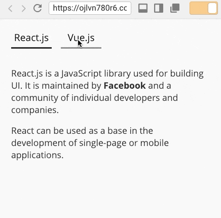
When will this be useful? Let's say we are building a tab widget for a UI component library, where there is a list of tabs and when we click on a tab, that tab's panel is shown. At any point of time only one tab panel can be seen.
It is clear that we have to keep the name of active tab as state and based on that show one tab panel and hide others. Can we implement this logic in our Tabs component but still allow the users to fiddle with the individual blocks of our component? Yes, with compound component pattern that is also possible, let's see how.
Communication between compound components and more about React Hooks
We need the individual components to know what the active tab is. Based on that the active tab, that tab's panel will be shown and all other panels will be hidden. When a tab is clicked that tab becomes the active tab.
Let's say this is the way our Tabs component will be used. (Some code is hidden as it is not of importance right now).
<Tabs initialValue="tab-react">
  ...
    <Tab name="tab-react">
      React.js
      ...
    </Tab>
    <Tab name="tab-vue">
      Vue.js
      ...
    </Tab>
  ...
  <TabPanel name="tab-react">
    React.js content
    ...
  </TabPanel>
  <TabPanel name="tab-vue">
    Vue.js content
    ...
  </TabPanel>
</Tabs>
We can have an active tab state inside Tabs component and also have a method to change this state. However, we need to share that state and method with Tab component and TabPanel component.
The name prop we pass to Tab and TabPanel serves as their identity. The activeTab state will store the name of the active tab.
The Tab component will use the activeTab state and its name to add additional classes if it is the active tab. When the tab is clicked, it will call the shared method with its name to inform that it is now the new active tab.
The TabPanel component will use the active tab state and its name to decide if it should render anything or not because only the active tab's panel should be rendered.
So how do we provide access to Tab's component state and methods to its children component like Tab and TabPanel? The answer is Context API.
import React, { createContext, useState, useContext } from 'react';

const TabContext = createContext();

function Tabs(props) {
  const {
    initialValue,
    className = '',
    children,
    ...restProps
  } = props;

  const [activeTab, changeTab] = useState(initialValue);
  const tabProviderValue = { activeTab, changeTab };

  const classNames = `tabs ${className}`;

  return (
    <TabContext.Provider value={tabProviderValue}>
      <div className={classNames} {...restProps}>
        {children}
      </div>
    </TabContext.Provider>
  );
}

// ... other compound components code
Yayy!! This is the part where we'll learn about hooks. In this tutorial, we'll be using only two hooks, useState and useContext.
In the Tabs component which is the parent component to all other compound components, we add a activeTab state via useState hook.
By default, the activeTab state will be the name of tab passed as initialValue prop.
Calling useState returns an array containing two items activeTab state and changeTab method. The names can be anything of our choice, what matters is that the first item will give the value of state and second item is a method which is used to change the state.
Next thing to note is that we created a TabContext context and then we render TabContext Provider inside Tabs component. The Provider is passed both the activeState and changeTab method. At last we render our custom markup and children prop inside the Provider.
This way all the children of Tabs component can get access to activeTab state and changeTab method.
function Tab(props) {
  const {
    name,
    className = '',
    onClick = () => {},
    children,
    ...restProps
  } = props;

  const tabContext = useContext(TabContext);

  const classNames = `
    tab
    ${tabContext.activeTab === name ? 'active' : ''}
    ${className}
  `;

  const handleClick = event => {
    tabContext.changeTab(name);
    onClick(event);
  };

  return (
    <span className={classNames} onClick={handleClick} {...restProps}>
      {children}
    </span>
  );
}
In the Tab component we get access to tab context by passing TabContext created earlier to the context hook. Now all the things passed in the context provider can be accessed as properties of tabContext object.
So we assign active class to the active tab (determined by comparing activeTab name with the current tab's name) and on click use the shared changeTab method from context to inform Tabs component what the new active tab is. Then the Tabs parent component shares the new active tab name with all compound components automatically.
Let's look at the final compound component, TabPanel, that access internal component state.
function TabPanel(props) {
  const { name, className = '', children, ...restProps } = props;

  const tabContext = useContext(TabContext);

  const classNames = `tab-panel ${className}`;

  return (
    tabContext.activeTab === name && (
      <div className={classNames} {...restProps}>
        {children}
      </div>
    )
  );
}
In the TabPanel component, just like before we get the name of activeTab from tab context and then we render the panel of the active tab only.
Check out this codesandbox to see the full Tabs code. It contains some more compound components which are useful for design purposes.
Conclusion
In this tutorial I explained what compound components are and how they can make our components flexible along with React Hooks. In my experience they are most useful in building design systems.
As Michael Chan says, it's just components designed to be used together sometimes leveraging Context to share internal state.
This in turn makes our components flexible but because of that we might need to think extra hard. If you don't need the flexibility then going with the render props route makes sense.
After reading this tutorial you should better understand when to use compound components with React Hooks. Please leave your comments if you liked it and make sure to follow me on Hashnode to stay up to date with all the things I write.