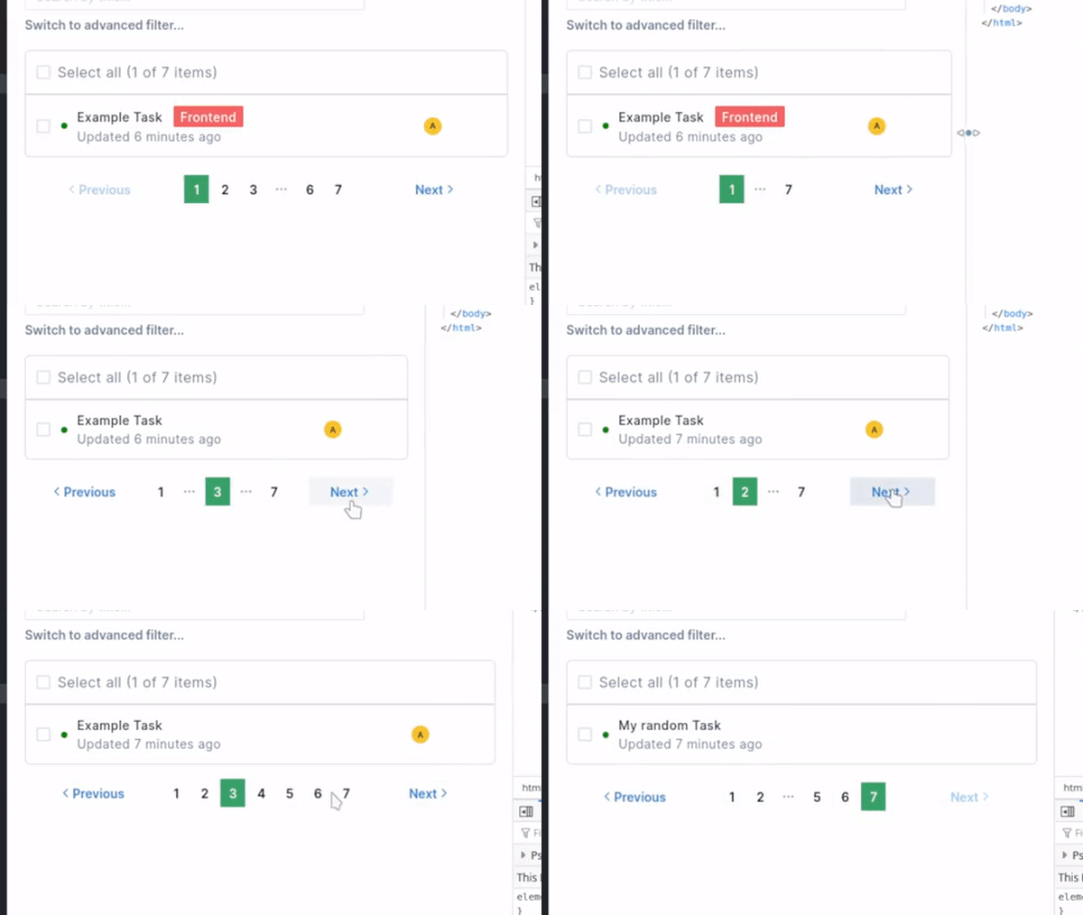
Here's the challenge: Re-create this pagination component from GitHub

Some problems looks hard but turns out to be easy. Then you look at one that seem easy but it turns out to be a hard problem. This is one of the latter. It's definitely not an ordeal, but it probably took me a good hour when I originally estimated to finish this within a few minutes.
Now, before you say "This is easy! You're just a bad programmer", I encourage you to try to re-create it!
Go to this page and scroll to the very bottom for reference. Make sure you test various scenarios. Here's some:
- Go to the first page
- Last page
- In the middle of the page
- At page 2--6
- When there's not many pages (Eg: Total of 10 pages)
- On lower screen resolution (mobile)
Need more time? Don't worry I'll wait.
.
.
.
.
.
.
.
.
.
Ok, let's explore the requirements. I hope this is detailed enough to make you wish you had these on $DAY_JOB!
Exploring the Requirements
There's 2 crucial points for this component:
- Able to navigate to first and last page
- Able to navigate to the adjacent pages easily
On its own, it's not a big deal. But once you account for responsive design, it's not as straightforward. So let's divide it per screen size.
1. Mobile
When we don't have enough space to put anything, GitHub simply shows 2 buttons.

Simple, let's move on to the next size.
2. Tablet
Here's where it starts to get tricky. When you're on the first page, show the first and the last page --- along with the "Previous" and "Next" button.

But if we're on a different page then we'll want to indicate that.

What if we're somewhere on the middle? Notice the difference? GitHub doesn't show dots between 1 and 3 above. However, they show dots between 1 and 7.

3. Desktop
Starting from the first page:

Notice that the first five pages and the last two are shown.
Let's try page 5:

Page 1 to 7 is now shown. That makes sense because the 2 pages around our current page seems to be shown. Combining the fact that the first five pages are shown, this adds up.

Sure enough, we follow the same trend.
Now, let's move to page 7.

As expected, now we've lost page 3--4. Page 5--9 is shown because we're on page 7.
Some things not mentioned:
- Previous and Next button becomes disabled when no page to paginate.
- It needs to handle any number of pages.
Here's 2 additional cases to refer to:


Didn't expect that many requirement did ya? Maybe you did --- I for sure didn't.
So why did this took me much longer than expected to make?
1. Unclear Scope
If you tried to re-create this component without looking at the requirements I laid out, you might be surprised at how many cases there are to handle. Unclear scope is a big issue that leads to mismatch in development time and expectation. Most of you probably had an experience of being asked "How long do you think this will take?".
And if you've experienced enough of those, you'll know to estimate a number and multiply that by at least 1.5. So for a feature that you think might take a week, you'll say one and a half week --- Maybe even two!
The more detailed a piece of work is, the better you'll be able to estimate. A vague task like "Re-create X feature" is bound to go beyond your estimate no matter how simple it is.
2. The amount of different cases to handle
"Less is better" --- Somebody
When I started on this component, my mindset was to create the component with as little parts as possible. Many developers like to shorten and use "smart" ways to code as they get better at programming. This can be syntactic sugar, clever tricks or little known facts of a certain language. If you know Functional Programming, you know what I mean!
At some point in my career, I did similar. I had fun figuring out how to write something clever. But that often increases the complexity of your code.
Most importantly, less !== better.
Simple is better. And less often times does not equal to simple.

Source: Twitter
Some of you might be tempted to create a single elegant function to handle all the cases. In this example however, it might be much simpler and readable to handle each case on its own if statement.
Although if you manage to solve this problem elegantly, let me know through e-mail or twitter! I'd love to see it.
End result
I originally set out to do this for Recall's task explorer page. Here's how it looks in the end. Not too bad!

Final thought: This component might be a good test for a technical interview. What do you think?
Originally published at https://michaelsalim.co.uk.