

Clone Experiment #3: Accessible Taxi Booking app for web and mobile


Introduction
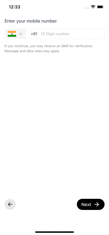
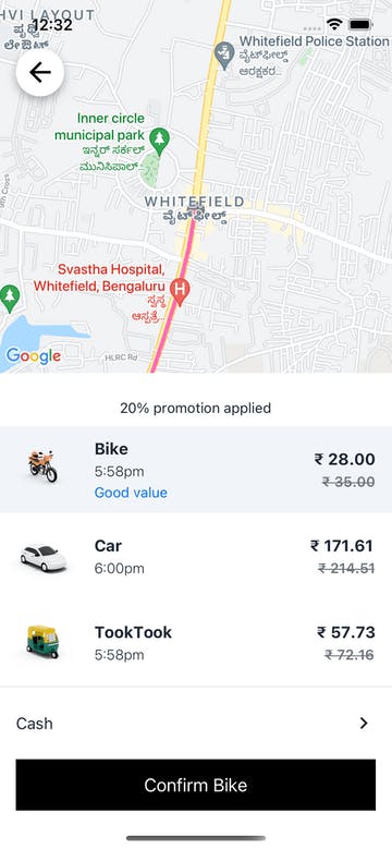
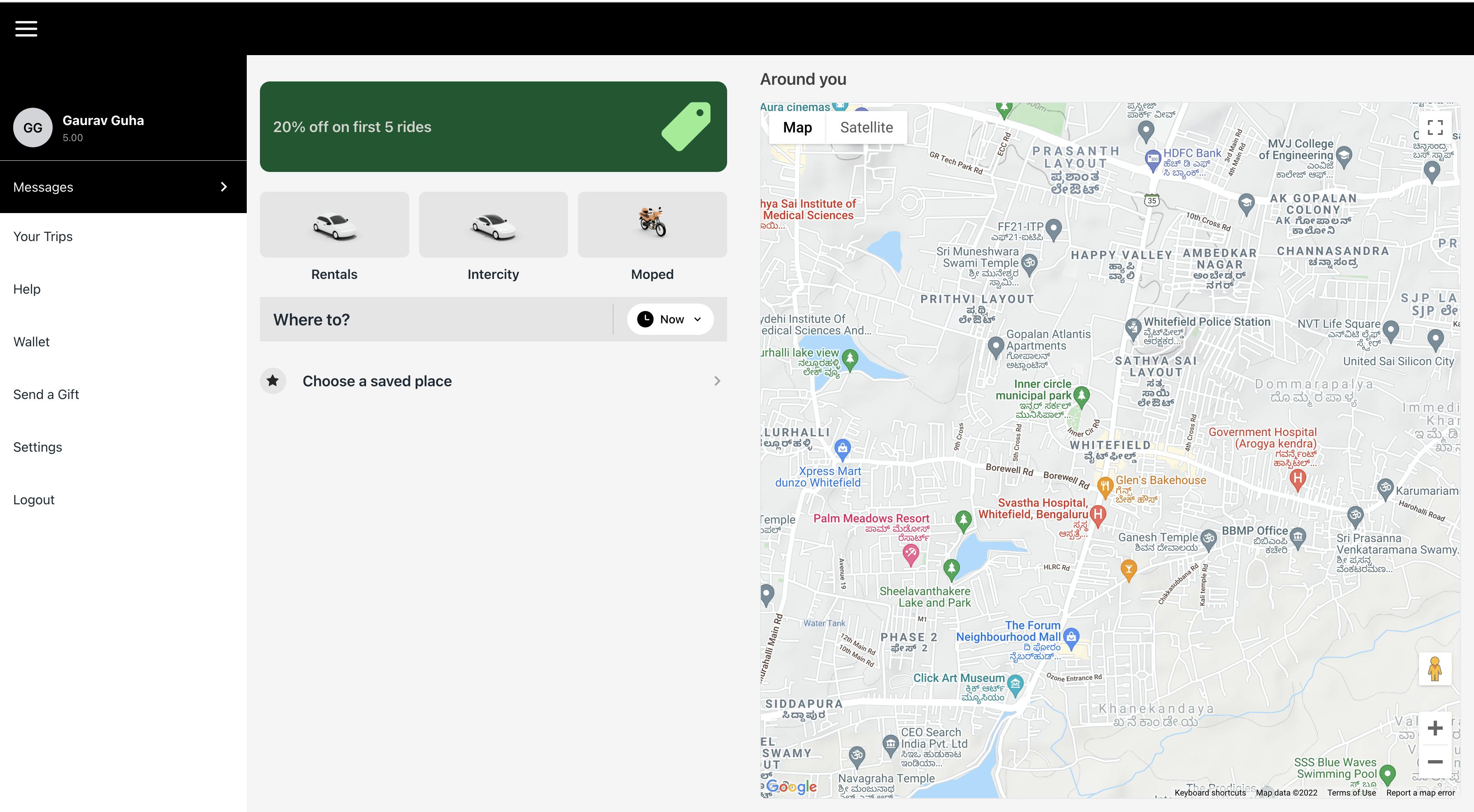
We have created a cross-platform Taxi services application using NativeBase. The main objective for this project was to show users how a single codebase having NativeBase components can be deployed as a web and a native app. The application created is inspired by the leading Taxi Service provider Uber’s application. The experiment’s final result looked like this. Check it out yourself.
Motivation:
Why should we build native apps when we have responsiveness in web apps?
Better user experience and cross-platform consistency are possible only through Native Apps.
Finding a solution for this, I came across the Expo framework which helps you to develop, build, deploy, and quickly iterate on iOS, Android, and Web apps from the same JavaScript / TypeScript codebase. But again, designing & achieving responsiveness is very complex in Expo / React Native.
Moreover, unlike CSS, there is nothing similar to media queries in React Native. You will end up writing separate style objects and individual files to support responsiveness in your App. That is where NativeBase comes to the rescue. It supports responsive styles out of the box. You can achieve responsiveness by using either an Object or Array syntax in the props.
Challenges faced:
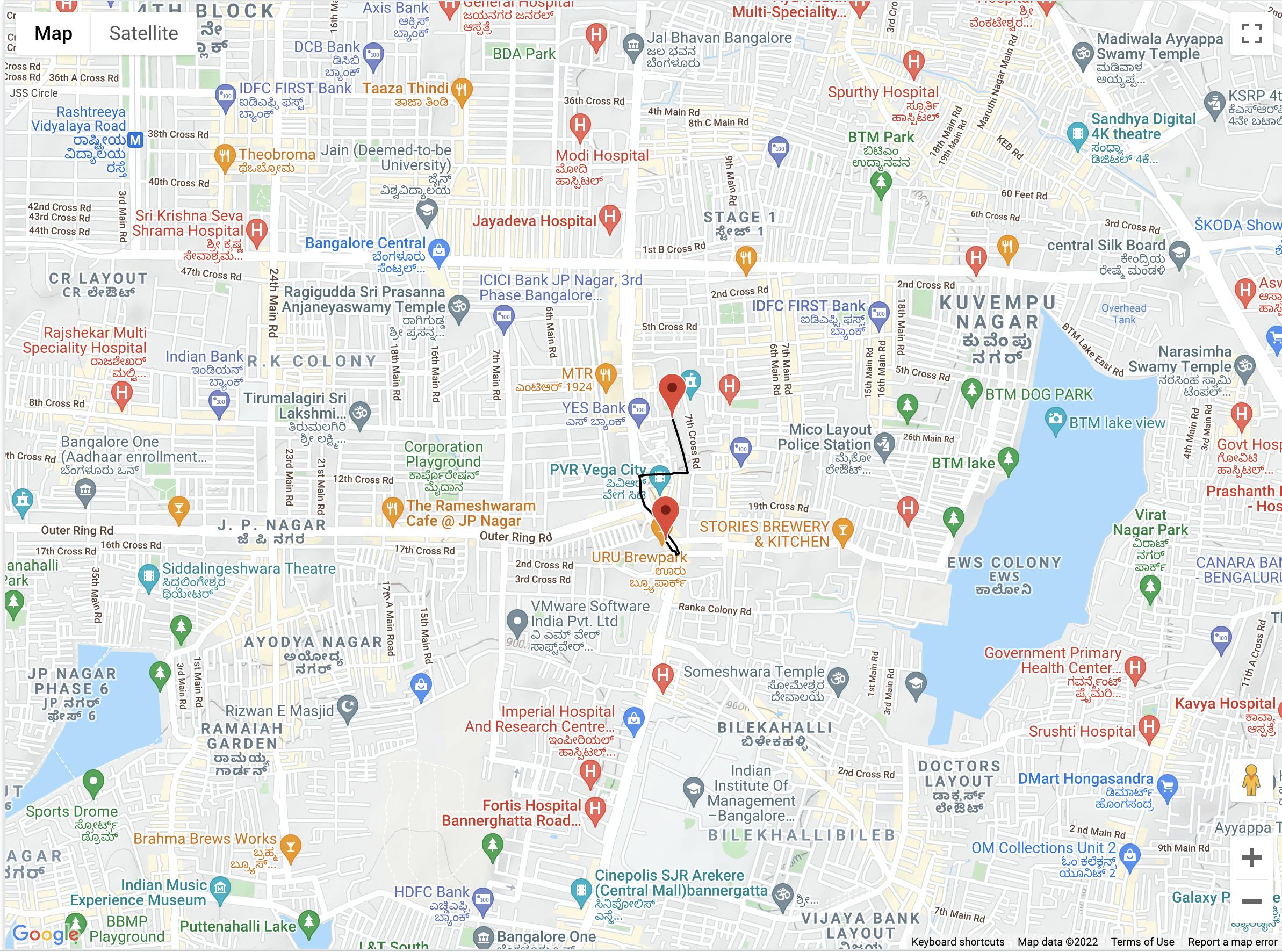
- Maps: The major challenge we have faced was the absence of a map API that works collectively on both native and web. For that, we needed to call different APIs based on the device.
import { Platform } from "react-native";

const ResponsiveMap = Platform.select({
  native: () => (
    <NativeMap />
  ),
  default: () => <WebMap />,
});
NativeMap.tsx
import React from "react";
import MapView, { PROVIDER_GOOGLE } from "react-native-maps";

function NativeMap(props: any) {
  return (
    <MapView
      style={{
        flex: 1,
        minHeight: 120,
      }}
      provider={PROVIDER_GOOGLE}
      region={{
        latitudeDelta: 0.015,
        longitudeDelta: 0.0121,
        latitude: 12.9698,
        longitude: 77.75,
      }}
    >
      <MapCircle
        center={{ latitude: 12.9698, longitude: 77.75 }}
        radius={100}
      ></MapCircle>
    </MapView>
  );
}
WebMap.tsx
import React, { useEffect, useState, useRef } from "react";
import { VStack, View } from "native-base";
import Constants from "expo-constants";

function WebMap() {
  const [mapLoaded, setMapLoaded] = useState(false);
  const mapContainerRef = useRef<HTMLElement>(null);    // C1

  useEffect(() => {
    // Check if map script is already present in DOM
    if (!document.body.dataset.mapLoaded) {
      const mapScript = document.createElement("script");
      mapScript.src = MAP_SCRIPT_WITH_API_KEY;

      mapScript.onload = () => {
        // set dataset property on body to indicate map script has been loaded.
        document.body.dataset.mapLoaded = "true";
        setMapLoaded(true);
      };
      document.head.appendChild(mapScript);
    }
  }, []);

  useEffect(() => {
    if (mapLoaded) {
      //@ts-ignore
      const map = new window.google.maps.Map(mapContainerRef.current, {
        zoom: 15,
        mapTypeId: "terrain",
        center: { lat: 12.9698, lng: 77.75 },
      });
    }
  }, [mapLoaded]);

  return (
    <>
      {mapLoaded ? (
        <VStack
          safeAreaBottom
          flex="1"
          space={{ base: "4", md: "0" }}
          rounded={{ md: "lg" }}
          borderWidth={{ base: "0", md: "1" }}
          _light={{
            bg: { md: "white", base: "primary.50" },
            borderColor: "coolGray.200",
          }}
          _dark={{
            bg: { base: "coolGray.700", md: "coolGray.700" },
            borderColor: "coolGray.700",
          }}
        >
          <View flex="1" ref={mapContainerRef} />
        </VStack>
      ) : (
        "Loading ..."
      )}
    </>
  );
}
As you can see, in line C1, we need to initialize the container as HTMLElement to show the map on the web.
- Sidebar: We needed to show the Sidebar differently on small and large-sized screens.
const isLargeScreen = useBreakpointValue({
    base: false,
    lg: true,
  });

return(
...

{isLargeScreen ? (
    <Box w="300" bg="white" display={isSidebar ? "flex" : "none"}>
      <Sidebar navigation={navigation} />
    </Box>
) : (
    <Slide in={isSlideOpen} placement="left" w={width} h="100">
    <HStack w="100%" h="100%">
      <Box w={{ base: "80%", lg: "25%" }} bg="white">
        <Sidebar navigation={navigation} />
      </Box>
      <Pressable
        w={{ base: "20%", lg: "75%" }}
        onPress={() => setSlideOpen(false)}
        opacity="0.5"
        bg="black"
      ></Pressable>
    </HStack>
  </Slide>
)}
...
);
Small screens
Large screens
Conclusion
With this fun experiment, we were able to show what NativeBase components can do with the expo. It is amazing how our code gets converted to div or React Native components on the basis of the device on which it gets rendered. The support of props has also allowed us to write minimal code to support the same design on the web as well as mobile.
We are working to enhance NativeBase components by turning the challenges faced in this experiment into features.