Introduction
There are some selectors in CSS that does the JavaScript magic. They work perfectly as expected, and take a few presses to achieve them. These CSS snippets are relatively not new, and yet not implemented by most developers, developers underestimate them to think only JavaScript can do the tasks. Today we are going to discuss CSS selectors that go along with some HTML elements to do magics! They include CSS Pseudo-classes selectors, CSS grouping selectors. Let's take a look at these selectors:
~: This selector is a universal sibling selector and it used to selects all elements that are sibling to a specific element+:This selector is not a universal selector, it Selects the immediate sibling of a specific element::beforeand::after: This selector are used to insert before and after of a specific element:hover:This selector is used to select a specific element you mouse over:checked:Returns true if an input is checked
If you are a newbie in CSS quickly go through some tutorials and come back or wait! if you are the type that learn fast let's move on
What Can these CSS Selectors Do?
1. Changing the innerText of an element:
When it comes to changing the innerText of an element most developer use javascript to accomplish it but CSS selectors do the same magic
Example
Let's assume you have an element with class="hoverMe" that has an innerText of hover me to change my innerText and you want to change the innerText when the element is hover
//HTML
<div class="hoverMe">
</div>
Let's set the innerText
   // CSS
   .hoverMe::after{
        content: "Hover me to change my innerText";
        font-size: 4vw;

        }
Changing the innerText when over
   //Changing the innerText when over
 .hoverMe:hover::after{
         content: "Wow css is awesome";
         cursor: pointer;
        }
The result

2. Toggle An Element Display
Yes we can use CSS to toggle an action and element display, toggling means vice-visa,
Example
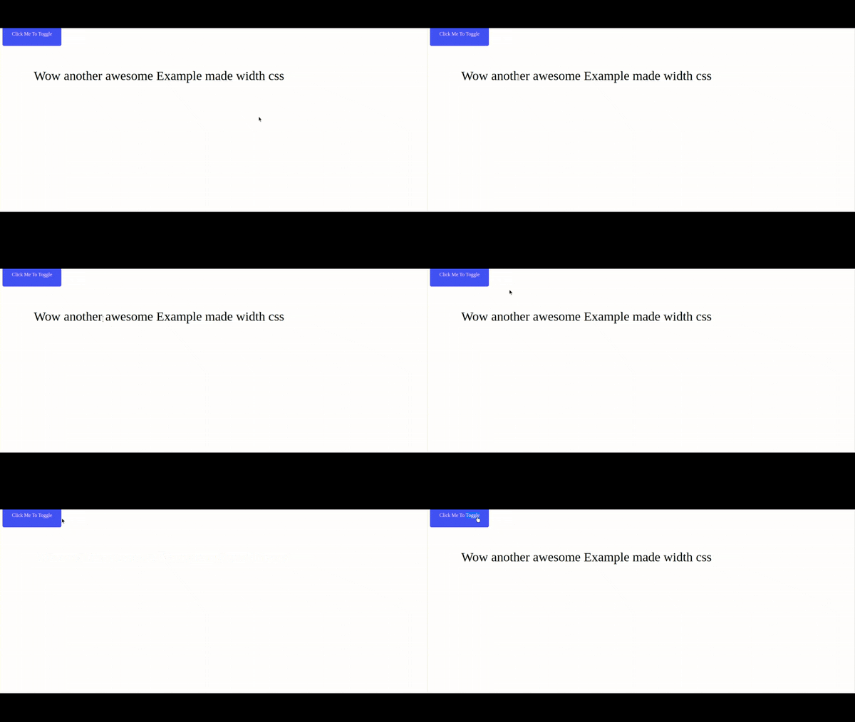
Here we are going to show an element if the input is checked and hide the element if the input is not checked
//HTML
  <label for="ErisanAkorede">Click Me To Toggle</label>
<input type="checkbox" id="ErisanAkorede">

<div class="showANDhide">
    Wow another awesome Example made width css
</div>
//CSS
label{
    color: #fff;
    background: #3e5afb;
    border-radius: 5px;
    padding: 30px;
    cursor: pointer;
}
.showANDhide{
    margin: 100px;
    font-size: 3vw;
}
input{
    opacity: 0;
}
.showANDhide{
    display: none;
}
input:checked + .showANDhide{
    display: block !important;
}
The result

3 Awesome Animation
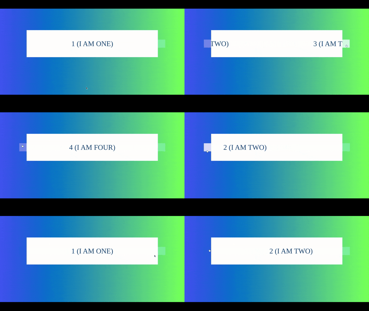
CSS also can create an awesome slider
//HTML
<html>
<body>
<div id="slider-container">
                <input checked type="radio" name="slider" id="toSlideOne" class="add" />
                <input type="radio" name="slider" id="toSlideTwo" class="add" />
                <input type="radio" name="slider" id="toSlideThree" class="add" />
                <input type="radio" name="slider" id="toSlideFour" class="add" />

                <div class="show-container">
                  <div class="overflow">

                    <div class="to-slide">1 (I AM ONE)</div>
                    <div class="to-slide">2 (I AM TWO)</div>
                    <div class="to-slide">3 (I AM THREE)</div>
                    <div class="to-slide">4 (I AM FOUR)</div>

                  </div>
                </div>

                <div class="controls-slide">
                  <label for="toSlideOne"></label>
                  <label for="toSlideTwo"></label>
                  <label for="toSlideThree"></label>
                  <label for="toSlideFour"></label>
                </div>
              </div>


</body>
</html>
//Css
body{
    height: 100%;
    font-size: 3.3em;
    background-image:linear-gradient(to right,#3e5af5, #3e5);
    text-align: center;
}
input.add {
     display:none;
    }

#slider-container .overflow {
     width:400%;
      -webkit-transform:translateZ(0);
      -webkit-transition:all 0.5s ease-out;
      -moz-transition:all 0.5s ease-out;
      -o-transition:all 0.5s ease-out;
      transition:all 0.5s ease-out;

    }

#slider-container .to-slide {
     width:25%;
     color: #114476;
      height:200px;
      line-height:200px;
      float:left;
      background:#fff;
    }

#toSlideOne:checked ~ .show-container .overflow {
     margin-left:0;
    }
#toSlideTwo:checked ~ .show-container .overflow {
     margin-left:-100%;
    }
#toSlideThree:checked ~ .show-container .overflow {
     margin-left:-200%;
    }
#toSlideFour:checked ~ .show-container .overflow {
     margin-left:-300%;
    }
#slider-container {
     margin:25vh auto; width:80%; position:relative;
    }
#slider-container .show-container {
     width:90%; overflow:hidden; margin:auto;
    }
.controls-slide {
     width:100%;

    }
.controls-slide label {
     display:none;
      width:5%;
      height:60px;
      opacity:0.3; position:absolute; top:50%; margin-top:-30px; cursor:pointer; background: #fff;
    }
.controls-slide label:hover {
     opacity:0.8;
    }
#toSlideOne:checked ~ .controls-slide label:nth-child(2), #toSlideTwo:checked ~ .controls-slide label:nth-child(3), #toSlideThree:checked ~ .controls-slide label:nth-child(4) {
     right:0; display:block;
    }
#toSlideTwo:checked ~ .controls-slide label:nth-child(1), #toSlideThree:checked ~ .controls-slide label:nth-child(2), #toSlideFour:checked ~ .controls-slide label:nth-child(3) {
     left:0; display:block;
    }
The result

Read Also: How To Create An Analog Clock With HTML, CSS, And JavaScript
So have you gain something so far, let me know by commenting or if you have something you want to add or correct please do by commenting thanks.
Show some love by liking this post!