Deep Insight Into Open Source Databases


On this page, we will share with you many deep insights into open source databases, such as the database popularity, database contributors, coding vitality, community feedback and so on.
We’ll also share the SQL commands that generate all these analytical results above each chart, so you can use them on your own on TiDB Cloud following this 10-minute tutorial.
Database Popularity
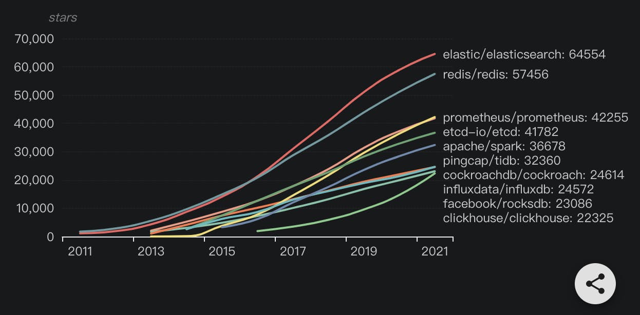
The popularity trend in the past ten years
The chart below displays the accumulated number of stars open source databases gained respectively each year and their star growth trend during the past ten years.
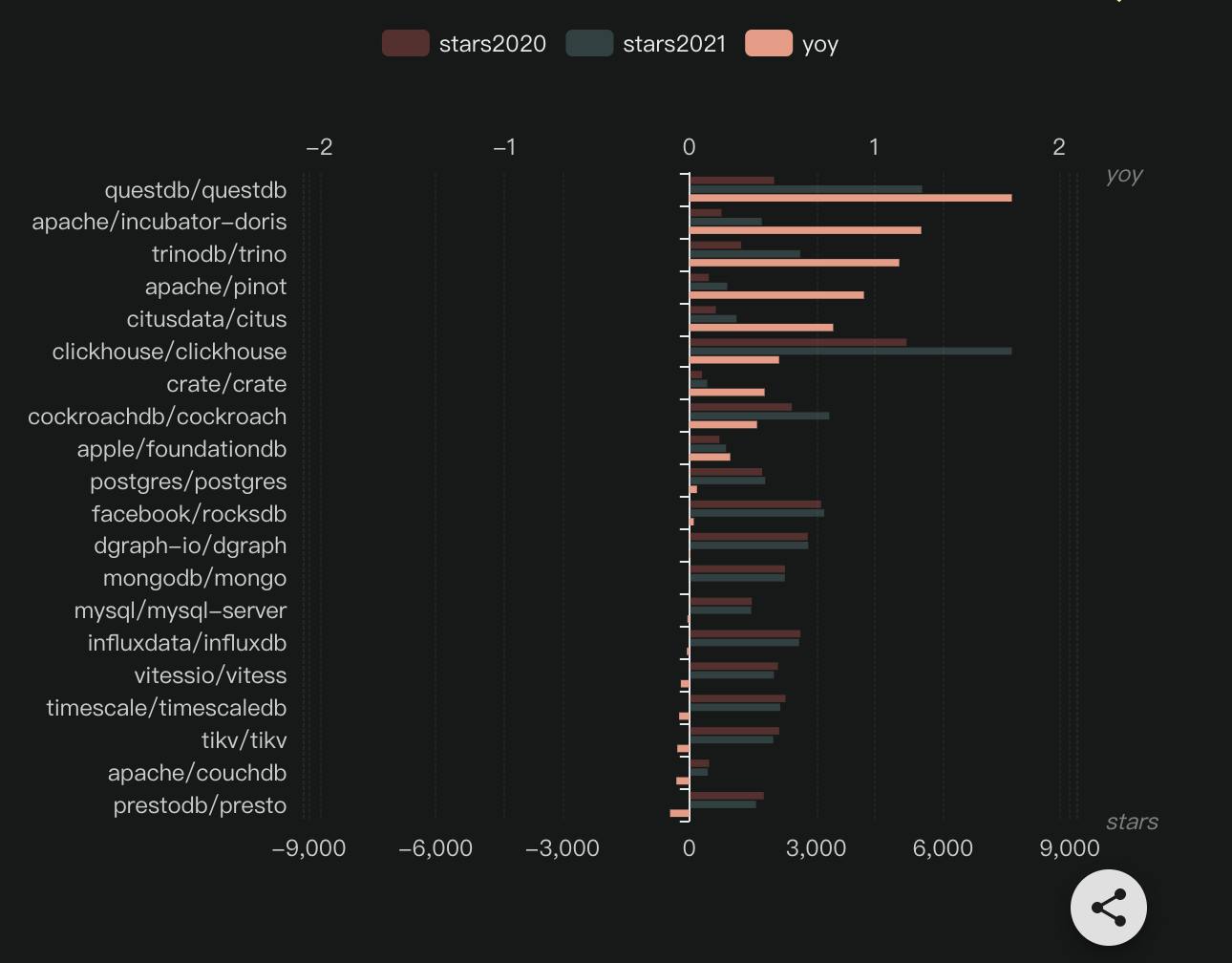
Which databases experienced a popularity boom in 2021?
The chart below displays top 10 open source databases with the highest year-over-year growth rate of stars in 2021 alone.
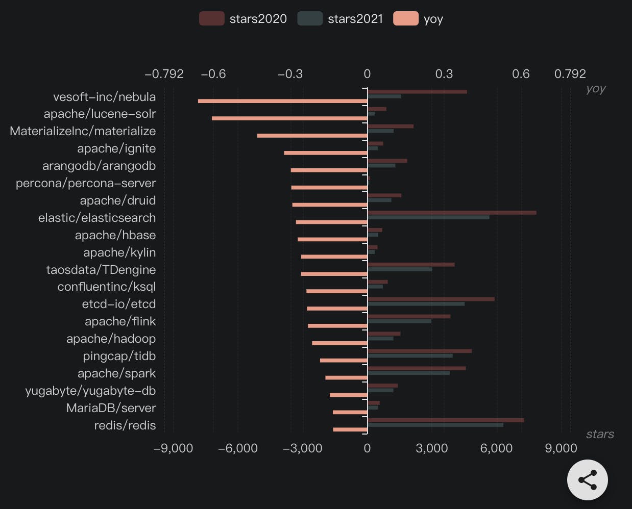
Which databases barely gained influence in 2021?
The chart below displays top 10 open source databases with the lowest year-over-year growth rate of stars in 2021 alone.
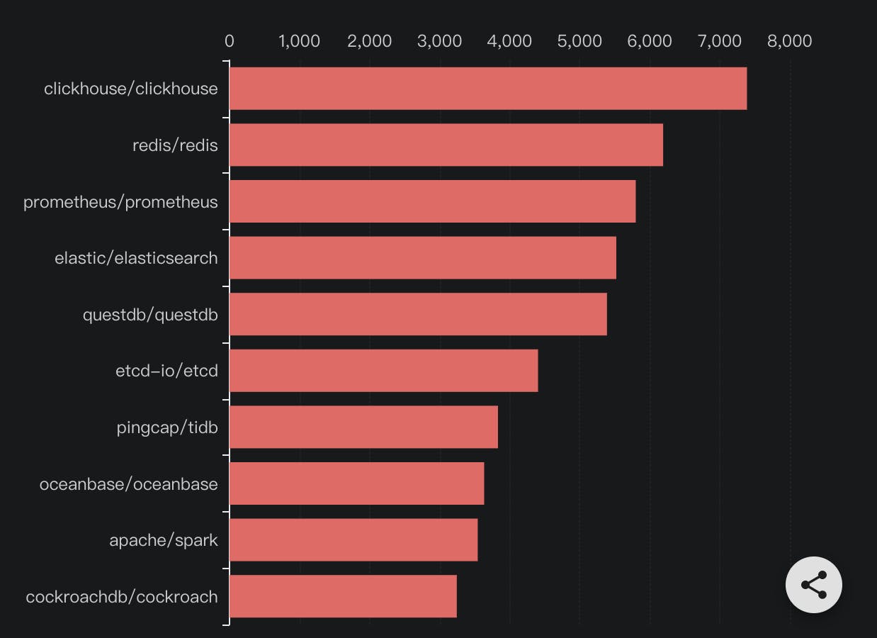
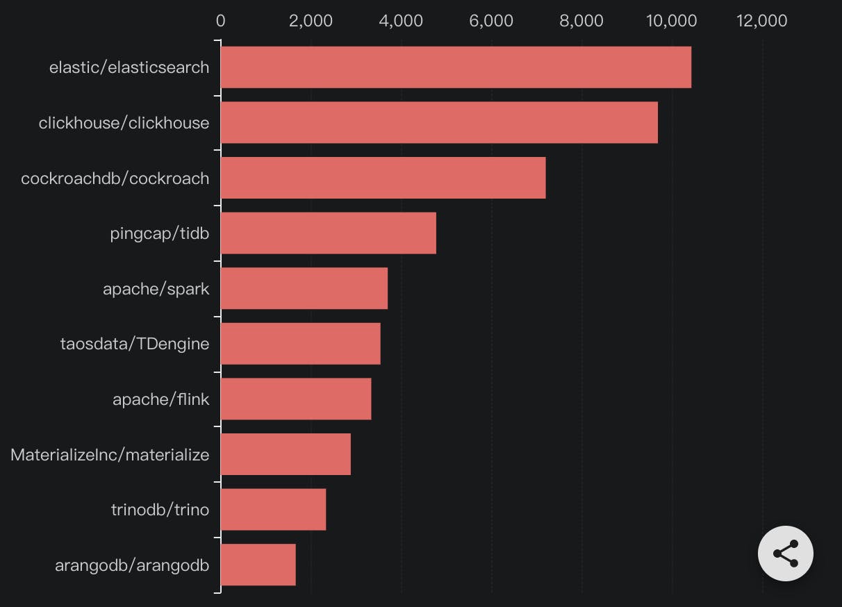
Which databases were the new favorites in 2021?
The chart below displays the top open source databases that gained the most stars in 2021.
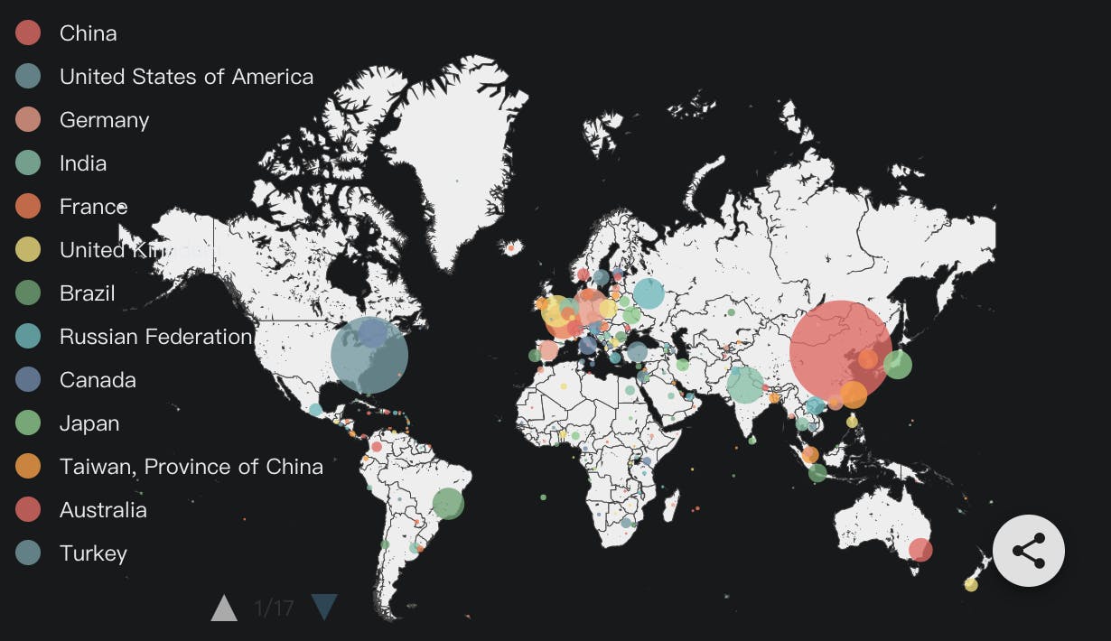
Which countries & regions favor databases the most?
The map below describes the geographical distribution of database stargazers. The larger and darker the color spots on this map, the more database stargazers are distributed.
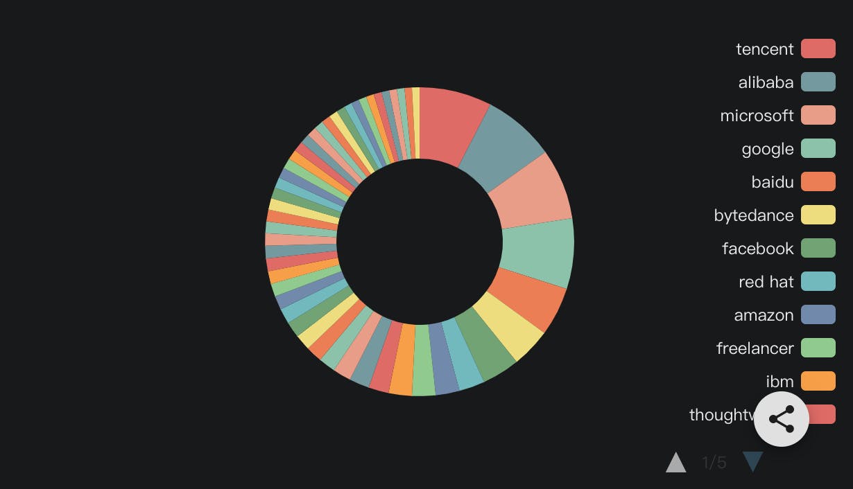
Which companies like databases the most?
The pie chart below describes which company those database stargazers work for and how many stargazers those companies employ.
Database contributors
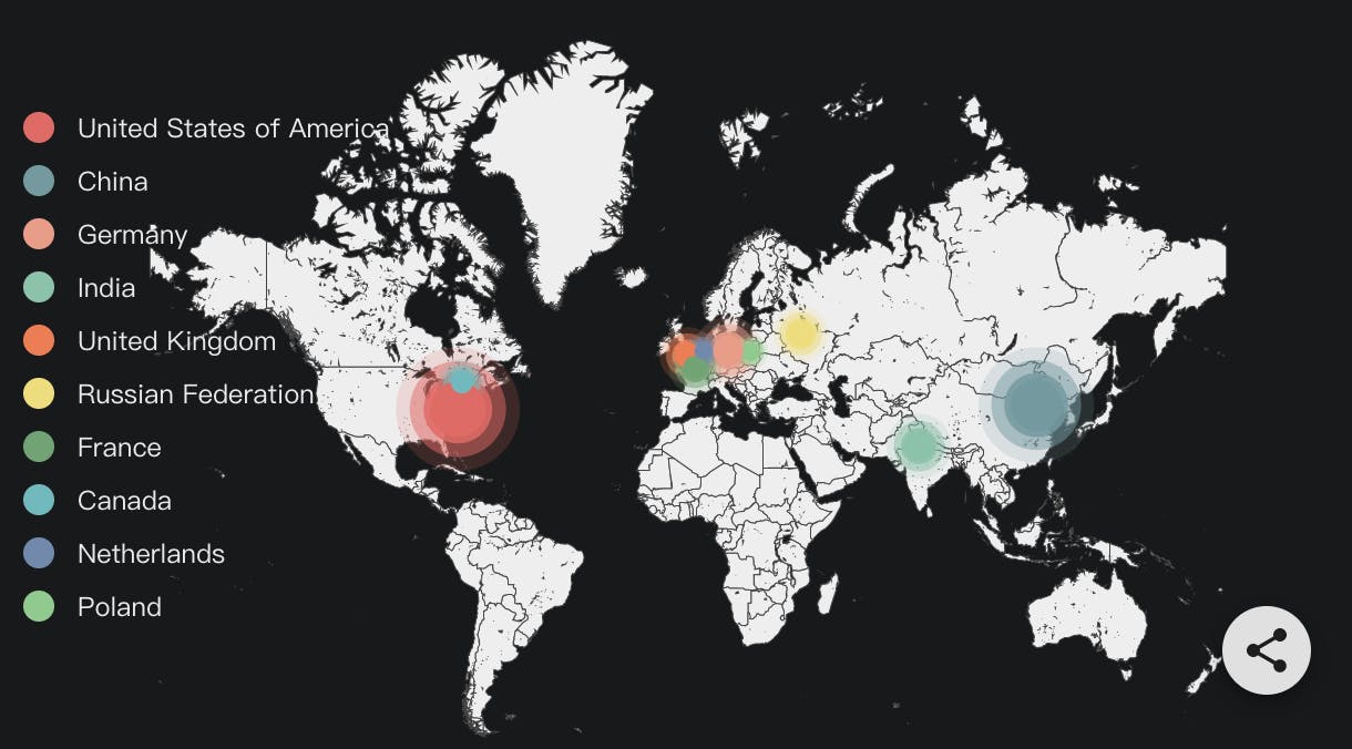
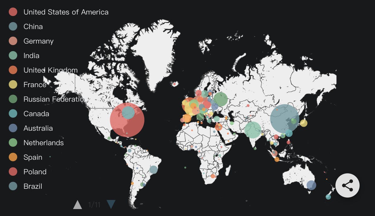
Which countries & regions led the database contributions in 2021?
The map below shows the geographic distribution of developers who pushed commits, resolved issues, or submitted pull requests to open source databases in 2021. The larger and darker the color spots on this map, the more database contributors were distributed.
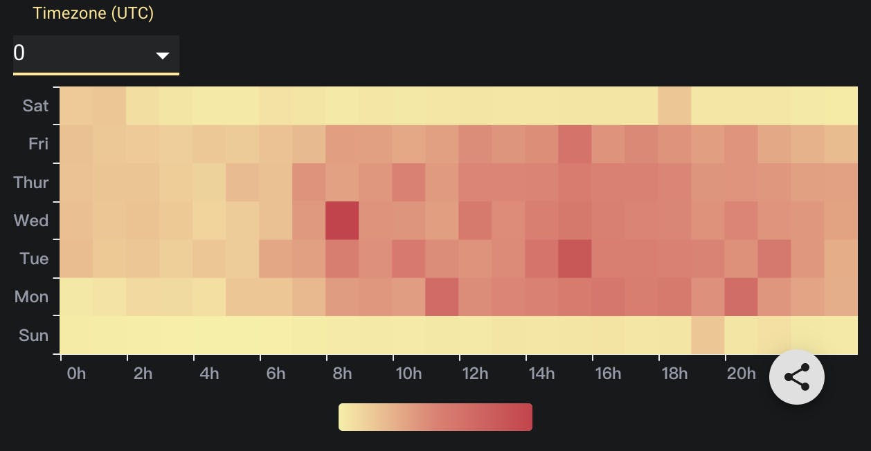
When did developers contribute?
The heat map below describes the number of push events that occur at a particular point of time (UTC). For each day and hour, the colored boxes indicate the number of push events. The lighter the color, the fewer push events; the darker the color, the more push events. You can learn from this heat map what time is the busiest for contributors, and roughly conclude which country or region distributes the most contributors.
Database coding vitality
Contribution trend in the past ten years
The chart below displays the accumulated number of commits pushed by contributors to open source database repositories each year, and their growth trend during the past ten years.
Coming soon
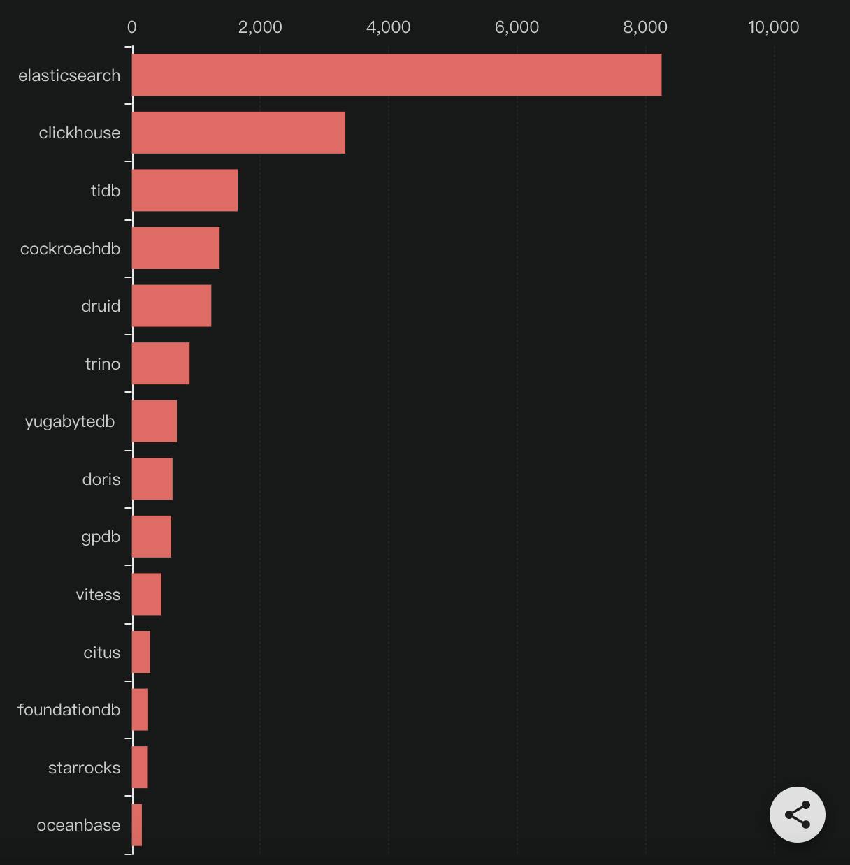
Which databases vibrantly maintains and updates itself in the past ten years?
The chart below displays top 10 open source databases that received the most pull requests in the past ten years.
Coming soon
Which databases vibrantly maintained and updated itself in 2021?
The chart below displays top 10 open source databases that received the most pull requests in 2021 alone.
Database user feedback
Which databases have the widest feedback sources?
The chart below displays the number of issue creators of leading open source databases each year and their growth trend during the past ten years.
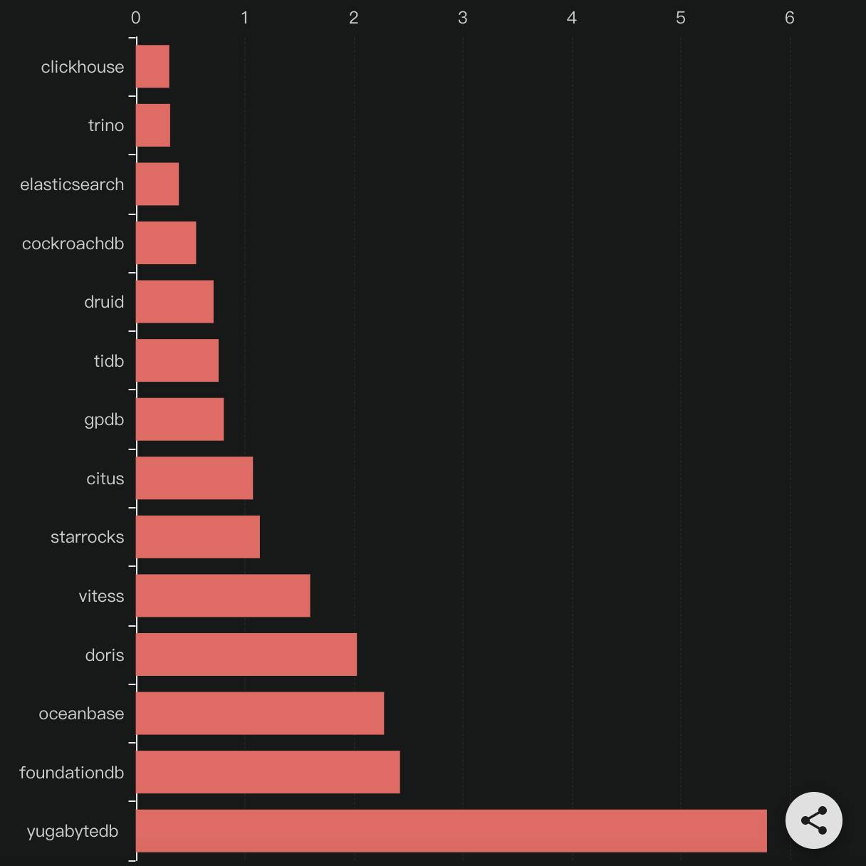
Which databases gave the fastest first response in 2021?
The bar chart below shows the median time each open source database needs to make its first response to an issue.
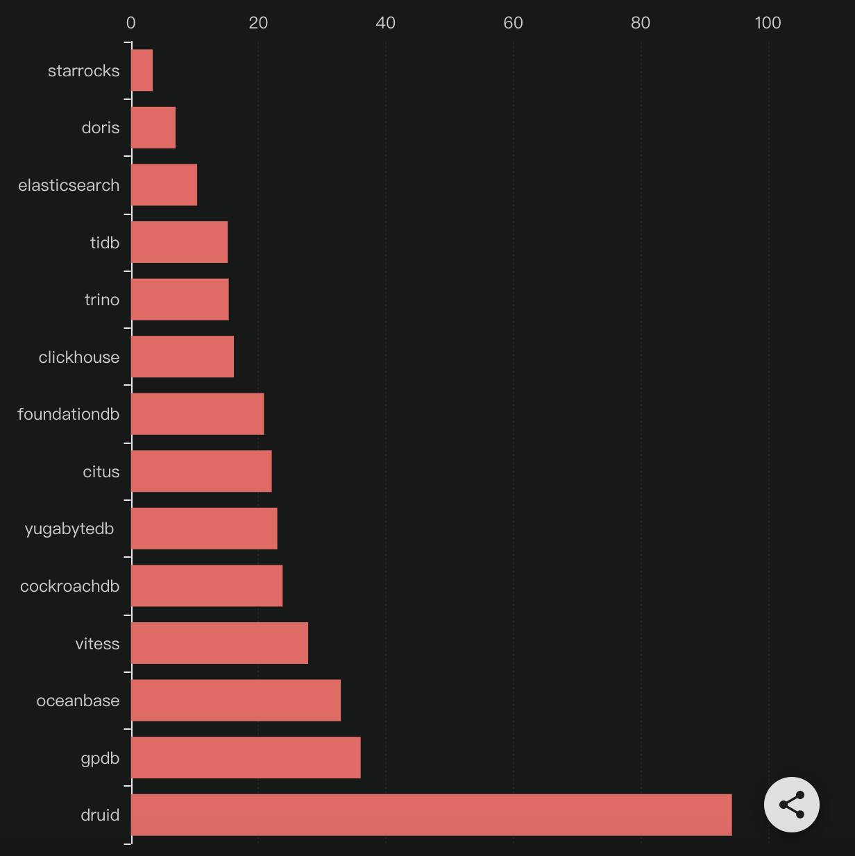
Which databases were the most efficient in feedback resolution in 2021?
The bar chart below shows the median time each open source database needs to close an issue.
Who gave the feedback in 2021?
The map below shows the geographical distribution of developers who submitted issues to open source databases. The larger and darker the color spots on this map, the more issue openers were distributed.
Community Robustness
Contributor growth trend in the past ten years
The chart below shows the accumulated number of contributors leading open source databases attracted respectively each year and their growth trend during the past ten years.
Coming soon
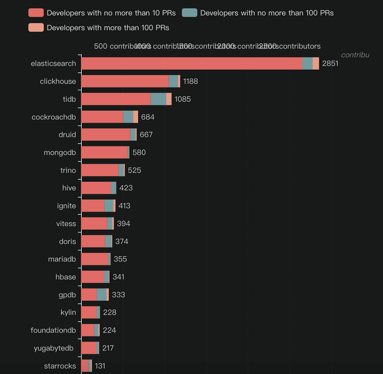
Which databases have the most heavy contributors?
The chart below displays the number of heavy contributors (who submitted more than 100 pull requests), medium contributors (who submitted more than 10 but less than 100 pull requests), and light contributors (who submitted less than 10 pull requests) of leading open source databases. The chart also ranks these databases based on their number of heavy contributors.
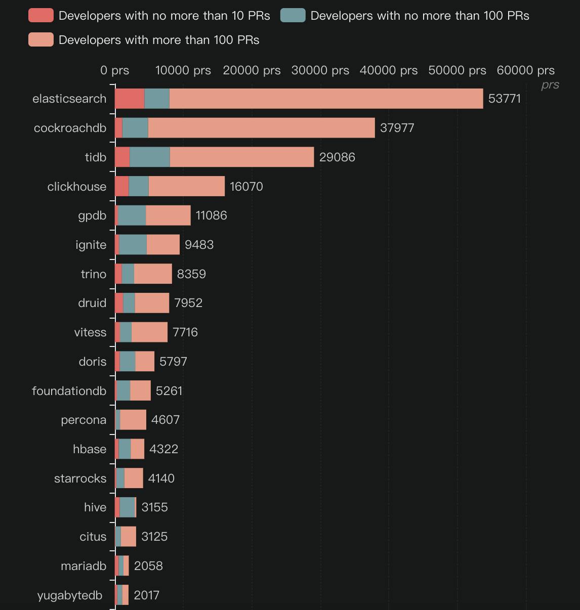
Which databases are heavily contributed?
The chart below displays the number of pull requests submitted by heavy contributors, medium contributors, and light contributors. The chart also ranks these databases based on the number of pull requests submitted by heavy contributors.
Database programming languages
Which languages were most favored in the past ten years?
The chart below shows the top programming languages used in open source databases in the past ten years and how many databases used them each year.
Coming soon
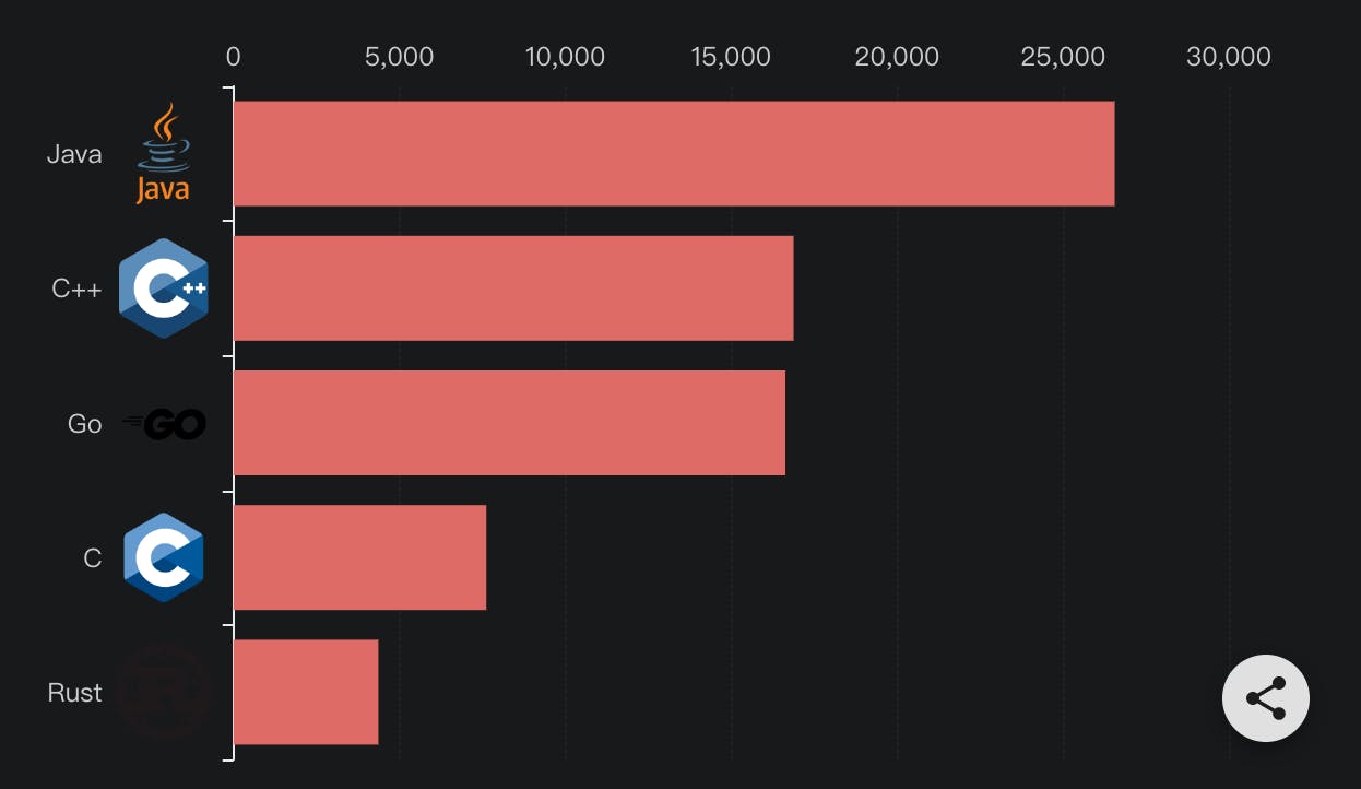
Which languages were most favored in 2021?
The chart below shows the top programming languages used in pull requests submitted to open source databases in 2021.
More content and specific SQL can go into the official website to learn more. ossinsight.io/blog/deep-insight-into-open-…