About the ‘But it looks different on the Specs’ effect, UI Toolkits and other stuff.
Two planets but at least the same Solar System! And that’s the end of the analogy with planets.
Allergy Advice
This is an article about Design Systems, particularly on the topic of UI Toolkits and the dynamics of the communication between Designers and Developers.
Designers, something tells me that you know about Design Systems and that you may dig them :) In case you want to read more, Nathan Curtis wrote a lot about it. I do love and respect his work on Design Systems.
Developers, I’m going to show some code at the end. The playground is a React + CSS-in-JS library (such as emotion or styled-components) app.
A kind of a typical scenario
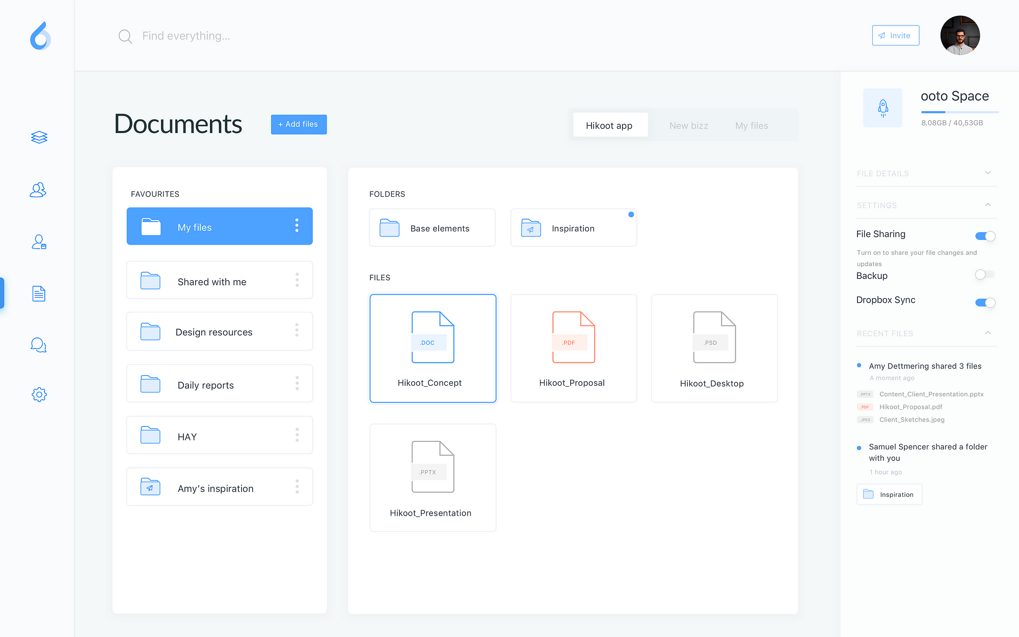
Our Designer produced a series of nice designs, including the layout of our Documents page:
It’s clean, it’s balanced, it’s kinda pleasing to the eye. For the Designers, this is the culmination of a long process, a whole series of tasks involving researching, interviewing, think-ing, review-ing, rethink-ing, white-board-ing, prototyp-ing, wirefram-ing. A fu*k-ing long and tedious process that often Developers are not exposed to.
How did Designers produce this image anyway?
They probably used a design toolkit. A very popular one is Sketch.
Alas, the way this software works is diametrically opposed to the way Developers work. And I say that’s the crux of our matter.
Designers need tools that let them re-iterate quickly, reviewing and updating, feedback after feedback, stakeholder meeting after the other. Designers need tools like Sketch.
Developers, on the other hand, work differently.
They works on ever-changing codebases that at any point in time must produce a working release of an application. It takes effort to implement a layout like the one in our example, designing, abstracting, implementing, refactoring, testing, reviewing, refactoring, bug fixing, refactoring. Developers need to make sure they don’t break anything else or pollute the codebase with bad, duplicated code.

Designers are more like jumping backwards and forwards where Developers work in a continuous loop of development.
The Visual Spec file
Now it’s time for Designers to communicate with Developers, hand off the baton.
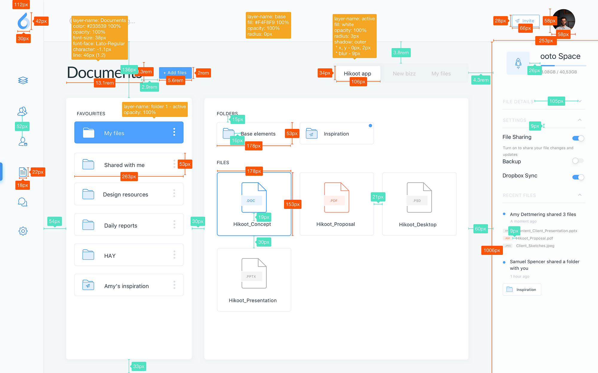
There are layouts, spaces and colors and so on to be documented. Sketch or any other tool doesn’t know much about your current codebase, your file structure, your abstraction, so what Sketch can do? Measure things. And that’s what will be produced:

A few days go by…
Stuff is ready and Designers have the first look at it:


Frustrated Designers, frustrated Developers.
That’s the moment when the enchantment is really broken. The Spec file. Little issues with color, spacing, typography, layout, miscommunicated details, missing behaviours.
Developers will have to interpret and adapt the specs to their own system in the codebase on the fly when they should just worry about implementing the business logic of the new feature. Designers are not to blame though, they may simply not know about such system.
My grandpa used to say:
When Designers and Developers don’t communicate well, get a Design System with a well shared and communicated set of tools, abstractions and constrains.
You need a good UI Toolkit
It’s through a shared system that Designers and Developers can really communicate effectively without stress. A UI Toolkit aims to reinforce the principles documented in a Design System. It is governed by a highly shared and documented set of conventions, UI patterns, behaviours, designed, tested and agreed by everyone. It’s where Designers and Developers efforts meet.
Why you really need a good UI Toolkit
- Is your app getting increasingly more complex?
- Designers are talking quite a lot about insconsistencies on the app?
- CI/CD? Going fast fast fast?
- Remote teams?
- Getting a bit messy with those CSS files?
- Starting to care about the size of the app?
- Is the User Experience at the core of your business model?
You don’t need to tick all the checks, even one may be enough :)
Why you need Your Own UI Toolkit
A Design System is all about the Language. Visual language, UI Design language, etc. It takes a lot of effort to define your own: Product, Design, Engineering, all these departments will be heavily involved.
A lot of times that’s just not a viable option. There are amazing frameworks out there, semantic-ui, ant-design,Bootstrap, Material-UI. They all come with a sort of pre-made Language and a battle-tested UI Toolkit, ready for you to use.
The catch? My opinion? Soon enough they won’t fit you anymore. You will want to evade from it. Besides, the UI toolkit are probably so engineered to be hard to control. Remember that those frameworks are made to pass countless cases, maybe more than what you need. Plus, this extra complexity is paid in kb as well.
Steal as an artist
Do not adopt a UI Toolkit. Copy from others instead, and by that I mean take the bits that fits you the most and implement them from scratch. It’s now common for highly user centric companies to have their own Design System, many of them open sourced!
Look at this list of Design Systems: https://adele.uxpin.com:
and dozens more. And in the end it’s all a matter of designing and delivering this together. It’s about building something specific for your domain, also unique and representative of your brand. It’s rewarding and you get to give it a nice name too :)
Let’s make one
I’m gonna show you how easy it is to bootstrap our own Design System.
I’m gonna call it Larry.
Let’s take a little portion of our layout and try to build it from scratch:

End result first
The following CodeSandbox is the one and only app in the world that implements Larry:
You can find Larry on GitHub: https://github.com/albinotonnina/larry
The Documentation
This bit is the most important. Who is in charge of this, maybe Designers? Well typically yes but trust me on this, you should be both equally involved in documenting your Language. You should both agree on literally everything here.
Let’s start defining some really basic conventions:
Colors
Let’s generate a palette for our layout.
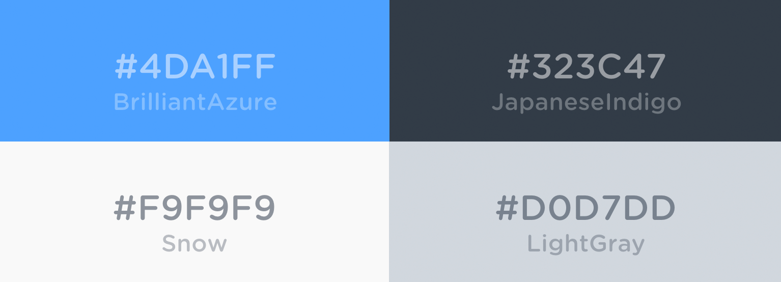
I suggest to define a series of semantic names from these colors, like so:
headerText = JapaneseIndigo
paragraphText = JapaneseIndigo
elementBackgroundDefault = Snow
elementBackgroundHover = BrilliantAzure
elementButton = LightGray — alpha 60%
These are the names you’re both gonna use when speccing (which is a word).
Spacing
Pay extra attention to spacing. Without a clear strategy for spacing things can go really wrong.
Define and agree on a spacing system, for example:
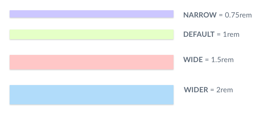
A spec file would look like this:
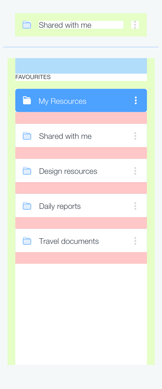
Typography
Make sure that font-sizes, font-weights, line-heights, margins, colors in your headings, your paragraphs etc just match. Call them with names you like, eg. HeaderHuge, HeaderLarge, HeaderTiny or use semantic tags (h1, h2, h3) properly. Just make sure you are aligned on this.
Patterns
What rhymes with UI Toolkit? Pattern library! You need to start populating your library of patterns. What you want is to have the components that you need to behave the way you agreed so you can compose them the way you want, anytime you want.
Start from the particles, primitives such a Box component, for when you have to set spacings and borders around something else.
Add more specialised new particles, such as a Text component or a Flex component, which you could imagine as a Box component + some flex utilities.
See them as particles that live in isolation, not aware of the context in which they will be used and of the space that should exist around them.
Continue with more complex UI Components, compositions of other smallest components and so on.
What’s important here is not the technology or which kind of abstractions in your documentation. What’s important is that you do this together.
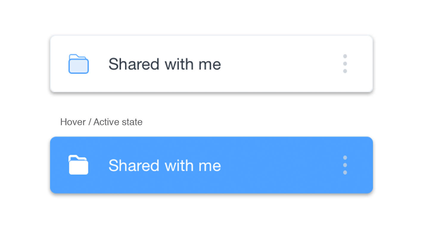 Example of a more complex UI Component
You got the gist?
You have defined constants and you have some particles to build.
You will reiterate over this particles and extend the library pretty quickly, so embrace and prepare for elasticity. Developers, you don’t want Designers to finish documenting the entire System before starting to implement the code. You have to do this thing together or it won’t just take off.
So, Designers and Developers,** straight after the article go make your own Larry **if you don’t have one!
Code
You have a copy of Larry, you can clone and play with it. Your Larry may be different or you may be using different frameworks so I’m going to go through the key points of this approach.
Theme, define the constants
It’s an object with our theme constants, so spaces definitions, colors, fonts, typography, breakpoints, anything. Here’s Larry’s theme, and here’s a sample version of it:
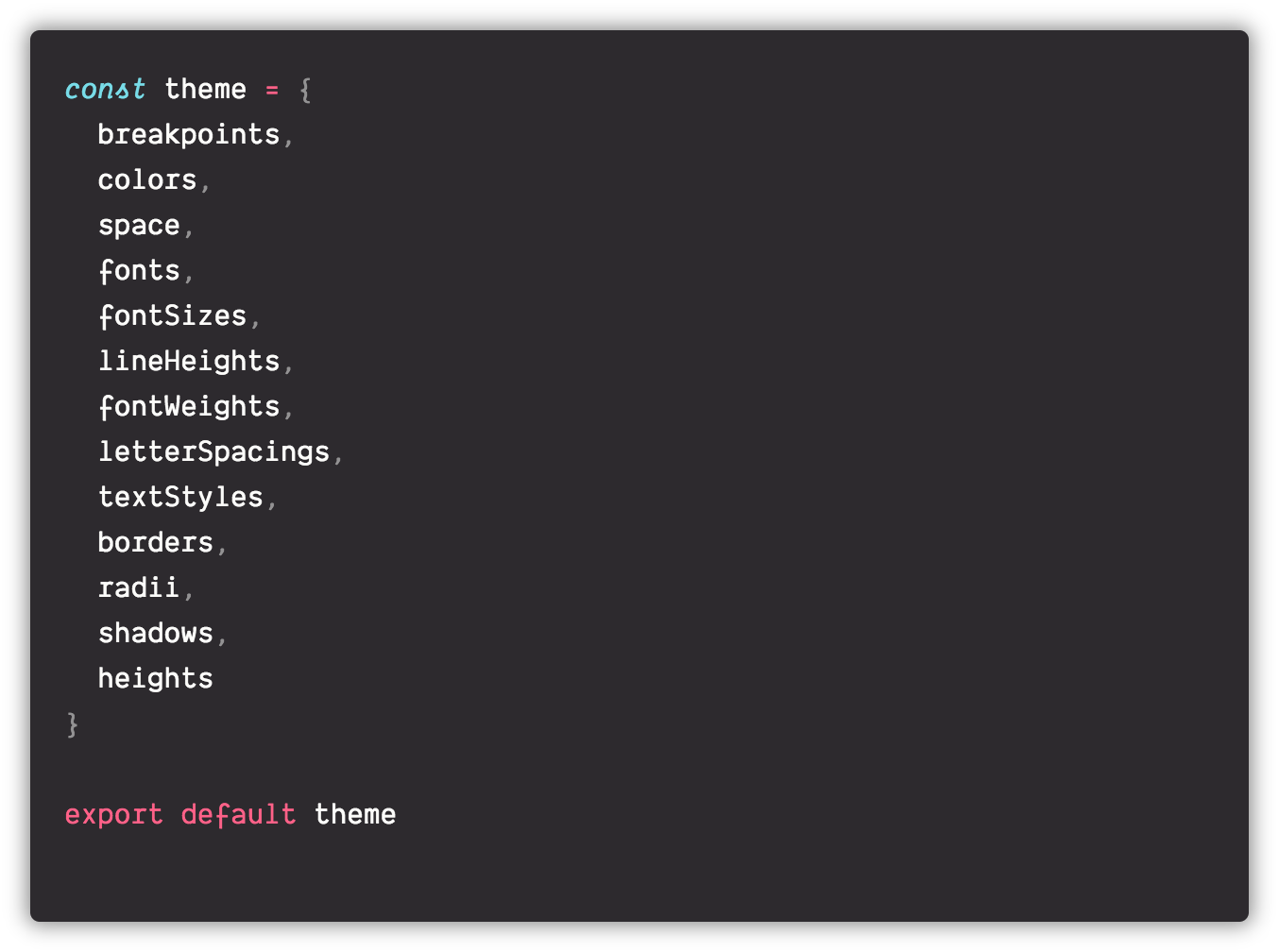
There’s no limit to the complexity/completeness you can achieve here, after all it’s a matter of generating a JavaScript object, just imagine what you could do!

This is a core file. Every color, margin or padding, font-size or font-weight or breakpoint must come from here and only from here.
CSS-in_JS libraries are amazing tools, styled-system makes them even better. It’s a set of utilities for Design Systems and consist of functions that take props as an argument and return style objects, while making it simpler to use values from a theme and apply styles responsively across breakpoints.
This approach take advantage of this utilities, feel free to evaluate it.
Plug the theme into your app
Provide those constants to your app: every component in the app will have access to our theme constants.
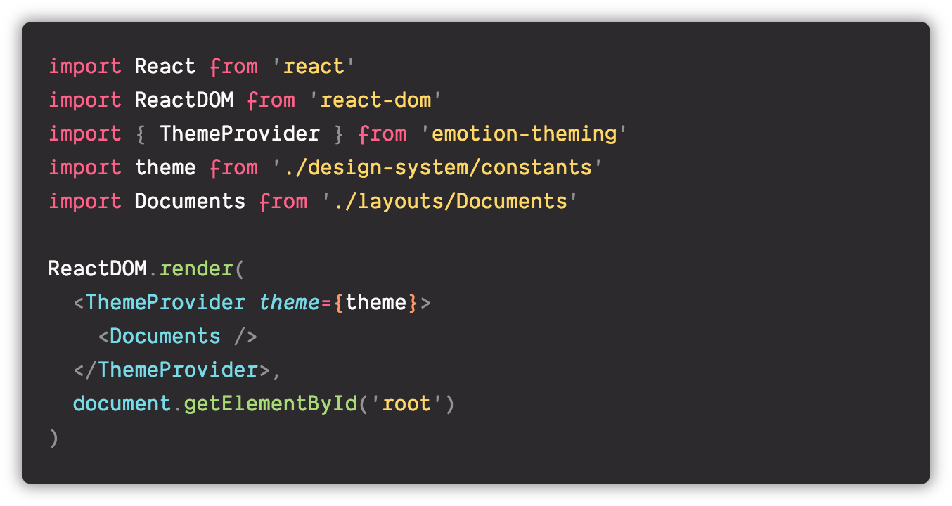
Create basic UI Components
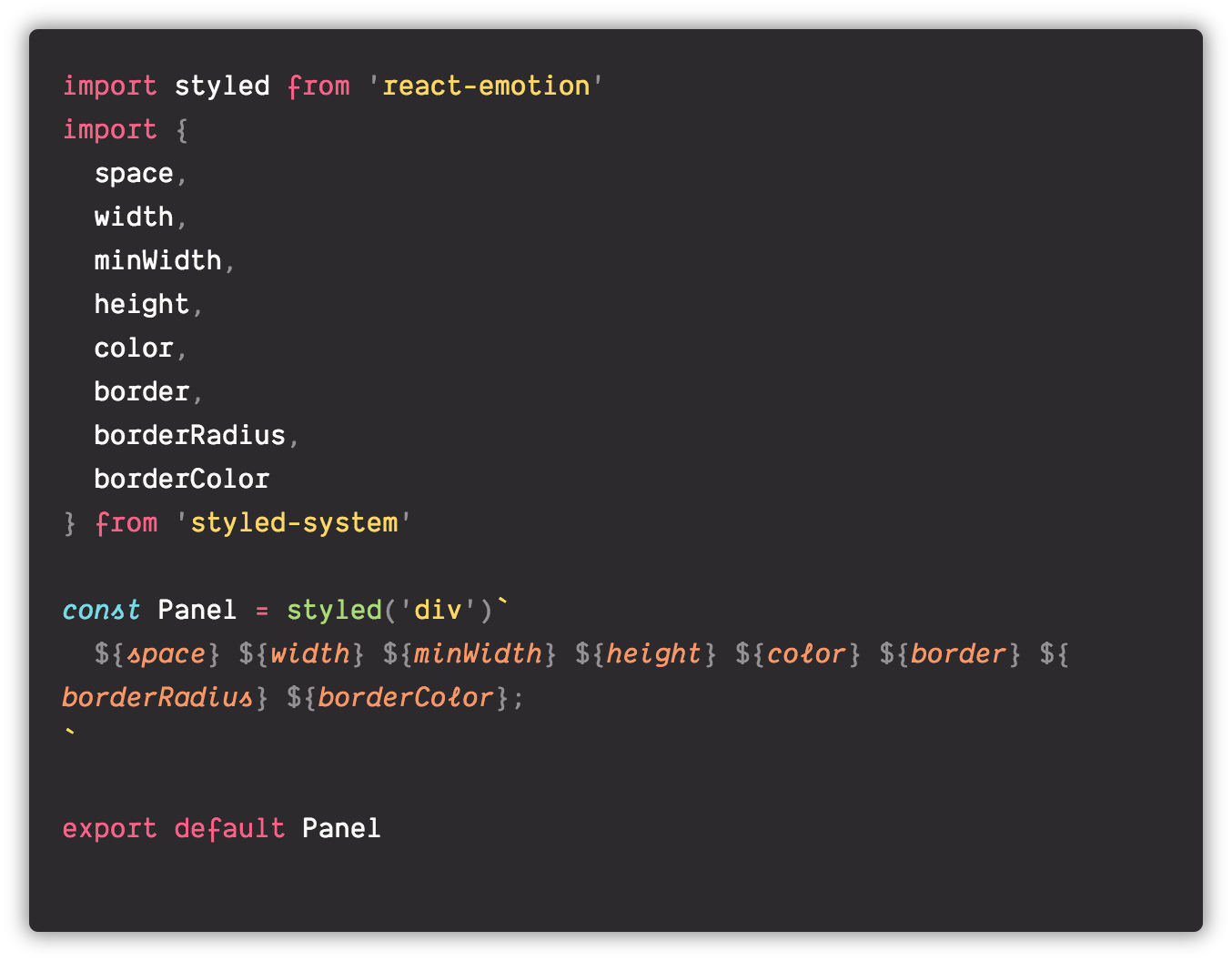 a primitive Box UI Component
More specialised UI components
Here’s a Flex component.
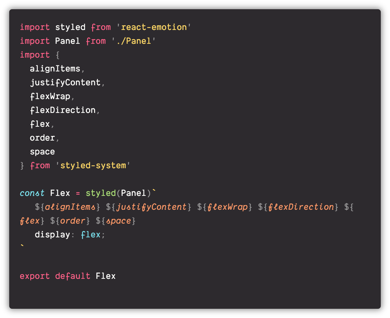
Implement UI components in your feature files

Time to render something
This is where you implement your UI Component and your business logic.

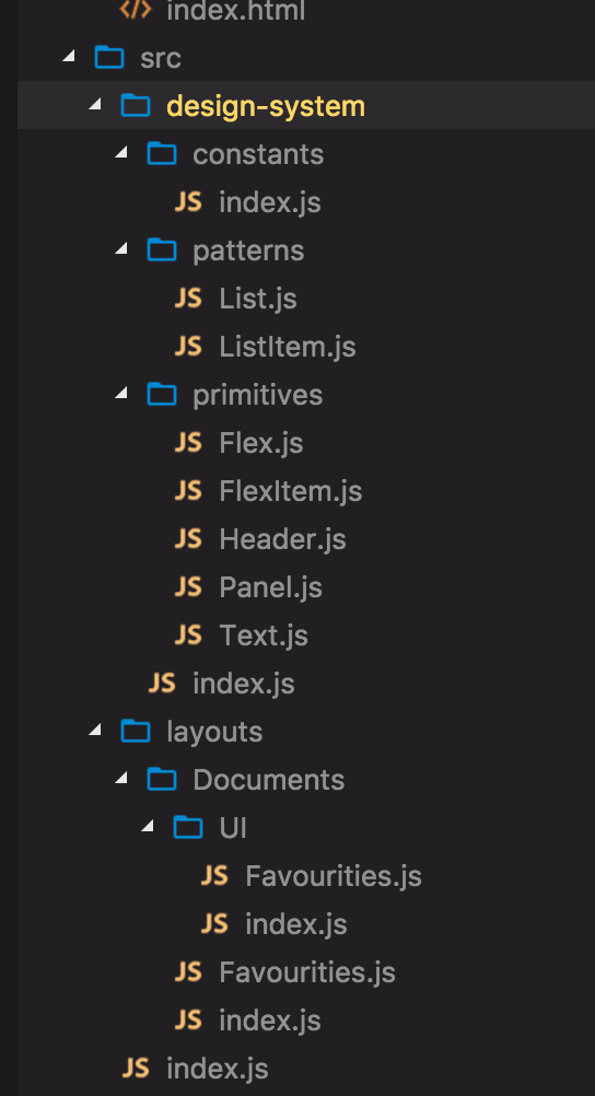
The files structure
This is Larry’s file structure. I don’t have strong opinions on file structures, actually I believe in something different: move around your files until you feel comfortable with them.
Larry is all into a “design-system” folder, this is where you can find its constants and generic and reusable UI components.
Notice also the UI folder into the Document layout folder, that’s where I define and export the UI components specific for our feature.
Conclusion
With large and complex apps, it’s never easy to keep the UI consistent and cohesive. Design Systems help. Custom Design Systems and tailored UI Toolkit really help.
Designers and Developers may have very different approaches to the same problem but that doesn’t mean that they cannot communicate effectively.
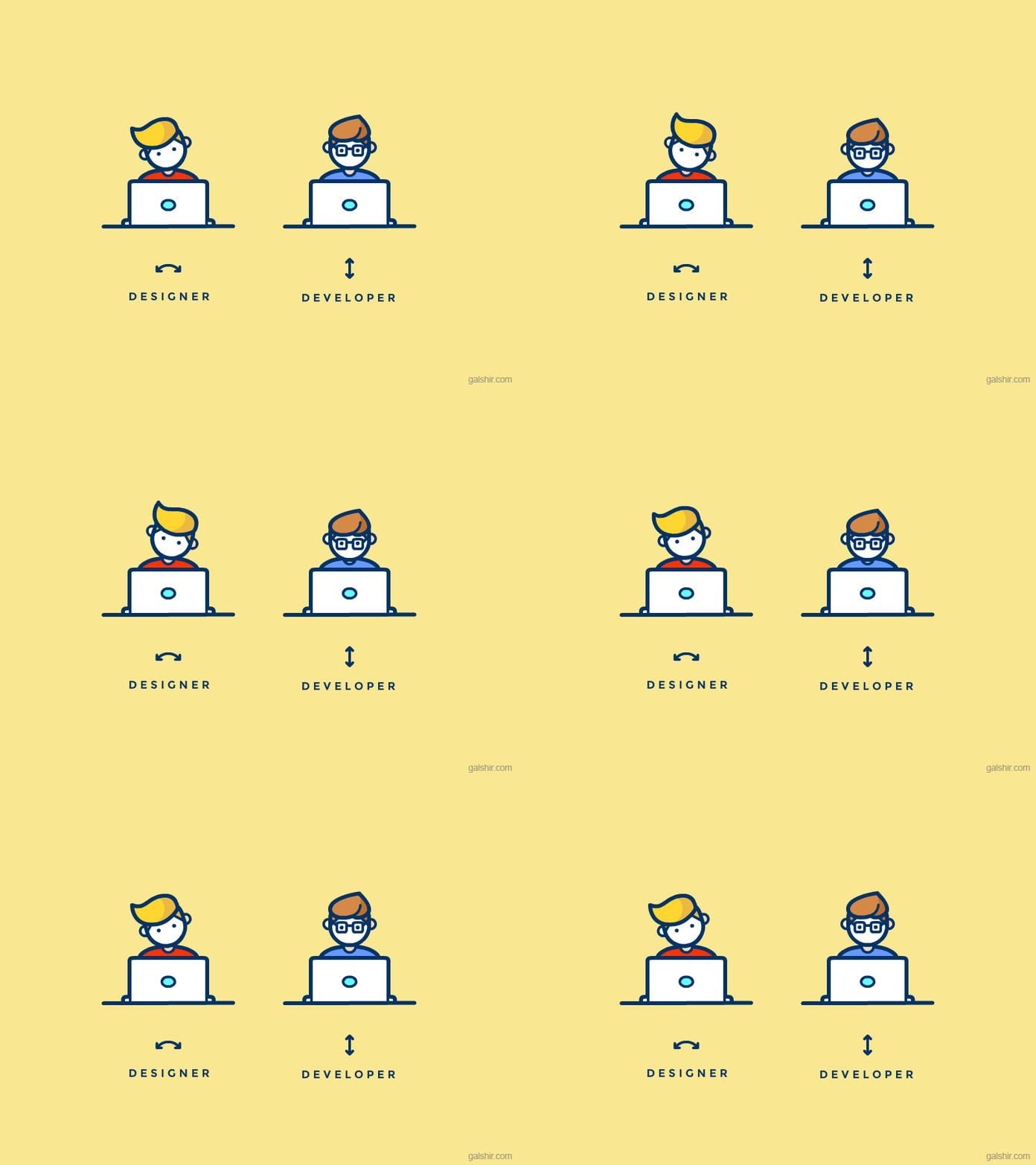 https://dribbble.com/shots/2712522-Designer-vs-Developer
Thank you for reading
Do you have positive experiences to share?
Hello, my name is Albino Tonnina, I’m a Software Engineer who works in London, you can find me on Twitter or Github or Instagram or around the city.

My latest articles
How to Lose an IT Job in 10 Minutes Speaking of web layouts…introducing the Magic Hat technique 🎩✨
Follow me on Twitter!
