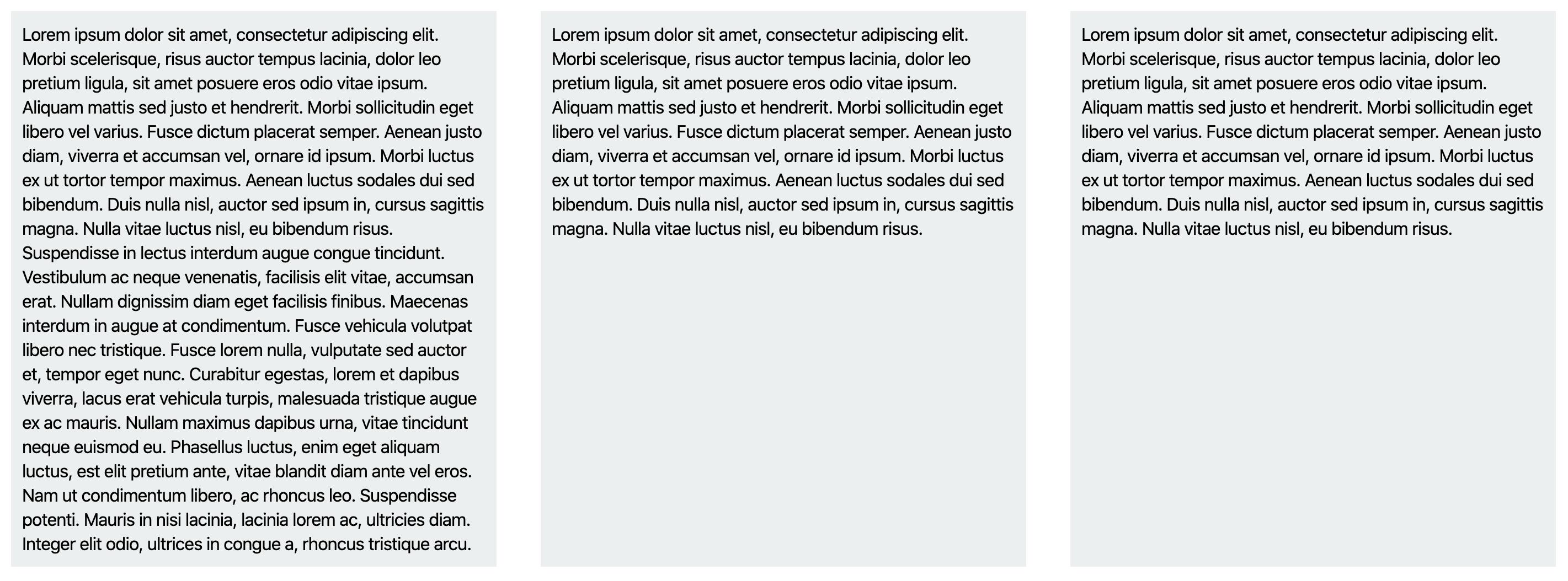
Easily create equal height columns with CSS Flexbox
Do you know with CSS Flexbox a lot of traditional layout challenges can be solved in a few lines of code? One such challenge was to create equal heights columns with CSS.
So, here's what you can do to achieve it:
HTML
<div class="columns-wrapper">
  <div class="column">
    Lorem ipsum dolor sit amet, consectetur adipiscing elit……
  </div>
  <div class="column">
    Lorem ipsum dolor sit amet, consectetur adipiscing elit……
  </div>
    <div class="column">
    Lorem ipsum dolor sit amet, consectetur adipiscing elit……
  </div>
</div>
CSS
.columns-wrapper{
  display: flex;
  flex-direction: row;
}

.column{
// apply your styles here for the column.
}
Output:

Please see:
If you have used flex-align CSS property, the boxes will resize themselves and won't have equal heights. So, you need to remove flex-align for them to have equal heights.
I hope that helps! ✌️