

Exploratory Data Analysis for Natural Language Processing: A Complete Guide to Python Tools


This article was originally posted by Shahul Es on the Neptune blog.
Exploratory data analysis is one of the most important parts of any machine learning workflow and Natural Language Processing is no different. But which tools you should choose to explore and visualize text data efficiently?
In this article, we will discuss and implement nearly all the major techniques that you can use to understand your text data and give you a complete(ish) tour into Python tools that get the job done.
Before we start: Dataset and Dependencies
In this article, we will use a million news headlines dataset from Kaggle.
If you want to follow the analysis step-by-step you may want to install the following libraries:
pip install \
   pandas matplotlib numpy \
   nltk seaborn sklearn gensim pyldavis \
   wordcloud textblob spacy textstat
Now, we can take a look at the data.
news= pd.read_csv('data/abcnews-date-text.csv',nrows=10000)
news.head(3)

The dataset contains only two columns, the published date, and the news heading.
For simplicity, I will be exploring the first 10000 rows from this dataset. Since the headlines are sorted by publish_date it is actually 2 months from February/19/2003 until April/07/2003.
Ok, I think we are ready to start our data exploration!
Analyzing text statistics
Text statistics visualizations are simple but very insightful techniques.
They include:
- word frequency analysis,
- sentence length analysis,
- average word length analysis,
- etc.
Those really help explore the fundamental characteristics of the text data.
To do so, we will be mostly using histograms (continuous data) and bar charts (categorical data).
First, I’ll take a look at the number of characters present in each sentence. This can give us a rough idea about the news headline length.
news['headline_text'].str.len().hist()

Code Snippet that Generates this Chart
The histogram shows that news headlines range from 10 to 70 characters and generally, it is between 25 to 55 characters.
Now, we will move on to data exploration at a word-level. Let’s plot the number of words appearing in each news headline.
text.str.split().\
    map(lambda x: len(x)).\
    hist()

Code Snippet that Generates this Chart
It is clear that the number of words in news headlines ranges from 2 to 12 and mostly falls between 5 to 7 words.
Up next, let’s check the average word length in each sentence.
news['headline_text'].str.split().\
   apply(lambda x : [len(i) for i in x]). \
   map(lambda x: np.mean(x)).hist()

Code Snippet that Generates this Chart
The average word length ranges between 3 to 9 with 5 being the most common length. Does it meanz that people are using really short words in news headlines?
Let’s find out.
One reason why this may not be true is stopwords. Stopwords are the words that are most commonly used in any language such as “the”,” a”,” an” etc. As these words are probably small in length these words may have caused the above graph to be left-skewed.
Analyzing the amount and the types of stopwords can give us some good insights into the data.
To get the corpus containing stopwords you can use the nltk library. Nltk contains stopwords from many languages. Since we are only dealing with English news I will filter the English stopwords from the corpus.
import nltk
nltk.download('stopwords')
stop=set(stopwords.words('english'))
Now, we’ll create the corpus.
corpus=[]
new= news['headline_text'].str.split()
new=new.values.tolist()
corpus=[word for i in new for word in i]
from collections import defaultdict
dic=defaultdict(int)
for word in corpus:
    if word in stop:
        dic[word]+=1
and plot top stopwords.

Code Snippet that Generates this Chart
We can evidently see that stopwords such as “to”,” in” and “for” dominate in news headlines.
So now we know which stopwords occur frequently in our text, let’s inspect which words other than these stopwords occur frequently.
We will use the counter function from the collections library to count and store the occurrences of each word in a list of tuples. This is a very useful function when we deal with word-level analysis in natural language processing.
counter=Counter(corpus)
most=counter.most_common()
x, y= [], []
for word,count in most[:40]:
    if (word not in stop):
        x.append(word)
        y.append(count)

sns.barplot(x=y,y=x)

Code Snippet that Generates this Chart
Wow! The “us”, “Iraq” and “war” dominate the headlines over the last 15 years.
Here ‘us’ could mean either the USA or us (you and me). us is not a stopword, but when we observe other words in the graph they are all related to the US — Iraq war and “us” here probably indicate the USA.
Ngram exploration
Ngrams are simply contiguous sequences of n words. For example “riverbank”,” The three musketeers” etc. If the number of words is two, it is called bigram. For 3 words it is called a trigram and so on.
Looking at most frequent n-grams can give you a better understanding of the context in which the word was used.
To implement n-grams we will use ngrams function from nltk.util. For example:
from nltk.util import ngrams
list(ngrams(['I' ,'went','to','the','river','bank'],2))

Now that we know how to create n-grams lets visualize them.
To build a representation of our vocabulary we will use Countvectorizer. Countvectorizer is a simple method used to tokenize, vectorize and represent the corpus in an appropriate form. It is available in sklearn.feature_engineering.text.
So with all this, we will analyze the top bigrams in our news headlines.
def get_top_ngram(corpus, n=None):
    vec = CountVectorizer(ngram_range=(n, n)).fit(corpus)
    bag_of_words = vec.transform(corpus)
    sum_words = bag_of_words.sum(axis=0)
    words_freq = [(word, sum_words[0, idx])
                  for word, idx in vec.vocabulary_.items()]
    words_freq =sorted(words_freq, key = lambda x: x[1], reverse=True)
    return words_freq[:10]
top_n_bigrams=get_top_ngram(news['headline_text'],2)[:10]
x,y=map(list,zip(*top_n_bigrams))
sns.barplot(x=y,y=x)

Code Snippet that Generates this Chart
We can observe that the bigrams such as ‘anti-war’, ’killed in’ that are related to war dominate the news headlines.
How about trigrams?
top_tri_grams=get_top_ngram(news['headline_text'],n=3)
x,y=map(list,zip(*top_tri_grams))
sns.barplot(x=y,y=x)

Code Snippet that Generates this Chart
We can see that many of these trigrams are some combinations of “to face court” and “anti war protest”. It means that we should put some effort into data cleaning and see if we were able to combine those synonym terms into one clean token.
Topic Modeling exploration with pyLDAvis
Topic modeling is the process of using unsupervised learning techniques to extract the main topics that occur in a collection of documents.
Latent Dirichlet Allocation (LDA) is an easy to use and efficient model for topic modeling. Each document is represented by the distribution of topics and each topic is represented by the distribution of words.
Once we categorize our documents in topics we can dig into further data exploration for each topic or topic group.
But before getting into topic modeling we have to pre-process our data a little. We will:
- tokenize: the process by which sentences are converted to a list of tokens or words.
- remove stopwords
- lemmatize: reduces the inflectional forms of each word into a common base or root.
- convert to the bag of words: Bag of words is a dictionary where the keys are words(or ngrams/tokens) and values are the number of times each word occurs in the corpus.
With NLTK you can tokenize and lemmatize easily:
import nltk
nltk.download('punkt')
nltk.download('wordnet')
def preprocess_news(df):
    corpus=[]
    stem=PorterStemmer()
    lem=WordNetLemmatizer()
    for news in df['headline_text']:
        words=[w for w in word_tokenize(news) if (w not in stop)]

        words=[lem.lemmatize(w) for w in words if len(w)>2]

        corpus.append(words)
    return corpus
corpus=preprocess_news(news)
Now, let’s create the bag of words model using gensim
dic=gensim.corpora.Dictionary(corpus)
bow_corpus = [dic.doc2bow(doc) for doc in corpus]
and we can finally create the LDA model:
lda_model = gensim.models.LdaMulticore(bow_corpus,
                                   num_topics = 4,
                                   id2word = dic,
                                   passes = 10,
                                   workers = 2)
lda_model.show_topics()

The topic 0 indicates something related to the Iraq war and police. Topic 3 shows the involvement of Australia in the Iraq war.
You can print all the topics and try to make sense of them but there are tools that can help you run this data exploration more efficiently. One such tool is pyLDAvis which visualizes the results of LDA interactively.
pyLDAvis.enable_notebook()
vis = pyLDAvis.gensim.prepare(lda_model, bow_corpus, dic)
vis
{% youtube IcJKA0QN0QY %}
Code Snippet that Generates this Chart
- On the left side, the area of each circle represents the importance of the topic relative to the corpus. As there are four topics, we have four circles.
- The distance between the center of the circles indicates the similarity between the topics. Here you can see that the topic 3 and topic 4 overlap, this indicates that the topics are more similar.
- On the right side, the histogram of each topic shows the top 30 relevant words. For example, in topic 1 the most relevant words are police, new, may, war, etc
So in our case, we can see a lot of words and topics associated with war in the news headlines.
Wordcloud
Wordcloud is a great way to represent text data. The size and color of each word that appears in the wordcloud indicate it’s frequency or importance.
Creating wordcloud in python with is easy but we need the data in a form of a corpus. Luckily, I prepared it in the previous section.
from wordcloud import WordCloud, STOPWORDS
stopwords = set(STOPWORDS)
def show_wordcloud(data):
    wordcloud = WordCloud(
        background_color='white',
        stopwords=stopwords,
        max_words=100,
        max_font_size=30,
        scale=3,
        random_state=1)

    wordcloud=wordcloud.generate(str(data))
    fig = plt.figure(1, figsize=(12, 12))
    plt.axis('off')
    plt.imshow(wordcloud)
    plt.show()
show_wordcloud(corpus)

Code Snippet that Generates this Chart
Again, you can see that the terms associated with the war are highlighted which indicates that these words occurred frequently in the news headlines.
There are many parameters that can be adjusted. Some of the most prominent ones are:
- stopwords: The set of words that are blocked from appearing in the image.
- max_words: Indicates the maximum number of words to be displayed.
- max_font_size: maximum font size.
There are many more options to create beautiful word clouds. For more details, you can refer here.
Sentiment analysis
Sentiment analysis is a very common natural language processing task in which we determine if the text is positive, negative or neutral. This is very useful for finding the sentiment associated with reviews, comments which can get us some valuable insights out of text data.
There are many projects that will help you do sentiment analysis in python. I personally like TextBlob and Vader Sentiment.
Textblob
Textblob is a python library built on top of nltk. It has been around for some time and is very easy and convenient to use. The sentiment function of TextBlob returns two properties:
- polarity: is a floating-point number that lies in the range of [-1,1] where 1 means positive statement and -1 means a negative statement.
- subjectivity: refers to how someone’s judgment is shaped by personal opinions and feelings. Subjectivity is represented as a floating-point value which lies in the range of [0,1].
I will run this function on our news headlines.
from textblob import TextBlob
TextBlob('100 people killed in Iraq').sentiment

TextBlob claims that the text “100 people killed in Iraq” is negative and is not an opinion or feeling but rather a factual statement. I think we can agree with TextBlob here.
Now that we know how to calculate those sentiment scores we can visualize them using a histogram and explore data even further.
def polarity(text):
    return TextBlob(text).sentiment.polarity
news['polarity_score']=news['headline_text'].\
   apply(lambda x : polarity(x))
news['polarity_score'].hist()

Code Snippet that Generates this Chart
You can see that the polarity mainly ranges between 0.00 and 0.20. This indicates that the majority of the news headlines are neutral.
Let’s dig a bit deeper by classifying the news as negative, positive and neutral based on the scores.
def sentiment(x):
    if x<0:
        return 'neg'
    elif x==0:
        return 'neu'
    else:
        return 'pos'

news['polarity']=news['polarity_score'].\
   map(lambda x: sentiment(x))
plt.bar(news.polarity.value_counts().index,
        news.polarity.value_counts())

Code Snippet that Generates this Chart
Yep, 70 % of news is neutral with only 18% of positive and 11% of negative.
Let’s take a look at some of the positive and negative headlines.
news[news['polarity']=='pos']['headline_text'].head()

Positive news headlines are mostly about some victory in sports.
news[news['polarity']=='neg']['headline_text'].head()

Yep, pretty negative news headlines indeed.
Vader Sentiment Analysis
The next library we are going to discuss is VADER. Vader works better in detecting negative sentiment. It is very useful in the case of social media text sentiment analysis.
VADER or Valence Aware Dictionary and Sentiment Reasoner is a rule/lexicon-based, open-source sentiment analyzer pre-built library, protected under the MIT license.
VADER sentiment analysis class returns a dictionary that contains the probabilities of the text for being positive, negative and neutral. Then we can filter and choose the sentiment with most probability.
We will do the same analysis using VADER and check if there is much difference.
from nltk.sentiment.vader import SentimentIntensityAnalyzer
nltk.download('vader_lexicon')
sid = SentimentIntensityAnalyzer()
def get_vader_score(sent):
    # Polarity score returns dictionary
    ss = sid.polarity_scores(sent)
    #return ss
    return np.argmax(list(ss.values())[:-1])
news['polarity']=news['headline_text'].\
    map(lambda x: get_vader_score(x))
polarity=news['polarity'].replace({0:'neg',1:'neu',2:'pos'})
plt.bar(polarity.value_counts().index,
        polarity.value_counts())

Code Snippet that Generates this Chart
Yep, there is a slight difference in distribution. Even more headlines are classified as neutral 85 % and the number of negative news headlines has increased (to 13 %).
Named Entity Recognition
Named entity recognition is an information extraction method in which entities that are present in the text are classified into predefined entity types like “Person”,” Place”,” Organization”, etc. By using NER we can get great insights about the types of entities present in the given text dataset.
Let us consider an example of a news article.

In the above news, the named entity recognition model should be able to identify entities such as RBI as an organization, Mumbai and India as Places, etc.
There are three standard libraries to do Named Entity Recognition:
In this tutorial, I will use spaCy which is an open-source library for advanced natural language processing tasks. It is written in Cython and is known for its industrial applications. Besides NER, spaCy provides many other functionalities like pos tagging, word to vector transformation, etc.
SpaCy’s named entity recognition has been trained on the OntoNotes 5 corpus and it supports the following entity types:

There are three pre-trained models for English in spaCy. I will use en_core_web_sm for our task but you can try other models.
To use it we have to download it first:
python -m spacy download en_core_web_sm
Now we can initialize the language model:
import spacy
nlp = spacy.load("en_core_web_sm")
One of the nice things about Spacy is that we only need to apply nlp function once, the entire background pipeline will return the objects we need.
doc=nlp('India and Iran have agreed to boost the economic viability \
of the strategic Chabahar port through various measures, \
including larger subsidies to merchant shipping firms using the facility, \
people familiar with the development said on Thursday.')
[(x.text,x.label_) for x in doc.ents]

We can see that India and Iran are recognized as Geographical locations (GPE), Chabahar as Person and Thursday as Date.
We can also visualize the output using displacy module in spaCy.
from spacy import displacy
displacy.render(doc, style='ent')

This creates a very neat visualization of the sentence with the recognized entities where each entity type is marked in different colors.
Now that we know how to perform NER we can explore the data even further by doing a variety of visualizations on the named entities extracted from our dataset.
First, we will run the named entity recognition on our news headlines and store the entity types.
def ner(text):
    doc=nlp(text)
    return [X.label_ for X in doc.ents]
ent=news['headline_text'].\
    apply(lambda x : ner(x))
ent=[x for sub in ent for x in sub]
counter=Counter(ent)
count=counter.most_common()
Now, we can visualize the entity frequencies:
x,y=map(list,zip(*count))
sns.barplot(x=y,y=x)

Code Snippet that Generates this Chart
Now we can see that the GPE and ORG dominate the news headlines followed by the PERSON entity.
We can also visualize the most common tokens per entity. Let’s check which places appear the most in news headlines.
def ner(text,ent="GPE"):
    doc=nlp(text)
    return [X.text for X in doc.ents if X.label_ == ent]
gpe=news['headline_text'].apply(lambda x: ner(x))
gpe=[i for x in gpe for i in x]
counter=Counter(gpe)
x,y=map(list,zip(*counter.most_common(10)))
sns.barplot(y,x)

Code Snippet that Generates this Chart
I think we can confirm the fact that the “us” means the USA in news headlines. Let’s also find the most common names that appeared in news headlines.
per=news['headline_text'].apply(lambda x: ner(x,"PERSON"))
per=[i for x in per for i in x]
counter=Counter(per)
x,y=map(list,zip(*counter.most_common(10)))
sns.barplot(y,x)

Code Snippet that Generates this Chart
Saddam Hussain and George Bush were the presidents of Iraq and the USA during wartime. Also, we can see that the model is far from perfect classifying “vic govt” or “nsw govt” as a person rather than a government agency.
Exploration through Parts of Speach Tagging in python
Parts of speech (POS) tagging is a method that assigns part of speech labels to words in a sentence. There are eight main parts of speech:
- Noun (NN)- Joseph, London, table, cat, teacher, pen, city
- Verb (VB)- read, speak, run, eat, play, live, walk, have, like, are, is
- Adjective(JJ)- beautiful, happy, sad, young, fun, three
- Adverb(RB)- slowly, quietly, very, always, never, too, well, tomorrow
- Preposition (IN)- at, on, in, from, with, near, between, about, under
- Conjunction (CC)- and, or, but, because, so, yet, unless, since, if
- Pronoun(PRP)- I, you, we, they, he, she, it, me, us, them, him, her, this
- Interjection (INT)- Ouch! Wow! Great! Help! Oh! Hey! Hi!
This is not a straightforward task, as the same word may be used in different sentences in different contexts. However, once you do it, there are a lot of helpful visualizations that you can create that can give you additional insights into your dataset.
I will use the nltk to do the parts of speech tagging but there are other libraries that do a good job (spacy, textblob).
Let’s look at an example.
import nltk
sentence="The greatest comeback stories in 2019"
tokens=word_tokenize(sentence)
nltk.pos_tag(tokens)

Note
You can also visualize the sentence parts of speech and its dependency graph with spacy.displacy module.
doc = nlp('The greatest comeback stories in 2019')
displacy.render(doc, style='dep', jupyter=True, options={'distance': 90})

We can observe various dependency tags here. For example, DET tag denotes the relationship between the determiner “the” and the noun “stories”.
You can check the list of dependency tags and their meanings here.
Ok, now that we now what POS tagging is, let’s use it to explore our headlines dataset.
def pos(text):
    pos=nltk.pos_tag(word_tokenize(text))
    pos=list(map(list,zip(*pos)))[1]
    return pos
tags=news['headline_text'].apply(lambda x : pos(x))
tags=[x for l in tags for x in l]
counter=Counter(tags)
x,y=list(map(list,zip(*counter.most_common(7))))
sns.barplot(x=y,y=x)

Code Snippet that Generates this Chart
We can clearly see that the noun (NN) dominates in news headlines followed by the adjective (JJ). This is typical for news articles while for artistic forms higher adjective(ADJ) frequency could happen quite a lot.
You can dig deeper into this by investigating which singular noun occur most commonly in news headlines. Let us find out.
def get_adjs(text):
    adj=[]
    pos=nltk.pos_tag(word_tokenize(text))
    for word,tag in pos:
        if tag=='NN':
            adj.append(word)
    return adj
words=news['headline_text'].apply(lambda x : get_adjs(x))
words=[x for l in words for x in l]
counter=Counter(words)
x,y=list(map(list,zip(*counter.most_common(7))))
sns.barplot(x=y,y=x)

Code Snippet that Generates this Chart
Nouns such as “war”, “iraq”, “man” dominate in the news headlines. You can visualize and examine other parts of speech using the above function.
Exploring through text complexity
It can be very informative to know how readable (difficult to read) the text is and what type of reader can fully understand it. Do we need a college degree to understand the message or a first-grader can clearly see what the point is?
You can actually put a number called readability index on a document or text. Readability index is a numeric value that indicates how difficult (or easy) it is to read and understand a text.
There are many readability score formulas available for the English language. Some of the most prominent ones are:
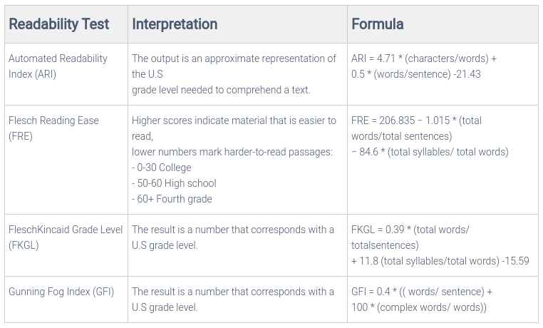
Textstat is a cool Python library that provides an implementation of all these text statistics calculation methods. Let’s use Textstat to implement Flesch Reading Ease index.
Now, you can plot a histogram of the scores and visualize the output.
from textstat import flesch_reading_ease
news['headline_text'].\
   apply(lambda x : flesch_reading_ease(x)).hist()

Code Snippet that Generates this Chart
Almost all of the readability scores fall above 60. This means that an average 11-year-old student can read and understand the news headlines. Let’s check all news headlines that have a readability score below 5.
x=[i for i in range(len(reading)) if reading[i]<5]
news.iloc[x]['headline_text'].head()

You can see some of the complex words being used in news headlines like “capitulation”,” interim”,” entrapment” etc. These words may have caused the scores to fall under 5.
Final Thoughts
In this article, we discussed and implemented various exploratory data analysis methods for text data. Some common, some lesser-known but all of them could be a great addition to your data exploration toolkit.
Hopefully, you will find some of them useful in your current and future projects.
To make data exploration even easier, I have created a “Exploratory Data Analysis for Natural Language Processing Template” that you can use for your work.
Get Exploratory Data Analysis for Natural Language Processing Template
Also, as you may have seen already, for every chart in this article, there is a code snippet that creates it. Just click on the button below a chart.
Happy exploring!