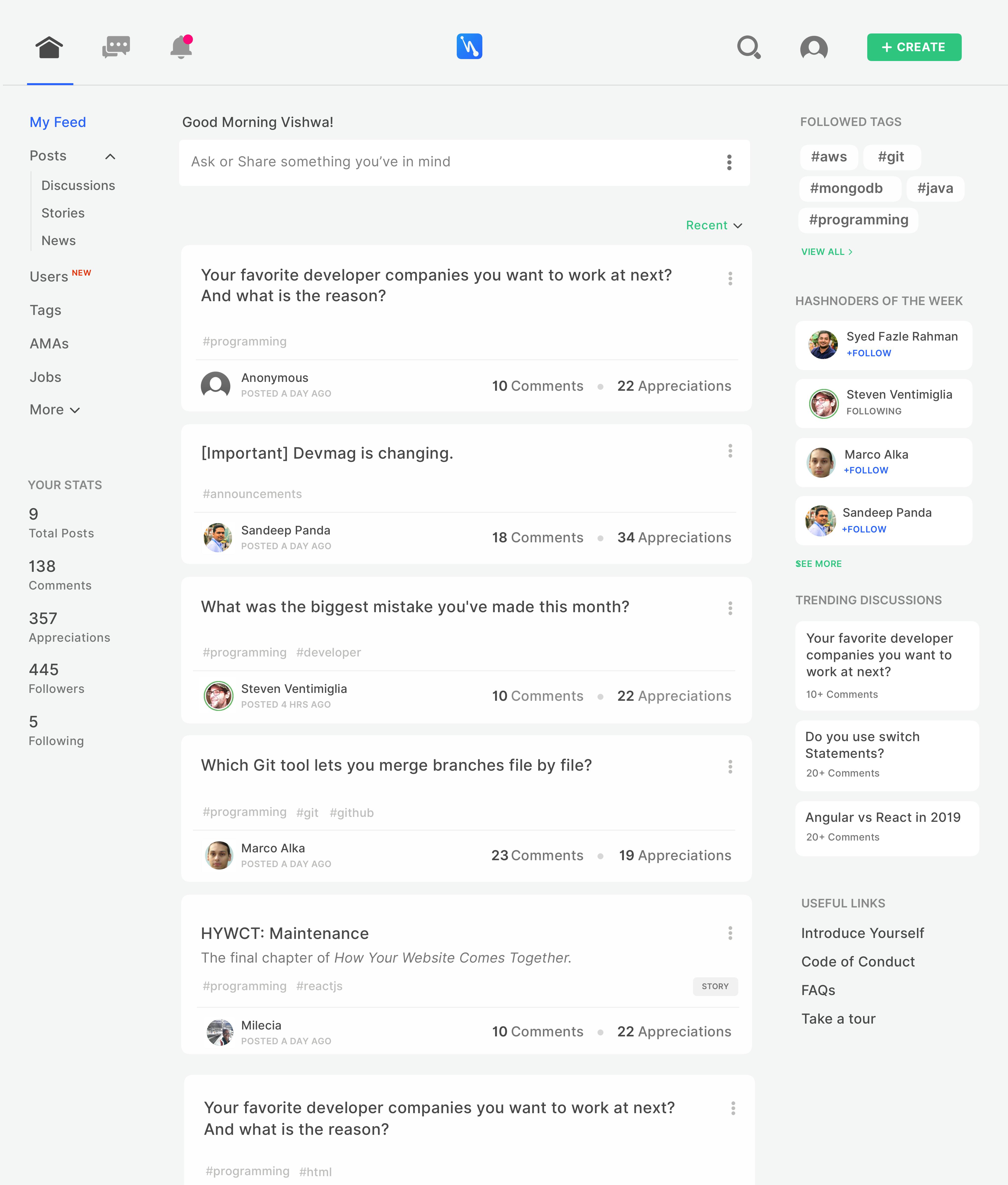
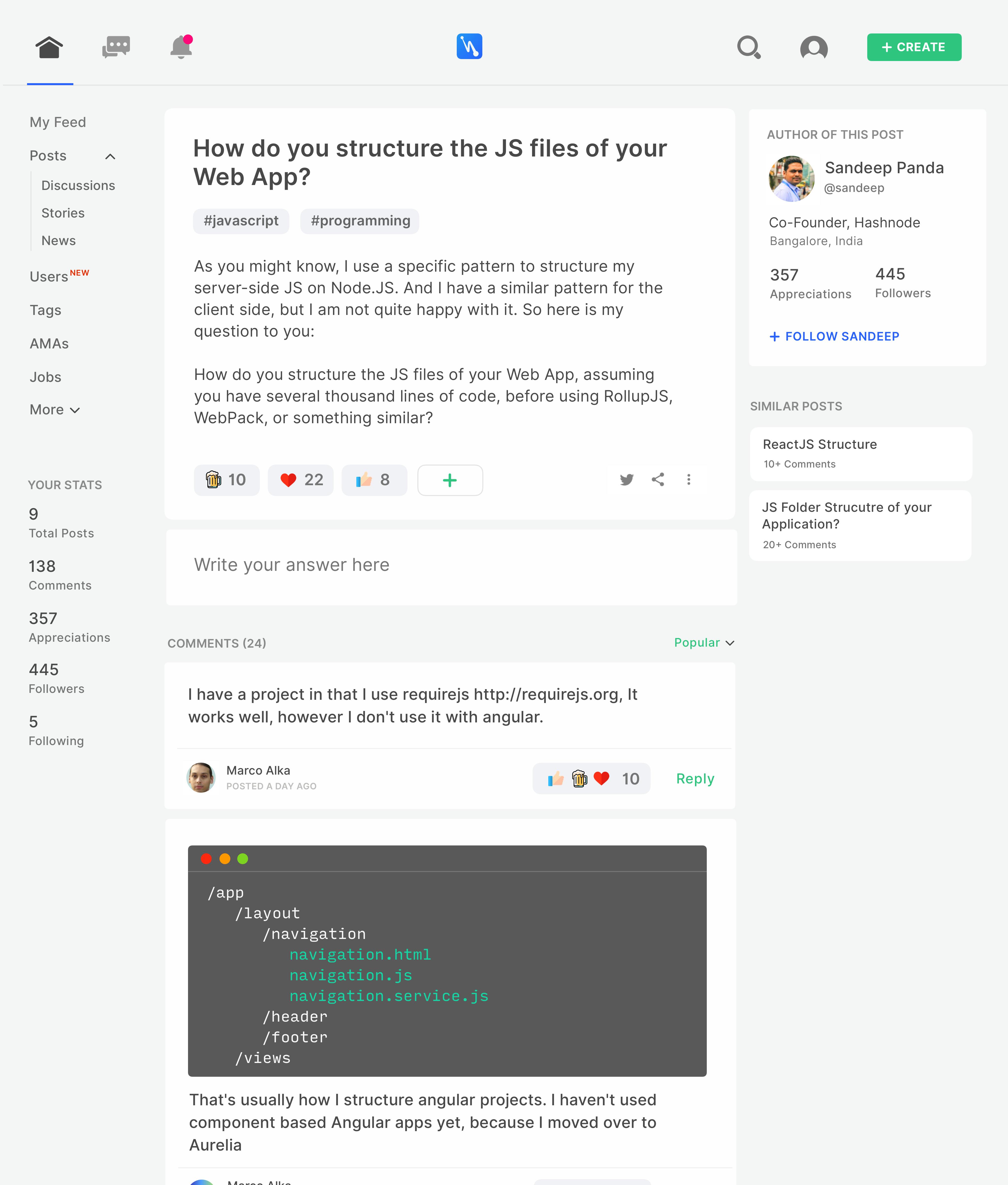
Disclaimer: This is just my weekend experiment on Hashnode's design concept. This has got nothing to do with Official Hashnode Design.
It's been so long since I used Sketch tool and it's friday night! I wanted to design something quick using Sketch and meanwhile Hashnode page was open in my browser. I thought, why not!
Anyway I did not have any intentions of designing whole Hashnode application so I decided to take just two pieces viz. Home Page and Post Page, you know, just to fulfil my appetite for designing something for the weekend
I followed mostly Flat and Spatial design which even the current Hashnode is following. Who uses material design these days anyway! Alright. Here we go.
Home Page

Hmm. Image seems to be force-fitted within the padded space of this post window. I wish it had occupied full width like Airbnb. Anyway, I'll share drive image link incase the image isn't clear.
Post Page

That's it. Here's the drive link of full resolution of above images incase they look pixelated in this post: drive.google.com/drive/folders/16sVBcusLkh…
Hope you liked it.
Have a great weekend. Cheers!
P.S. Please ignore the validity of the content present in the images as I have just copy-pasted some posts and attached them to some known user photos