


One of the CSS concepts I've been experimenting with for the past couple of years is the idea of 'style scoping'. There have been a number of different proposals for the way this might work, and early support even crept into Firefox at one point, but as far as I know all development for supporting style scoping has been stopped now. So what is style scoping, how can we use it, and what is it good for?
Style scoping is the idea that you can select an element anywhere in your document to serve as a point of reference as you write styles. Originally the idea was for containment purposes, but with scoped styles and the addition of any kind of responsive query you suddenly have a very powerful new way to build responsive layouts!
You might describe "element queries" as "scoped styles with a responsive condition".
How can we use Style Scoping
Currently there isn't enough browser support (or even an approved spec) for style scoping using CSS alone, so most approaches involve either a build step (preprocessing your CSS) or use a JavaScript plugin. The plugin I use to do this is EQCSS.
If you think of a web page, everything in your document is a child of the HTML element. When you write media queries to add responsive styles, it always applies to the entire document:
@media (min-width: 500) {
  body {
    background: lime;
  }
}
This means:
When the HTML element is at least
500pxwide, make thebodyelement lime.
This is functionally equivalent to the following element query:
@element 'html' and (min-width: 500px) {
  body {
    background: lime;
  }
}
This could be interpreted the same way:
When the
htmlelement is at least500pxwide, make thebodyelement lime.
In our second example, the element query, we could refer to html as our “scoped element”, or the element that is in the “scope”. The fun part about scoped styles is that you are able to scope styles to any element in your document this way!
How would we describe this kind of a query:
@element '#sidebar' and (min-width: 500px) {
  body {
    background: lime;
  }
}
When the
#sidebarelement is at least500pxwide, make thebodyelement lime
This is amazing! But let's suppose for a second that instead of having one #sidebar on the page we have many .widget elements - how could we write a style for them?
@element '.widget' and (min-width: 200px) {
  .widget h2 {
    font-size: 20pt;
  }
}
When any element with a class of
.widgeton the page is at least200pxwide, make anyh2inside any.widgeton the page20pt
The problem with this rule is when you have more than one .widget on the page with different widths. Any time any .widget element meets the condition, it's applying that CSS rule to all .widget h2 elements. 🤔 Probably not what we want in most cases!
The solution to this is to use a special selector, $this, which only works in EQCSS inside of a scoped style. Anywhere $this is present inside of a scoped style it refers to only the scoped element. This means a rule like this would work for us:
@element '.widget' and (min-width: 200px) {
  $this h2 {
    font-size: 20pt;
  }
}
When any element with a class of
.widgeton the page is at least200pxwide, make anyh2element inside the.widgetelement that matches the condition20pt
In most cases this is what we want, but it's nice to be able to set styles on any element in your document from within a scoped style too.
Here's another explanation of hot $this affects styles:
@element 'div' and (min-width: 500px) {
  $this { background: red; }
  /* When any div is >=500px, make that div red */

  div { background: lime }
  /* When any div is >=500px, make all divs on the page lime */

  $this div { background: gold }
  /* When any div is >=500px, make all divs inside the scope gold */
}
What is Style Scoping useful for?
There are many potential uses for style scoping, so I'll just list the ones that have proven the most useful to me over the past two years:
Style scoping makes it easy to 'quarantine' your styles
When building modules, embeddable widgets, or adding new code to old sites it can be nice to have the peace of mind knowing that 100% of the new styles you are adding to the website are contained within the scope of the element they apply to, and will not be applying to anything else on the page.
Selectively quarantining your styles
Tools that build things like HTML5 animations sometimes have a feature where they can either allow your animation to inherit styles on the page, or be 100% self-contained. With style scoping you have total control over how permeable you want your styles to be. A style like this would allow its children to inherit styles from the page it's embedded on:
@element '#animation' {}
And if we wanted to ensure that nothing from the page gets inherited, we could do something like this (or include any CSS reset):
@element '#animation' {
  $this,
  $this *,
  $this :before,
  $this :after {
    all: initial !important;
  }
}
This would reset (in most browsers) all styles for the scoped element and all of the elements it contains, ensuring that only our styles inside the scoped style apply to its element. In the past without style scoping, we used to isolate animations, widgets, and embed inside iframe elements, but this cut them off entirely from the pages they were displayed in, sometimes had cross-origin issues, and it wasn't possible for the embedded content and the page to interact.
Now with style scoping we can have the same styling flexibility as embeds in an iframe with better interactivity with the pages it's embedded on.
Writing Element Queries
When you add responsive conditions to scoped styles you can build responsive websites without using @media queries. This is something that has proven really useful for building layouts as self-responsive modules that all fit into a basic page layout. These modules can be displayed in all kinds of different websites, with all sorts of different visual styles and branding, and you never have to fiddle with @media query breakpoints when moving the modules around from layout to layout since they are based on the properties of the elements themselves, not based on the dimensions or properties of the browser and viewport.
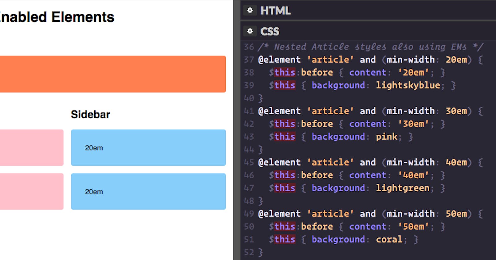
Some of the responsive conditions you can add to scoped styles in EQCSS include: min-height, max-height, min-width, max-width, min-characters, max-characters, min-lines, max-lines, min-children, max-children, min-scroll-y, max-scroll-y, min-scroll-x, max-scroll-x, orientation, min-aspect-ratio, max-aspect-ratio which make this sort of responsive styling a lot more flexible than what @media queries can do.
Conclusion
If you haven't experimented with style scoping yet, it's a very exciting concept and usable today in all browsers via JS plugins. Here are a few demos from Codepen that are made possible by style scoping. View them, fork them, play around with them, use them, and enjoy!
- Nested Element Queries: http://codepen.io/tomhodgins/pen/beeQON
- Order form with Element Queries: http://codepen.io/tomhodgins/pen/yOjrzx
- Testimonials block: http://codepen.io/tomhodgins/pen/vOqaVa
- Responsive Table Layouts: http://codepen.io/tomhodgins/pen/akrRqX
- Element Query Layout Demo: http://codepen.io/tomhodgins/pen/eJJqoz
Happy Hacking!