


Most web pages on the internet have every or most elements styled as boxes in a square, or in a rectangular shape with sharp 90º corners, or rounded a bit with the CSS border-radius property. This will not help to make your web design stand out from the crowd! It will be looking very ordinary even if you use some sorts of gradients and different color palettes.
Real-world shapes differ from circles to triangles and polygons, something that would look great if we could implement on our web page design. The good news is that’s totally possible in CSS3! let me introduce you to the CSS clip-path property which I consider a real game-changer in modern web design. This property helps you style your elements in custom shapes that you can control and adjust upon your need and even add some cool animations to them and make your page look great without even using JavaScript.
So what is the clip-path property and what does it do? Clip-path is a new CSS property that allows you to specify a specific region of an element to display instead of showing the complete element, or in other words, it is a CSS3 property that allows you to hide some parts of the element giving you the possibility to shape it however you want! cool right? let’s see how we can use it: Clip-path accepts four main values in general: polygon(), circle(), ellipse() and inset()# each one of these four values is used for a different purpose:
Polygon(): clip-path: polygon(5% 25%, 100% 0%, 100% 75%, 5% 100%); the first value we will see is the polygon which will take usually four pairs representing the X, Y axes starting from the top left corner, to the top right one, then bottom right and the bottom left corner last. Like in the above example: the first 5% represents the X-axis and 25% after it represents the Y-axis for the first corner (top left) and so on like explained above.
Circle(): clip-path: circle(80px at 50% 50%); The first value here is the circle’s size (or axis) the second two values after the at keyword are the X, Y axes from the top left corner of its container and its CSS positioning (static, relative or absolute…) in our case the circle is in the center of its container.
Ellipse(): clip-path: ellipse(180px 80px at 50% 50%); Its values are the same as the circle, the only difference though is that it takes two values before the at keyword representing its width and height respectively.
Inset(): clip-path: inset(10% 10% 10% 10%); It is one of my favorite values, what it does exactly is to hide or clip the element in a rectangular shape depending on the values you give it, it starts also from the top left corner going clockwise until the bottom left one. A common use for it is to hide parts of images making only a specific area visible. It is also very useful when we want to make some cool animations mixing it with the transition property and the :hover selector. The following is a quick demonstration of that:
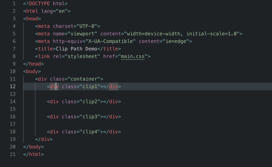
We start by making a quick HTML5 document linking it to a CSS file and creating a container with four elements inside it
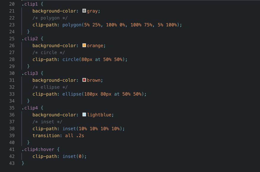
Then we give the elements different colors and shapes using the clip-path property
In the last element’s CSS rule (clip4) I clipped all the sides by 10% to make the element look smaller then I reverted that on hover giving it its original size when the mouse is over it, adding a smooth transition effect just to show an example of how to mix these properties and get a nice animation out of them.
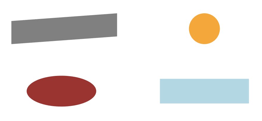
The result of the above code in the browser
Real World Websites Using clip-path: Some websites are using this cool new property which made the design stand out from the standardly generated pages, it is easy to use and does not require any fancy software to premake it like SVG backgrounds for example.
The first website is my personal portfolio where I implemented the clip-path property in some parts on it like the hero section to achieve an appealing design.
The second is a music website where they made the artists' pictures have different shapes to make them stand out of the rest of the content which gave a very beautiful result.
Browser Support: Although this property is very cool, it is not supported by all browsers. By the time this article was written the only browser supporting it 100% is Firefox 54 and up for computer and Firefox 67 and up for Android mobiles. Other major browsers like Chrome and Safari have partial support for it, therefore you might want to use the suffix -webkit- when working with this property just to avoid the headache. You can check this link for more details about browser support: caniuse.com/#search=clip-path
Conclusion: The clip-path property is one of my favorites in CSS3 and it can be used to achieve some very nice animation effects and cool shapes. I used it a lot on my personal website and on some other websites that I made and I think the design was very appealing. However, this property has to be used with caution and always have the -webkit- prefix with it since it is not fully supported by all major browsers.
PS: Thank you for reading and if you liked my article I would appreciate it if you follow me here and on twitter (twitter.com/redvanisation) so you get notified about any new articles I post in the future.