


A few days back someone tweeted that "CSS is hell", But I think CSS is Awesome. It is definitely overwhelming and difficult to learn exhaustively because It had to evolve over the last 25 years. Every browser implements CSS differently, leading to code that works in one browser but not the other. These days most of the modern browser has the support but yet some of them do not provide these support. So, It requiring the developer to write a bunch of confusing vendor prefixes in your code just to make it work across all browsers.
A framework like bootstrap, tailwind, chakra and Material UI are great tools that can help you get a nice-looking UI quickly but If you start learning this framework at your beginner stage you won't learn CSS Fundamentals, it's like getting married tailwind or bootstrap. if you learn CSS will give you more freedom. The guy who knows CSS can switch frameworks very easily. As you can see below 😉

1. Remove default styles.
In every browser, the HTML elements have their own sets of properties with different values. which leads to inconsistency in your design over cross-browser. To make avoid these issues add the below code in main.css
*{
margin:0;
padding:0;
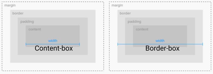
box-sizing: border-box;
}
This removes default margin, padding from every element, and box-sizing sets the behavior of every element to border-box. So an element's width to 100 pixels, that 100 pixels will include any border or padding you added and the content box will shrink to absorb that extra width.
2. Use rem instead of px or em
For using rem add font-size:16px in body element or HTML and size everything in the multiple of 16px. By sizing everything in rem will help you a lot in making your design responsive. It will give you the power to scale everything just by changing the root element font size.
Now some people will say this can also be achieved using em. Then why rem over em? My answer is I prefer using rem over em because debugging in em needs a lot of time and it's not about I can't develop something using em, it's about how easy and fast I can develop something that other teammates can understand.
:root {
  font-size: 16px;
}
@media (max-width: 56.25rem) {
   :root { font-size: 14px; }
}
@media (max-width: 37.5rem) {
   :root { font-size: 13px; }
}
NOTE: If you're not using rem or em in the website will lose accessibility for the people who have a week's eyesight because they deliberately increase their device font size and your website would not sense that.
3. Use CSS Variables
Variables are one of the major reason CSS preprocessors exist but now all modern browsers support CSS variables so you can use them without CSS preprocessors. Variables have the ability to describe the whole theme of your website if you use it in the right way. Some go to variables that every project need like colors, margins, padding, and fonts
:root {
  --main-color: #F06D06;
  --sm-margin:0.5rem;
  --lg-padding:4rem;
  --font-san:'Playfair Display', serif;
  --font-san-serif:'Roboto Slab', serif;
}
4. Make use of utility classes
Utility classes are self-descriptive, single-purpose CSS classes, Building with CSS utility classes is an incredible boost to productivity and organization. It allows you to define your own CSS library that powers all your styles, managed from a single directory. It helps me a lot while developing applications, and I made my own CSS library on top of it Bucket.css.
.margin-b-16{
margin-bottom:1rem
}
.text-xl{
font-size:4rem
}
.text-lg{
font-size:3rem
}
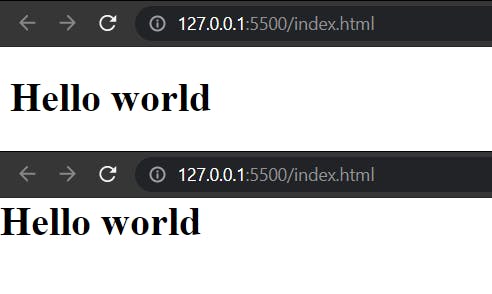
<h1 class=" text-xl margin-b-16" >Hello world</h1>
<h2 class=" text-lg margin-b-16" >Hello world</h2>
5. Use both Grid and Flex-box
There is no doubt Grid and Flexbox have more power than any layout technique that came before them. They have lots of common and differences between them. There are a lot of situations where one is more well-suited than the other.
Use Flexbox for 1 Dimension layouts(for one row and column) and Grid for 2 Dimension layouts(for multiple rows and columns). Using them in the right manner saves your time.
if you want to read more 👉🏻 Difference Between Flexbox and Grid
6. Avoid inline styling
Inline styles Will overkill the process. The advantage of having a different CSS file is:
- It is easy to maintain your styles seprately.
- Your CSS files would be cached on the browser side. So you will contribute a little to internet traffic by not loading some
kbsof data every time a page loads.
Note: If you're making a single-page application using a framework like react, angular, or anything else then you're making a big mistake by using inline styles.
7. Minify your CSS and add vendor prefixes.
It's Important to compress your CSS files and add vendor prefixes for production builds. All CSS preprocessors have these things But if you won't like to use CSS preprocessors you can use online tools cssminifier, Autoprefixer or Webpack plugins for the same.
Here are some good resources to learn HTML & CSS.
Thanks for reading 💝