
Material UI Reusable Confirmation Dialog in React
Interfering destructive actions of the user with a confirmation box.


We are all familiar with those confirm/cancel dialog windows but have you ever tried implementing it in your React application?
Whenever your user tries to delete an item or perform a destructive action, it is a good practice to ask them if they are sure or not! Let's get started!
Are you sure?
The Problem
Whenever the user tries to perform a destructive action in the application, we need to interfere with the process and ask for confirmation! After getting the confirmation the process should continue. We need to ask custom questions that are related to the action also. By creating this kind of flow, we provide a better user experience.
Our Goal
There are tons of ways to create a confirmation dialog in a react application but we are after a specific user and developer experience.
- Make the component reusable and follow dry code principles
- Easily pass the custom messages to the dialog
- Do it with Material UI and Zustand(Don't worry, it is a damn small library!)
1. Install dependencies
As we mentioned above, we will use Material UI and Zustand in this tutorial. Material UI is one of the most used UI libraries with a large component base. Zustand will be useful as a state management library. You can use Context API instead but Zustand seems cleaner for this project, in my humble opinion!
npm install @material-ui/core @material-ui/icons zustand
2. Create the component JSX
First things first, let's create the component skeleton!
// ConfirmDialog.jsx
// material ui
import {
  Dialog,
  DialogTitle,
  DialogContent,
  DialogActions,
  Button,
  Box,
  IconButton,
  Typography,
} from '@material-ui/core';
import { Close } from '@material-ui/icons';

const ConfirmDialog = () => {
  return (
    <Dialog open={true} maxWidth="sm" fullWidth>
      <DialogTitle>Confirm the action</DialogTitle>
      <Box position="absolute" top={0} right={0}>
        <IconButton>
          <Close />
        </IconButton>
      </Box>
      <DialogContent>
        <Typography>some message here</Typography>
      </DialogContent>
      <DialogActions>
        <Button color="primary" variant="contained">
          Cancel
        </Button>
        <Button color="secondary" variant="contained">
          Confirm
        </Button>
      </DialogActions>
    </Dialog>
  );
};

export default ConfirmDialog;
Now we can import the component into our application. You can put it at the root of your project, such as App.js. This will make the component reachable from all over your project. You can see your component rendered on the screen like this:
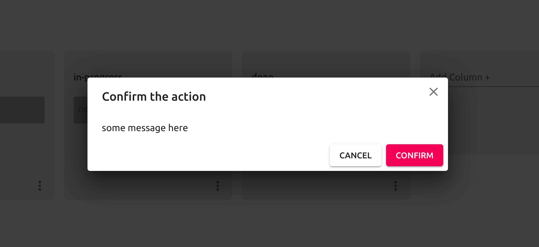
Most probably your colors will not be the same because of my material UI theme configuration but the functionality will be exactly the same.
Well, it looks fine but there is no functionality right now! The message is hard-coded also. Don't worry we will handle it in a second.
3. Create the state store with Zustand
We need to import the create method from Zustand first.
// ConfirmDialog.jsx
// ...
import create from 'zustand';
// ...
After the import, we can create our store with the necessary items.
// ConfirmDialog.jsx
// ...
const useConfirmDialogStore = create((set) => ({
  message: '',
  onSubmit: undefined,
  close: () => set({ onSubmit: undefined }),
}));
// ...
4. Use store data in the dialog JSX.
Now we have our store to store dialog content and its state(open or not). It is time to use it in the actual JSX.
const ConfirmDialog2 = () => {
   // destructure the store data and functions
  const { message, onSubmit, close } = useConfirmDialogStore();
  return (
     // if the onSubmit is undefined the dialog will be closed.
     // close() function sets the onSubmit to undefined,
     // so it will close the dialog, if we pass it to the onClose attribute.
    <Dialog open={Boolean(onSubmit)} onClose={close} maxWidth="sm" fullWidth>
      <DialogTitle>Confirm the action</DialogTitle>
      <Box position="absolute" top={0} right={0}>
        <IconButton onClick={close}>
          <Close />
        </IconButton>
      </Box>
      <DialogContent>
        <Typography>{message}</Typography>
      </DialogContent>
      <DialogActions>
        <Button color="primary" variant="contained" onClick={close}>
          Cancel
        </Button>
        <Button
          color="secondary"
          variant="contained"
          onClick={() => {
            if (onSubmit) {
              onSubmit();
            }
            close();
          }}
        >
          Confirm
        </Button>
      </DialogActions>
    </Dialog>
  );
};
5. Create the utility function to use the store
We are almost done! We need to create the utility function to use our store and open the confirmation to ask the user before deleting some super important data :)
// ConfirmDialog.jsx
// ...
export const confirmDialog = (message, onSubmit) => {
  useConfirmDialogStore.setState({
    message,
    onSubmit,
  });
};
// ...
As you can see, we are exporting this function from the ConfirmDialog.jsx component so it will be available in the other parts of the application.
6. You are done, use it!
We have successfully created our reusable confirmation dialog. Let's use it in our application.
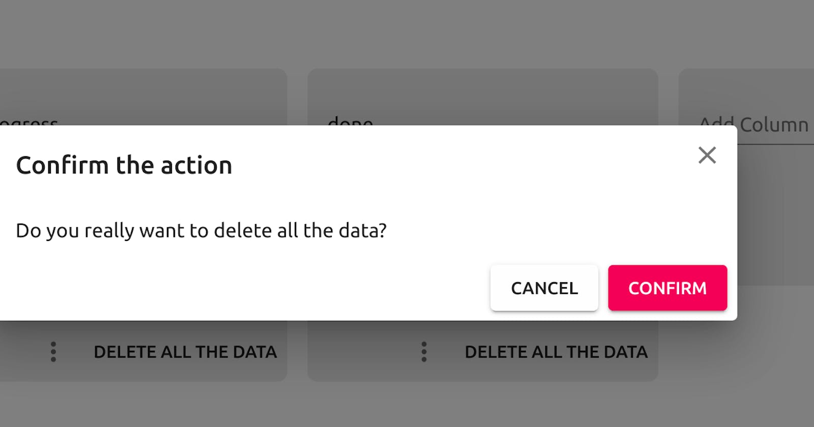
Let's say you have a button labeled as Delete All The Data. I bet you you want to warn the user before implementing this action!
// App.tsx
import { confirmDialog } from './ConfirmDialog';
// ...
<Button
  onClick={() => {
    confirmDialog('Do you really want to delete all the data?', () =>
      console.log('deleting all the data!')
    );
  }}
>
  Delete All The Data
</Button>;
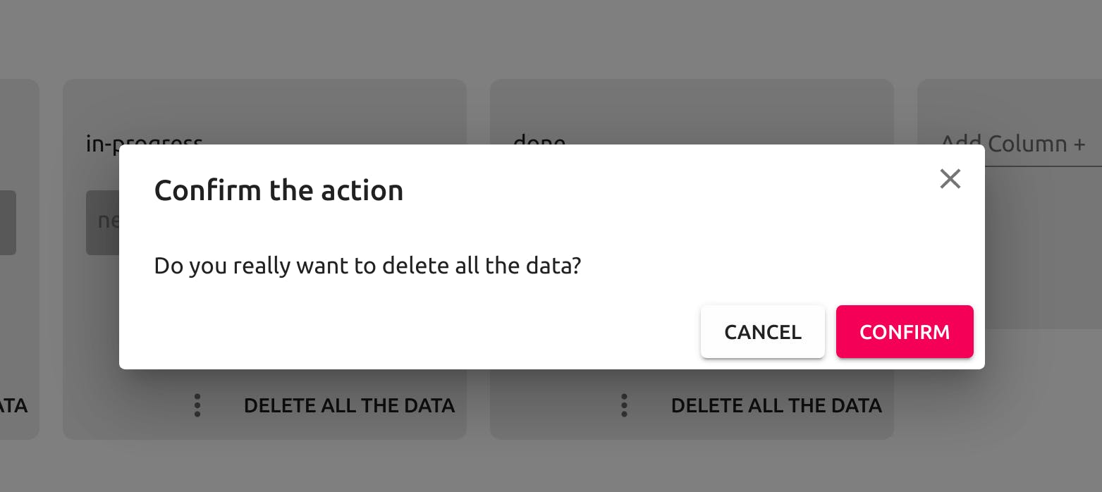
Open your console and enjoy your coffee while deleting all the data after clicking the confirm button!
Conclusion
Providing information to the user about their actions in your application might be crucial. Asking for their confirmation with a dialog window is a good way to provide that information.
I hope you find this tutorial useful.
This implementation is a part of my Fullstack Jira-Clone with React, Hasura, Auth0, and Apollo. I will be sharing my challenges and the solutions to these challenges here while creating the actual project.
If you are interested in the whole project, you can check it here and see the live version here.
I am open to any suggestions and improvements. All kind of contribution is appreciated!
Cheers!