


"If you don't know SVG you can't call yourself a web developer, Call yourself a web enthusiast"
- Dmitry Baranovskiy (Creator of Snap.svg)
SVG has been around for a long, long time but hasn't gained as much popularity as it deserved. Though many programmers are scared of SVG, its usability cannot be denied and there is no reasonable excuse to avoid using SVGs.
In this guide, we will take a look at how we can use SVGs to develop webpages that look crisp on all screen sizes while delivering a high performance.
INTRODUCTION
Everyone wants their web pages to look crisp and responsive for all screen sizes, with lots of graphics, icons and illustrations. But with new devices with different physical dimensions and pixel densities coming out every day, is it possible to deliver web pages that look crisp on every display while keeping the size low?
Traditional Raster graphic image formats like JPG, PNG, GIF have been a part of our web experience for a long time and they had been working just fine until we started using high end devices with large pixel densities.
Different screen sizes can be handled by responsive design but how do we handle different pixel densities? Well let's find out!
People have started using this approach where they supply a high resolution image for screens with pixel dense displays.
.logo {
  background-image: url("img/logo.png");
}
@media only screen and (min-device-pixel-ratio:1.5) {
  .logo {
    background-image: url("img/logo@2x.png");
  }
}
And though this approach works, the increased file sizes is a big concern.
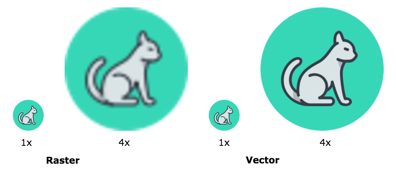
This is the inherent problem with using raster images. If you don't supply enough pixels to the device you end up with a blurry image and if you use a high resolution image, there will be wasted bandwidth.
So.. What's the solution?
Back to Computer graphics 101, The answer is: Vector Graphics
What are SVGs?
SVG or Scalable Vector Graphics is an XML based markup where the visual information is stored in a human-readable code, which can be calculated and rendered by your browser or graphics software.
In simple words, SVG are just text files with a bunch of markup inside and just like HTML there’s a set of tags for every defined shape. Few examples of these tags are <line />, <circle />, <polygon /> and <path />. Each tag contains the coordinates for where its points lie on the plane and are all wrapped inside of an <svg /> tag.
Why use SVG?
It's Responsive!
Scalable/Responsive/Resolution independent, whatever you call it. You can scale SVGs as much as you want and it won't get pixelated.
One less http request to handle :)
With support to inline SVG in the browser, you can completely avoid using external images for graphics.
Stylable and Scriptable!
SVG markup can be accessed with JS and CSS which means you can use CSS to manipulate its styles and sizes. You can also generate your SVG and add it to your DOM dynamically.
Animatable
You can apply CSS or native SVG animations over it and do amazing things with it!
Future Proof your websites
SVG is pretty much the de-facto standard for vector graphics on the web. It has great support right now and it's only going to get better with time.
Great support
SVG has a great support from all modern browsers going till IE9. IE8 and older Android browsers are the only ones you have to worry about. Use SVG with a .png fallback and you should be good to go!
Check out caniuse.com for a detailed support guide.
Small Size
Since an SVG is just a bunch of code, it can be compressed to almost ridiculously small sizes.
How do I use SVG?
As images, object and iframe
You can use SVGs inside an img tag, object tag or inside an iframe.
Here are few code samples :
as an img
<img src="img.svg" />
as an object
<object data="img.svg" />
<embed src="img.svg" />
inside an iframe
<iframe src="img.svg" />
Inside the CSS
Since SVG can be used as an image, you can use it inside your CSS as a background.
.bg {
  background-image: url("bg.svg");
}
As inline code
You can put your SVG code directly in your markup inside and <svg> tag.
Using svg file in img tag or using it as inline SVG are the best ways to fully utilize the capabilities of SVGs.
How do I make my SVGs?
Though SVG markup can be read and written, very few programmers actually write it. Because as the design gets complex, writing the code can get tedious and confusing.
Instead, you can use a graphics program to make your SVG for you. Here are a few popular graphic editor softwares you can use:
Adobe Illustrator
Sketch
Inkscape (free)
Mondrian (open source webapp)
So if SVGs are so good, Why not use them everywhere?!
Well.. No.
Here’s the catch, SVGs are great for images that have an identifiable pattern of pixels. If you are trying to put a ‘photograph’ on a page, almost every other pixel would be different from its neighbouring pixel and there'd be too many tiny details for the SVG file to store which would make it huge in size.
This said, SVG is pretty much the only way to go with for icons, logos and illustrations on the web.
Conclusion
- Gone are the days when you could put up a 72dpi image on your website and be sure that it would look sharp on all displays.
- We want everything to look nice and sharp for anyone who uses our websites but we need to keep file sizes low for performance.
- SVG(Scalable Vector Graphics) can look crisp at all screen resolutions while having super small file sizes.
- SVGs can be easily modified and manipulated with CSS and Javascript.
- SVGs are pretty much only way to go with for icons, logos and illustrations on the web.
Bottom line: SVGs can really enhance your website experience, give it a shot!