


This article was originally published on DoableDanny.com
Whilst learning web development, most of us don’t have much design experience or access to a UI designer. So here are 11 easy to apply UI design fundamentals to make your projects look sleek and modern.
1. Be consistent
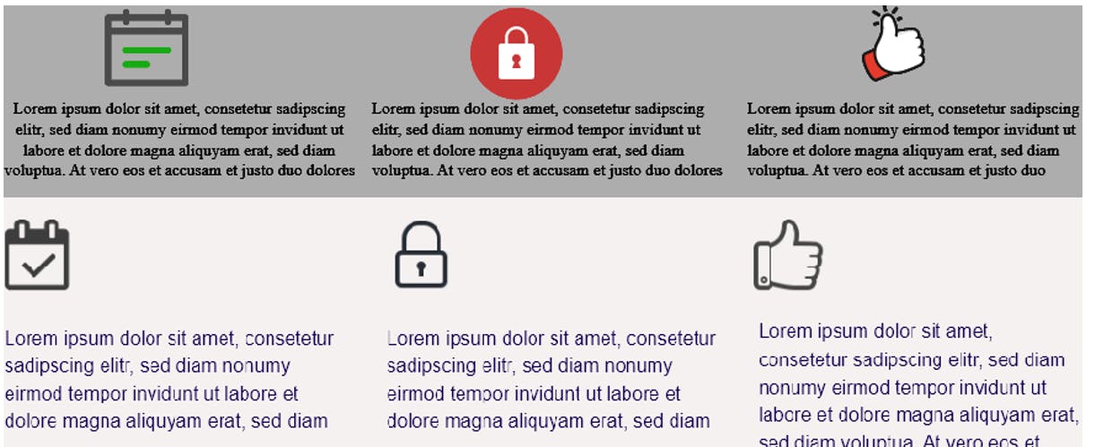
In the top image you can see that the icons have different styles and colours:
- The calendar icon has some green and a grey outline.
- The lock icon has a solid orange circle around it and is white filled with no outline.
- The thumbs up has a thin black outline and smoother lines.
There is no consistent theme - different shapes, colors, sizes and outline thicknesses.
In the bottom image, the icons look to be from the same icon set. They all have a simple dark grey outline and that’s about it. The icons also have the same height and width.
In the bottom image, the text is left aligned, and so are the icons. I also could've centred the text and put each icon over the centre. Both are fine - consistency is key.
Rule of thumb is to left-align any longer form text e.g. a blog post, as it’s easier to read. For shorter amounts of text, you can left-align or centre.
2. Use quality images
Clipart may have been great back when you were 10 years old, but using stuff like that now looks extremely unprofessional.
Professional images can be downloaded and used in your projects completely free from unsplash.com.
3. Contrast
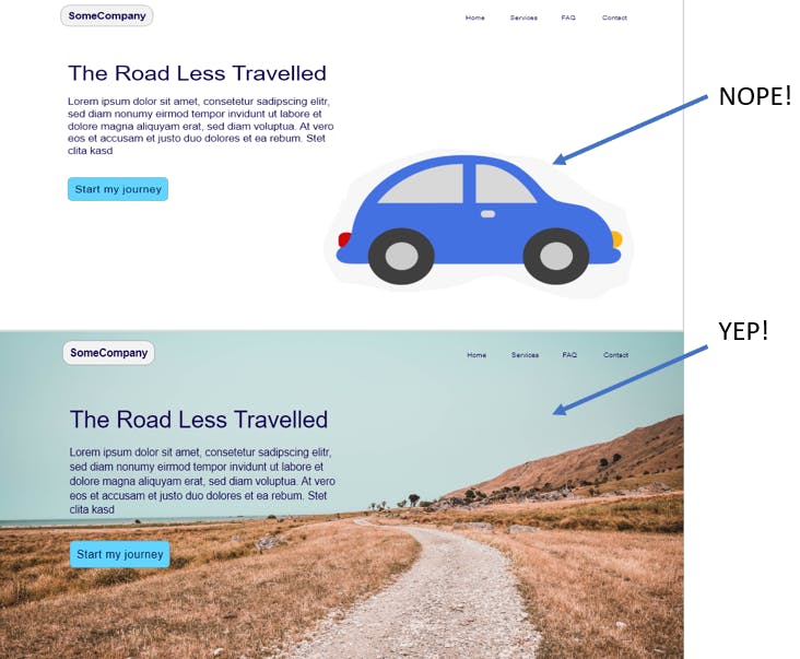
If your background is light, use dark text. If dark, use light text. Simple enough. A problem I see quite often on websites is when people use colourful images as a background with light and dark spots and then plonk some text on top. It’s often difficult to read.
Solutions:
- Use an image overlay e.g. if you are using light coloured text, place over the image a dark coloured overlay (a semi-transparent div with background-color using rgba) and reduce the opacity down to darken the appearance of the image and make the light text clearer. Remember to give the text a higher z-index than the overlay so it sits on top!
- Choose an image like above, where there is a nice consistent coloured section to place your text.
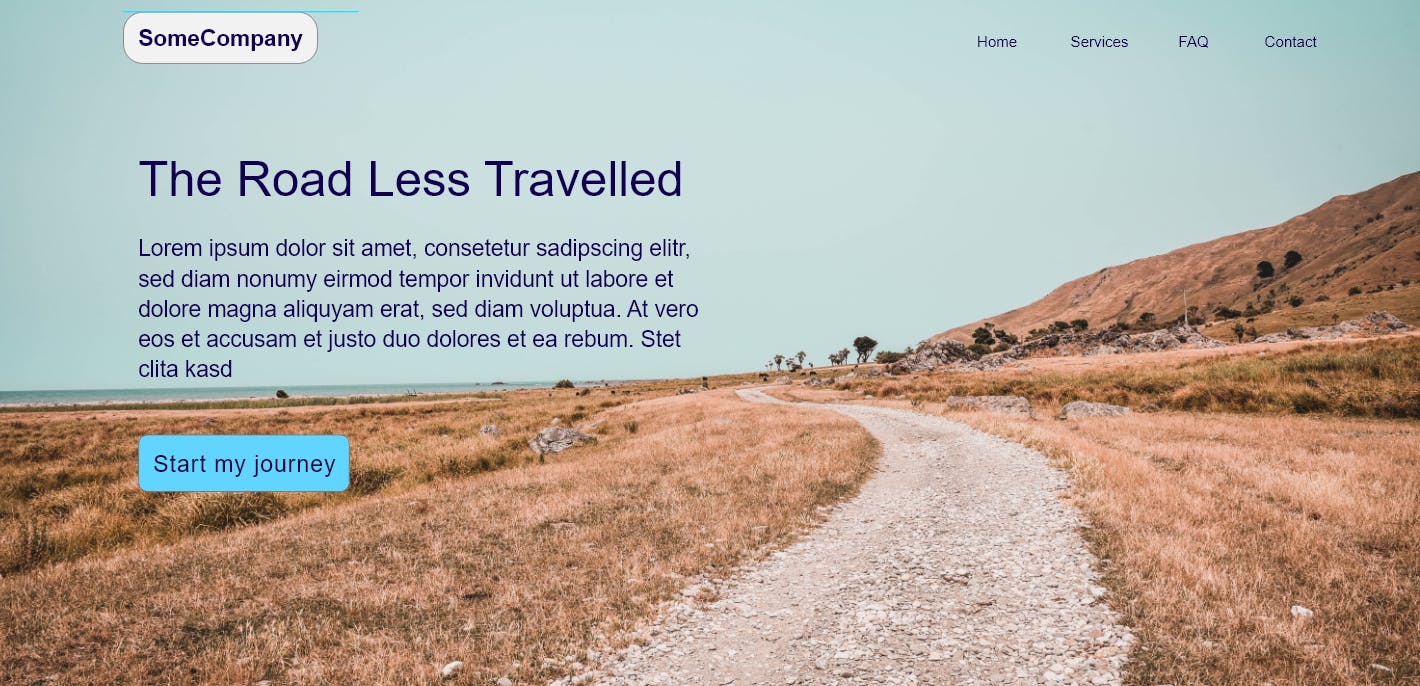
Also, notice how the logo in the nav bar is aligned vertically with the left edge of the text and “start my journey” call to action button… now that’s consistency! It's key to a sleek looking design.
4. Whitespace
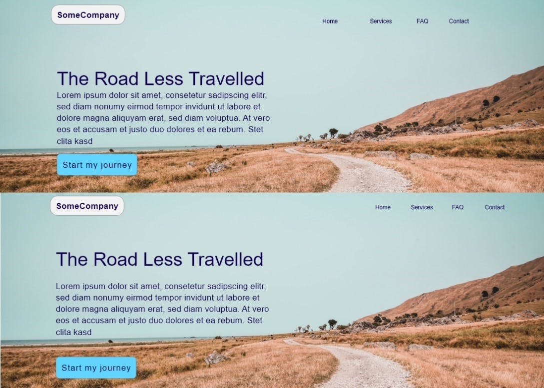
In the top image, the “SomeCompany” logo at the top has less space to its left than the right-most nav link has to its right. In the bottom, we can see the space is roughly equal.
The paragraph of text in the top image is cramped up too close to the heading and call to action button. In the bottom, it has more breathing room.
We can also see that the heading is closer to the paragraph than it is to the logo. Stuff that is closely related should be closer together… but not stupid close.
5. Visual hierarchy – size matters
Your eyes are probably drawn to “The Road Less Travelled” in the image from tip 4. Obviously because it is bigger. It is also bolder. Attention can also be demanded by colour e.g. the “start my journey” button.
A common mistake is to make the nav logo too big, or the nav links stand out too much with colour.
We want the users attention directed towards the content, not the logo and nav links.
6. One font is fine!

It is fine to use just one font. No need to overcomplicate. Just avoid “Times new roman” (it’s overused) and “Comic sans” (it just looks naff!?).
Nunito, Helvetica or sans serif are pretty nice modern looking fonts.
You can still use a second font for headings if your design looks a little too boring (check out the title of this blog post!).
For font sizes, 18px to 21px are common for paragraphs.
7. Tints and shades
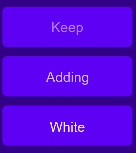
Use few colours. Too many colours can look noisy and unprofessional, especially if you don’t know what you’re doing. Keep it simple.
Pick a base colour and just use tints (add white) and shades (add black) for variation.
Then pick one primary “call to action” colour for areas that should stand out. Check out the “complementary colour scheme”.
I use coolors to find complimentary colours and to get tints and shades.
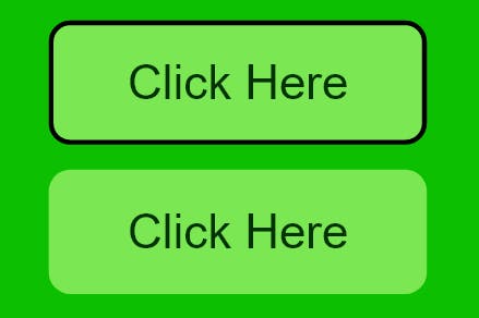
8. Round vs sharp

Sharp corners and edges draw your attention. Think the sharp part of a speech bubble.
What can we do with this knowledge? Round out the corners of your buttons. Why would you want to draw attention to the corners of the button?
9. Borders are so last year
In the old days of the web, borders were everywhere. Nowadays, it’s better to not use them quite as much – it often looks cleaner. Borders can look a little overkill.
Obviously don’t become completely anti-border, they are still great for separating things. Just don’t make them too thick and attention grabbing.
10. Don't underline nav-bar links
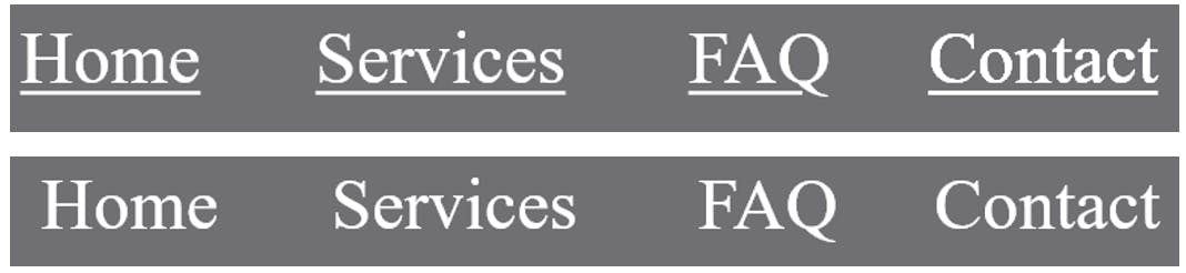
It’s pretty old school. It looks cleaner without them.
Underline/change the colour or size on mouse hover and keyboard focus for accessibility.
You should still underline links in a body of text for good accessibility - it makes it obvious they are links. Just avoid underlining text that isn't a link.
11. Download a design software
I used to begin coding up a project with little to no plan of how I wanted it to look. It took me ages to code everything with trial and error for colours and positioning of elements.
You can iterate through ideas much quicker using design software. I now use AdobeXD (free) to just drag and drop things in place and quickly get a nice design ready to be coded. Figma is also popular.
Awesome References
- Turn a bad design into a good one: youtube.com/watch?v=0JCUH5daCCE&t=112s
- Amazing UI tips: medium.com/refactoring-ui/7-practical-tips…
- The science of great UI: youtube.com/watch?v=nx1tOOc_3fU
If you enjoyed this post, subscribe to my newsletter. I write on topics such as algorithms, UI design and freelancing. I’ll email you once per week with my latest article and bonus tips and tricks. I like to dive deeply into topics to give you all the information you need in one place!
You can also find me on Twitter and YouTube.
Thanks for reading,
Have a great day!