Help with Flexbox Grid


I want to make a box grid with flexbox. I want to be able to define a fixed width, have line wrapping, the line should be floating to left, center or right. Every other line should be filled with the max width of the page, but keep the fixed width of the box. This means that the space between should be variable.
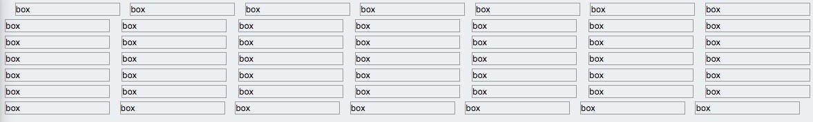
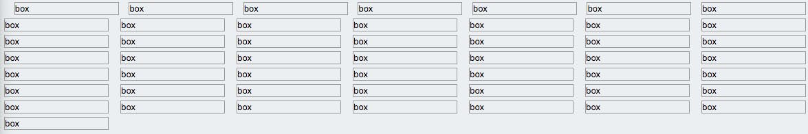
Right now it seems to work for me on every line except the first, where it has some weird space before the first one. The last line craps out too if the amount of boxes fit the maximum.
My markup code is
<grid>
    <box>
        box
    </box>
</grid>
And the CSS (SCSS) is
grid {
    margin-bottom: 10px;

    display: flex;
    flex-wrap: wrap;
    overflow: hidden;
    justify-content: space-between;

    &:before,
    &:after {
        width: 0;
        content: " ";
        display: table;
    }

    box {
        margin-bottom: 5px;
        min-width: 150px;
        display: flex;
        border: 1px #999 solid;
    }
}