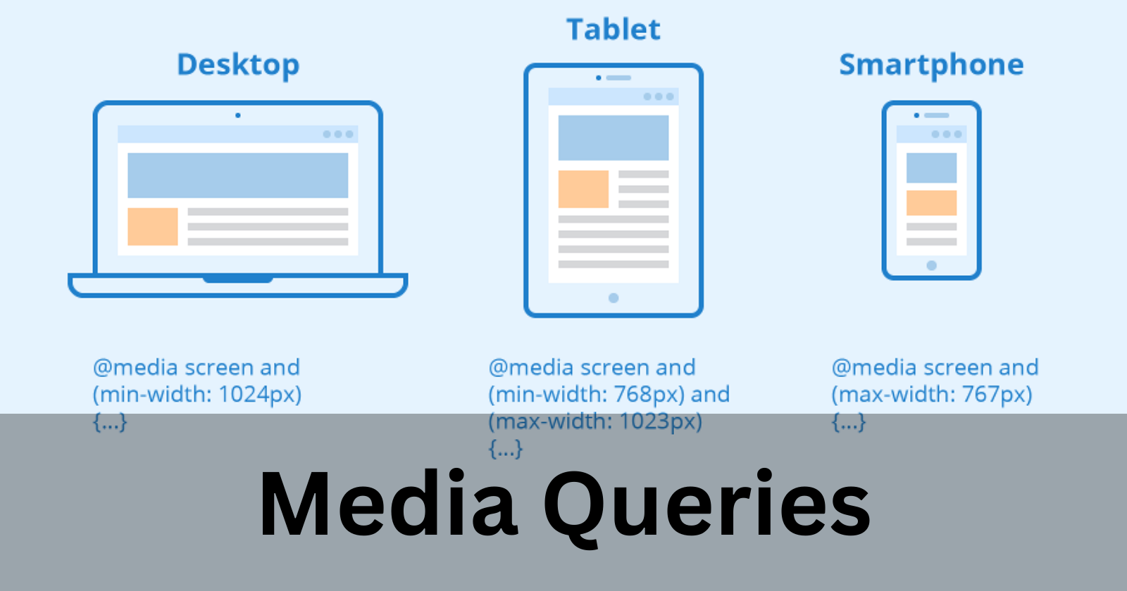
Media Queries
Media queries allow you to apply CSS styles depending on a device's general type (such as print vs. screen) or other characteristics such as screen resolution or browser viewport width. If the browser window is 600px or smaller, the background color ...
Written by
Senior Systems Engineer at Infosys Ltd.
Hello World! I am going to git init my blogging journey, as I am learning Full Stack Web Development so I will git push my learnings here :)
Responses
Markdown supported · ⌘↵ to post
No responses yet.