Feed
Discussion
Mar 8, 2023
Media Query
Media Query Media Query makes the web page responsive. Media query is used for three screen sizes to make it responsive. Mobile Screen, Laptop Screen and Desktop Screen. Max-width and Min-width are breakpoints to make the screen responsive. How to de...
ayashadevikar.hashnode.dev2 min read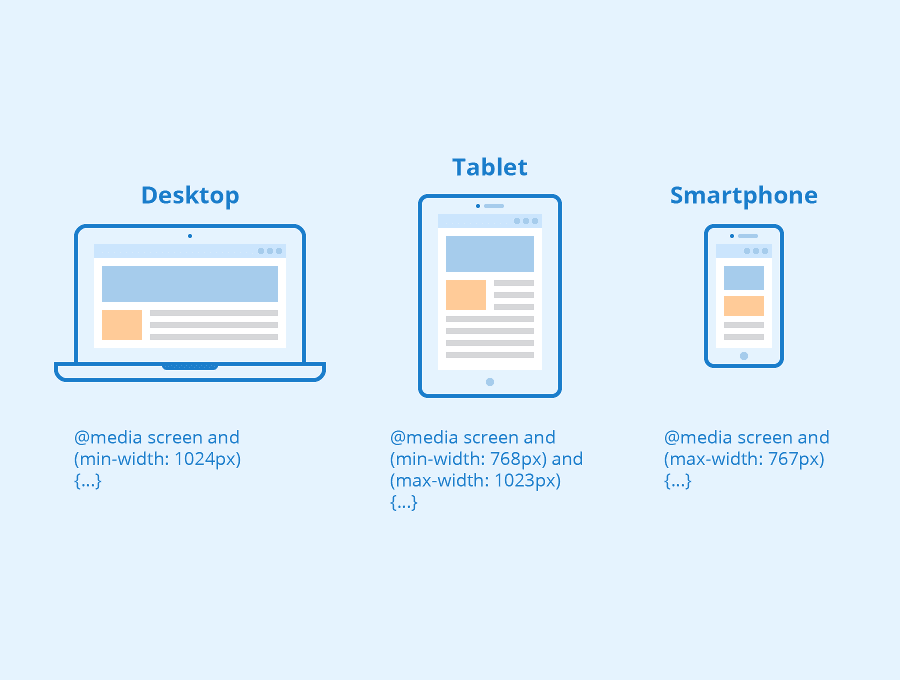
Responses
No responses yet.