


How To Making Navbar (appbar) In React.js ?
We all try to make a little Navbar together. which responsive would you be more colourful. we will use bootstrap in this. which will be of great help.


We want our one to look good and have a good response but we just can't. But we can not do this. Because we are just beginning and we don't know very well how to use UI/UX apps how to use CSS in our code. But we don't have to worry anymore. Today we will learn about it and remove the usual problem.
are we ready?
In this blog, we will see how to write a Navbar (Appbar). We will also see some of the best practices for writing tests.
The reducer functions contain the main logic of our application and hence it is very important to test them.
Let's get started
Let's create a navbar for react.js with bootstrap.
We will create 3 files in this.
- Navbar.js
- Navbar.css
- MenuItems.js
- It's
Navbar.jsFile
import React from "react";
import { Link } from "react-router-dom";
import { FaBars, FaTimes } from "react-icons/fa";
import MenuItems from "./MenuItems";
import "./Navbar.css";

const Navbar = () => {
    const [click, setClick] = React.useState();

    const clickHandler = () => {
        setClick(!click);
    };
    return (
        <nav className="nav">
            <div className="nav-center container">
                <h1 className="logo">NAVIDMANSURI</h1>

                <ul className={click ? "nav-list active" : "nav-list"}>
                    {MenuItems.map(({ id, title, cName }) => (
                        <div key={id} className="nav-item">
                            <Link className={cName}>{title}</Link>
                        </div>
                    ))}
                </ul>
                <div className="hamburger" onClick={clickHandler}>
                    {click ? <FaTimes /> : <FaBars />}
                </div>
            </div>
        </nav>
    );
};

export default Navbar;
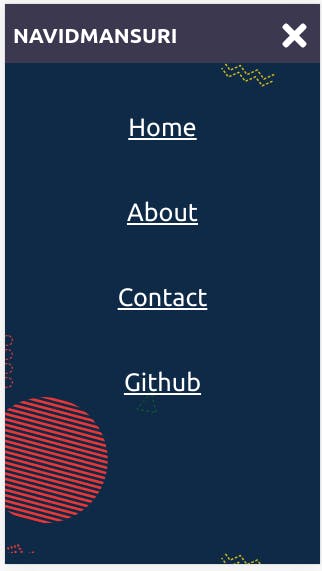
We will have to add another File to this. in which our data will be. who helped us create a Navbar. like HOME , ABOUT , GITHUB etc...
MenuItems.js
export default [
    {
        id: 1,
        title: "Home",
        cName: "nav-link",
    },
    {
        id: 2,
        title: "About",
        cName: "nav-link",
    },
    {
        id: 4,
        title: "Contact",
        cName: "nav-link",
    },
    {
        id: 5,
        title: "Github",
        cName: "nav-link",
    },
];
- And after creating this 2 file, you can add CSS file
Navbar.css
:root {
  --primary: #3c3850;
}

.nav {
  padding: 0.11rem 0;
  background-color: var(--primary);
}

.hamburger {
  display: none;
  padding-right: 9px;
}

.nav-center {
  display: flex;
  justify-content: space-between;
  align-items: center;
}

.logo {
  color: #fff;
  padding-left: 9px;
}

.nav-list {
  display: flex;
  align-items: center;
}

.nav-item:not(:last-child) {
  margin-right: 0.5rem;
}

.nav-link {
  font-size: 1.1rem;
  color: #fff;
  padding: 1rem;
  border-radius: 0.8rem;
  transition: all 300ms ease-in-out;
}

.nav-link:hover {
  background-color: rgb(56, 57, 82);
}

@media only screen and (max-width: 768px) {
  .hamburger {
    display: flex;
    align-items: center;
    justify-content: center;
    color: white;
    font-size: 2.5rem;
    cursor: pointer;
  }

  .nav-list {
    background-image: url("YOU_LIKE_IMAGE");
    position: fixed;
    top: 8%;
    left: -100%;
    flex-direction: column;
    align-items: center;
    background-color: #8fa0e4;
    width: 100%;
    height: 100%;
    padding: 1.6rem 0;
    transition: all 300ms ease-in-out;
  }

  .nav-list.active {
    left: 0%;
  }

  .nav-item:not(:last-child) {
    margin-right: 0;
  }

  .nav-item {
    margin: 2rem 0;
    width: 100%;
    text-align: center;
  }

  .nav-link {
    font-size: 1.8rem;
    width: 100%;
  }
}
And after importing these 3 files, your Navbar will be ready. which will be fully responsive. and it would look something like this.
-Desktop size

-Mobile size
The complete code could be found here github.com/NavidMansuri5155/Navgurukul_pro...
Some Best practices for testing:
Each test should be independent, it should not depend on the previous test
Each test should test only one thing
It should be fast and automatic
Happy learning! Hope you learned something new from this blog. I would love to connect with you on. Twitter Linkedin
Thank's and happy coding ...